<?xml version="1.0" encoding="utf-8"?><feed xmlns="http://www.w3.org/2005/Atom" ><generator uri="https://jekyllrb.com/" version="3.10.0">Jekyll</generator><link href="https://scottlangford.com/feed.xml" rel="self" type="application/atom+xml" /><link href="https://scottlangford.com/" rel="alternate" type="text/html" /><updated>2026-06-18T16:07:38+00:00</updated><id>https://scottlangford.com/feed.xml</id><title type="html">W. Scott Langford, PhD</title><subtitle>Personal website of W. Scott Langford, PhD. Research, teaching, and Southbound 35 — a blog on public finance, economic development, and applied analysis on the Texas corridor (drafted with Claude).</subtitle><author><name>W. Scott Langford, PhD</name><email>scottlangford@txstate.edu</email></author><entry><title type="html">Who Governs Hays County?</title><link href="https://scottlangford.com/posts/2026/05/hays-county-governance/" rel="alternate" type="text/html" title="Who Governs Hays County?" /><published>2026-05-25T00:00:00+00:00</published><updated>2026-05-25T00:00:00+00:00</updated><id>https://scottlangford.com/posts/2026/05/hays-county-governance</id><content type="html" xml:base="https://scottlangford.com/posts/2026/05/hays-county-governance/"><![CDATA[<p>A typical homeowner in Hays County is governed by <a href="https://www.hayscountytx.gov/">Hays County</a>, Hays CISD, the city they live in (or, if unincorporated, no city at all), an <a href="https://www.hayscountytx.gov/emergency-services-districts">Emergency Services District</a>, possibly a Municipal Utility District or Water Control and Improvement District, the <a href="https://haysgroundwater.com/">Hays Trinity Groundwater Conservation District</a> or <a href="https://www.edwardsaquifer.org/">Edwards Aquifer Authority</a>, a river authority (<a href="https://www.gbra.org/">GBRA</a> or <a href="https://www.lcra.org/">LCRA</a>), the <a href="https://hayscad.com/">Hays Central Appraisal District</a>, and — for most subdivisions built since 2000 — a homeowners association.</p>

<p>That is ten distinct entities, before adding the state and federal governments. Each one has a separate governing board. Most have separate elections. A few are not directly elected at all. Their tax rates appear on different lines of the same property-tax bill, and their decisions about water, roads, schools, and emergency services are made largely in isolation from one another.</p>

<p>
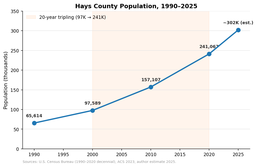
This is the final post in a series on Hays County. The first four looked at growth, projections, water, and schools. This one looks at the structure that has to manage all of it — and at why “manage” may be the wrong word for what actually happens.</p>

<h2 id="the-cast">The cast</h2>

<p>Here are the entities a Hays County address typically falls within:</p>

<p><strong>Hays County government.</strong> A five-member Commissioners Court (one judge plus four precinct commissioners) handles unincorporated land use, roads outside cities, the jail and sheriff, and a long list of statutory duties. Tax rate: $0.3999 per $100 of taxable value in 2025.</p>

<p><strong>A school district.</strong> Almost everyone is in Hays CISD, San Marcos CISD, or Dripping Springs ISD. Wimberley ISD covers part of the western county. Each has an elected board of trustees, separate tax rates (M&amp;O plus I&amp;S), and the largest combined rate of any local entity — $1.1546 in HCISD.
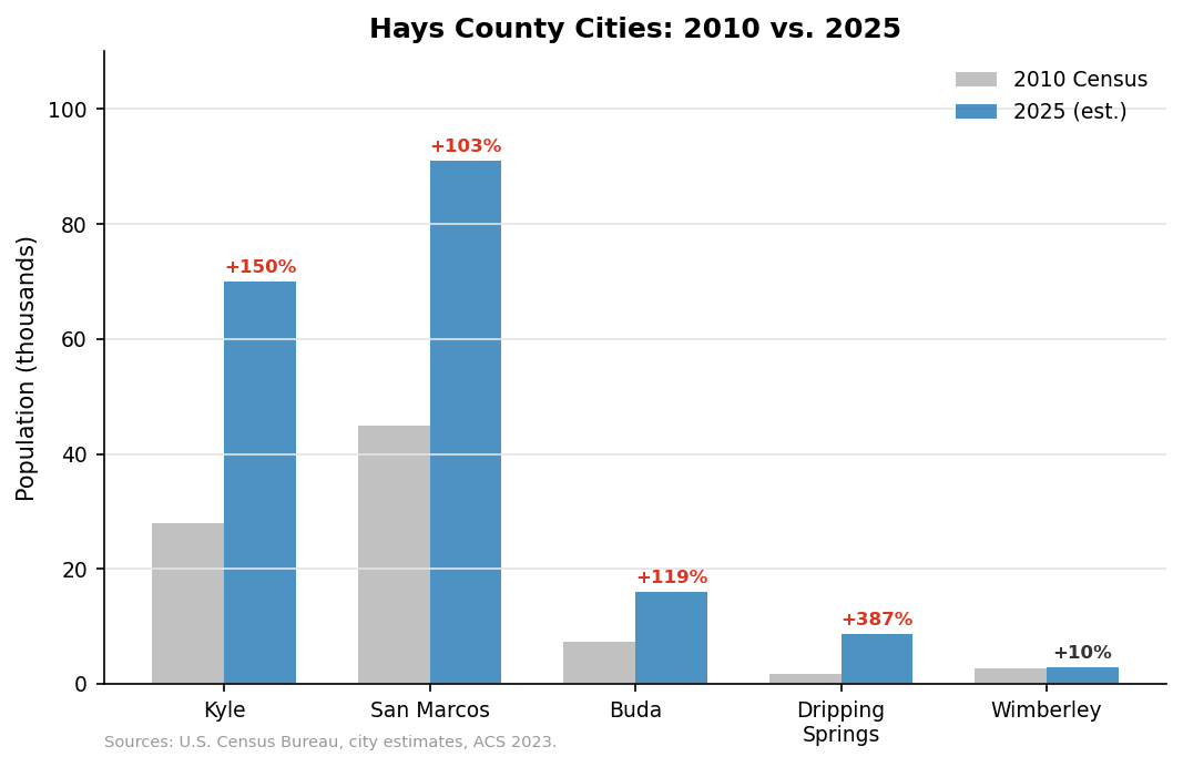
</p>

<p><strong>A city, sometimes.</strong> Kyle, Buda, San Marcos, Wimberley, Dripping Springs, Mountain City, Niederwald, and Uhland are the named cities, plus a handful of smaller incorporated places. Each has its own council, its own zoning, its own utilities. City tax rates range from $0.3576 (Buda) to $0.6515 (San Marcos). The unincorporated portion of the county — which is large — has no city government at all.</p>

<p><strong>An Emergency Services District.</strong> Hays County is served by <a href="https://www.hayscountytx.gov/emergency-services-districts">nine ESDs</a>, plus a tenth that crosses into Caldwell County. Each has an appointed (in some cases elected) board, levies its own ad valorem tax, and contracts for fire and EMS service from local volunteer departments or municipal providers. ESDs are the modern descendants of volunteer fire associations, formalized into political subdivisions so they could levy taxes and issue debt.</p>

<p><strong>A Municipal Utility District or Water Control and Improvement District, sometimes.</strong> New subdivisions in the unincorporated county are typically organized into MUDs at the time they are platted. The MUD issues bonds to finance the water lines, sewer lines, drainage, and roads — bonds paid back by future homeowners through property taxes. <a href="https://districtdirectory.org/hays-county/">At least twelve MUDs</a> operate in Hays County, plus several WCIDs (the older water-only variant). MUD tax rates vary widely; a typical supplemental rate is around $0.65 per $100, but rates above $1.00 are not uncommon in newly built developments.</p>

<p><strong>The Hays Central Appraisal District.</strong> A single appointed board (with members chosen by the taxing jurisdictions whose values it assesses) sets the market value of every parcel in the county. HCAD does not levy taxes of its own, but its assessments determine the taxable base for every other entity on this list.
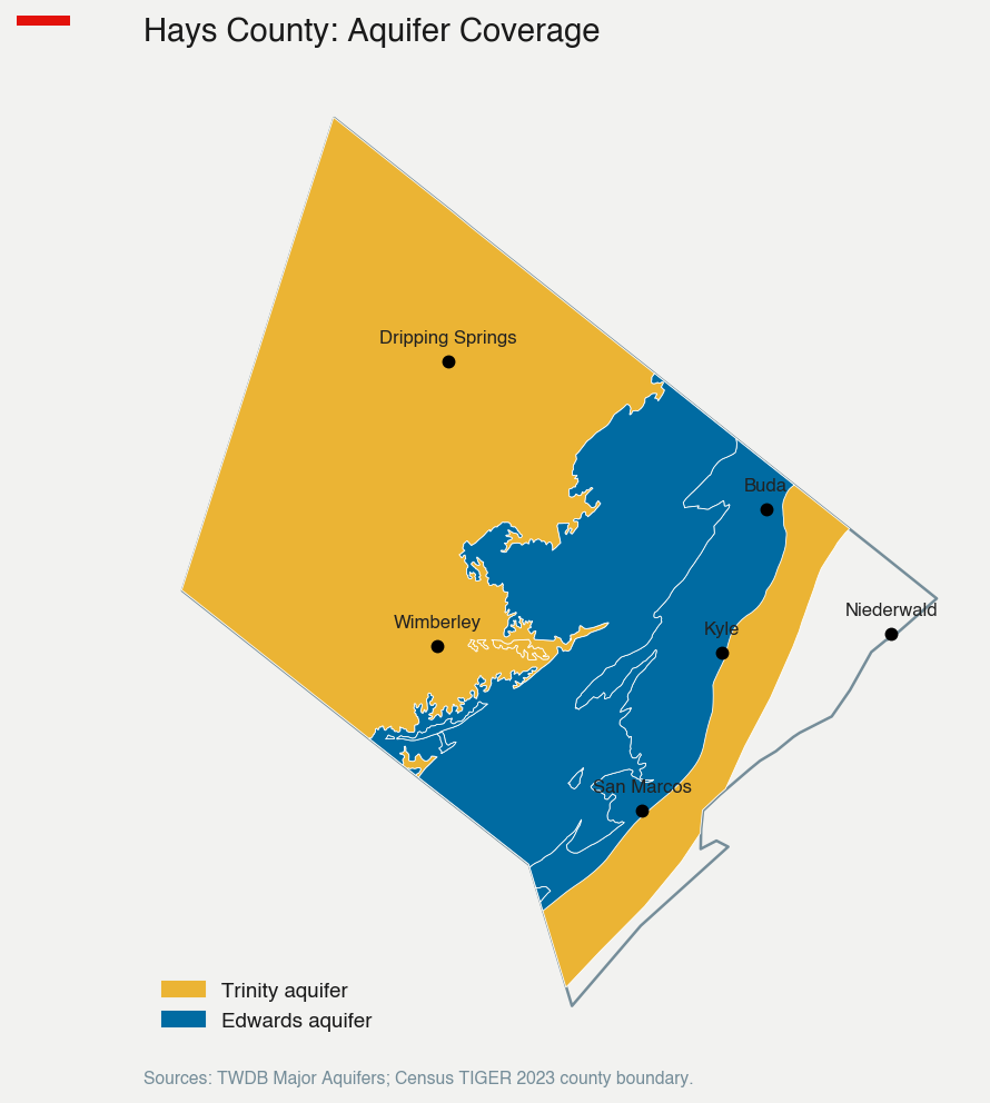
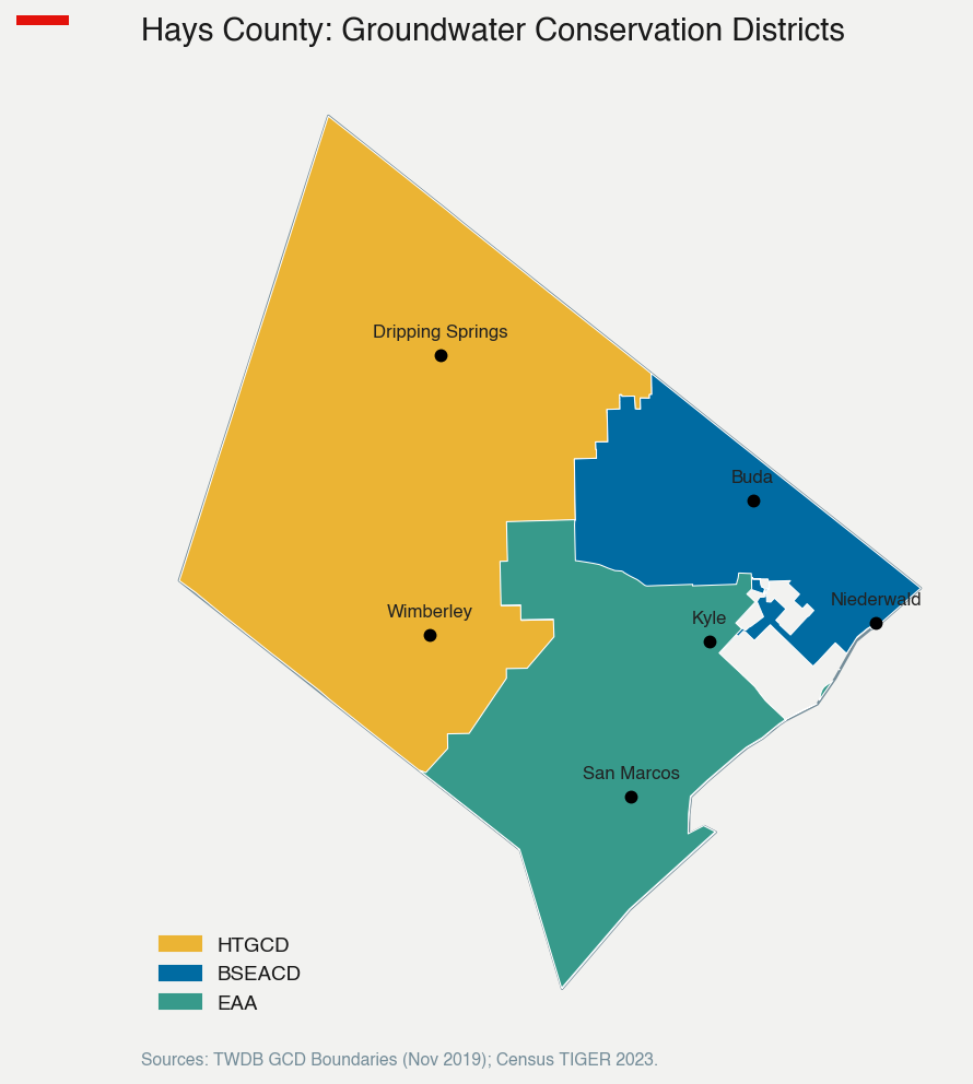
</p>

<p><strong>A groundwater conservation district.</strong> Most of Hays County is in the <a href="https://haysgroundwater.com/">Hays Trinity Groundwater Conservation District</a>, which regulates well permits and pumping. The western edge falls under the <a href="https://www.edwardsaquifer.org/">Edwards Aquifer Authority</a>. Neither levies a property tax in most cases, but both can deny or condition the right to drill a well.</p>

<p><strong>A river authority.</strong> The <a href="https://www.gbra.org/">Guadalupe-Blanco River Authority</a> covers the eastern and southern portions of the county; the <a href="https://www.lcra.org/">Lower Colorado River Authority</a> covers the northern portion. Both manage surface water supply, sell raw water to municipal utilities, and operate wastewater systems in some areas. They do not levy property taxes but they set wholesale water prices and approve contracts that determine how much water local utilities can buy.</p>

<p><strong>A homeowners association, often.</strong> Almost every subdivision built since 2000 has an HOA with mandatory dues, deed restrictions, and (in many cases) the power to fine, foreclose, and govern day-to-day life. HOAs are not government — they are private contracts — but for many residents they are the most visible and demanding “authority” they interact with.</p>

<h2 id="how-the-layers-stack-up-on-a-tax-bill">How the layers stack up on a tax bill</h2>

<p>The cumulative property tax rate in Hays County is high by national standards and not far below the highest rates in Texas. Here is the composition for three typical address types:</p>

<p><img src="https://raw.githubusercontent.com/scottlangford2/scott_langford/master/images/hays/hays_governance_tax_stack.png" alt="How many layers tax a Hays County homeowner" /></p>

<p>
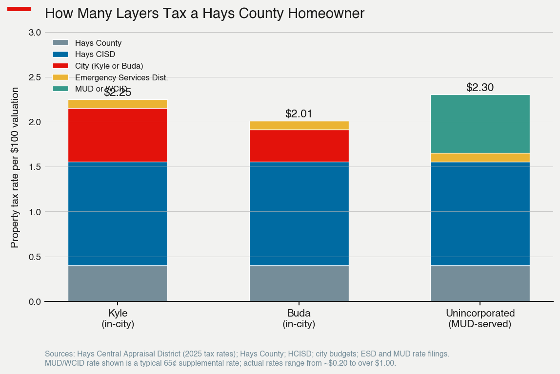
A homeowner inside Kyle’s city limits pays about $2.25 per $100 of taxable value across four entities. A Buda homeowner pays about $2.01, mostly because the Buda city rate is lower. A homeowner in an unincorporated MUD pays about $2.30 — the city rate is replaced by the MUD rate, which is often higher than what a city would charge.</p>

<p>The school district is the largest single component everywhere. The county and ESD are roughly constant. The variable piece is whether you live inside a city, inside a MUD, or in rural territory with neither.</p>

<h2 id="and-the-count-of-governing-bodies">And the count of governing bodies</h2>

<p>The dollar amount is one way to count the layering. The number of distinct entities is another:</p>

<p><img src="https://raw.githubusercontent.com/scottlangford2/scott_langford/master/images/hays/hays_governance_entity_count.png" alt="Who governs a Hays County address" /></p>

<p>
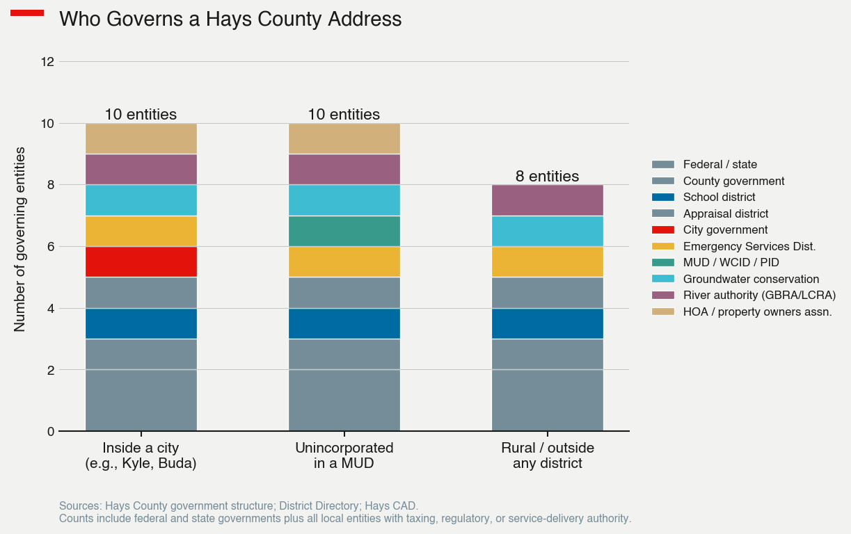
Inside a city or inside a MUD, a typical address is governed by ten entities — including the federal and state governments. Even in fully rural territory the count is eight. Each one has its own board, its own meetings, its own elections, its own budget cycle, and its own statutory authority.</p>

<h2 id="why-it-grew-this-way">Why it grew this way</h2>

<p>The proliferation of special districts is not a Hays County phenomenon. It is a Texas phenomenon, with deep roots in two pieces of state policy.</p>

<p>First, Texas makes it <a href="https://comptroller.texas.gov/economy/local/index.php">easy to create new local entities and hard to consolidate them</a>. The MUD statute, in particular, was written to let developers finance subdivisions without front-loading the cost onto a city or county. A developer petitions to create a MUD, the MUD issues bonds for the water, sewer, and drainage infrastructure, and the bonds are repaid by the homeowners who eventually buy the houses. From the developer’s perspective this is brilliant: it shifts the carrying cost of infrastructure off the balance sheet and onto a public entity that can issue tax-exempt debt. From the future homeowner’s perspective it shows up as a higher annual property tax bill for the first 20 to 30 years.</p>

<p>Second, Texas counties — outside the largest urban ones — have <a href="https://www.tml.org/241/Local-Authority-and-Land-Use">extremely limited regulatory authority over land use</a>. They cannot zone. They cannot impose subdivision regulations as broad as a city’s. They cannot easily compel developers to coordinate on shared infrastructure. The Texas legislature has historically preferred to create new special districts than to empower county government, because new districts answer to local boards rather than to a county judge with broader political accountability.</p>

<p>The result is a system that grows fractally. A subdivision platted in 2010 produces a new MUD, a new HOA, a new water contract, and a new tax rate. Ten years later, the houses are full of homeowners who never voted on any of those decisions but now pay for them. The MUD board is elected by residents but, in the early years, residents are mostly the developer’s representatives. By the time the population shifts, the major decisions — bond issuance, rate structure, service contracts — are already locked in for decades.</p>

<h2 id="the-coordination-problem">The coordination problem</h2>

<p>The first four posts in this series each ended on the same observation: Hays County’s growth is moving faster than its institutions. This post is the version of that story that has to do with the institutions themselves.</p>

<p>
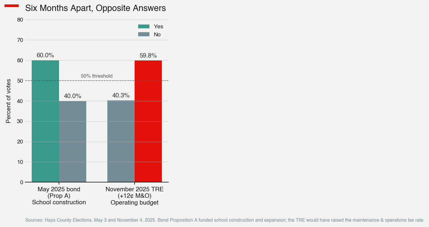
The water study commissioned in early 2026 is being done by the county, with limited authority over the MUDs, river authorities, and city utilities that actually buy and sell most of the water. The $440 million road bond approved by voters and then voided by a judge was a county-level instrument; the cities will keep funding their own roads on their own schedules. The Hays CISD budget squeeze is set by a state funding formula that the district itself does not control, and it will not be solved by any local action. The voted-down November TRE was a Hays CISD election; it had no effect on the seven other taxing jurisdictions on the same homeowner’s bill.</p>

<p>No single entity in this list has the authority to coordinate the others. The county judge can call meetings. The cities can pass resolutions. The school districts can lobby. The MUDs can be left out of the room and frequently are. There is no equivalent of a metropolitan planning council with binding authority, because Texas does not have that institution.</p>

<p>The accountability problem is the obverse of the coordination problem. When a Hays County homeowner is unhappy about their tax bill, water service, schools, or roads, the answer to “who is responsible” is rarely simple. Often it is six different entities, each pointing at the others. The homeowner has the right to vote in their school board election, their ESD board election (in some districts), their city council election, their county election, their state and federal elections — and frequently their MUD board election, which most do not realize they are eligible for. Turnout in those smaller elections is regularly under five percent.</p>

<h2 id="what-the-alternatives-are">What the alternatives are</h2>

<p>Other states have made different choices. Many empower county government to do what Texas leaves to special districts. A handful have aggressive city-annexation laws that absorb new developments into existing city limits, eliminating the need for a parallel MUD. A few use regional service authorities to deliver water, transportation, and emergency services across multiple counties without proliferating new entities.</p>

<p>Texas has chosen the opposite. The 2025 legislative session, in particular, <a href="https://comptroller.texas.gov/">further restricted county authority</a> — most notably by clarifying that counties cannot impose moratoriums on water-heavy development, the same provision that derailed Hays County’s effort to slow industrial water use in early 2026.</p>

<p>The political logic is consistent: keep authority dispersed, keep decision-making local and small-scale, let developers and property owners create new districts when they need them. The cost is the system this post describes — a homeowner governed by ten entities, a county that cannot coordinate water across them, and a tax bill that no single body is responsible for managing.</p>

<h2 id="pulling-the-series-together">Pulling the series together</h2>

<p>
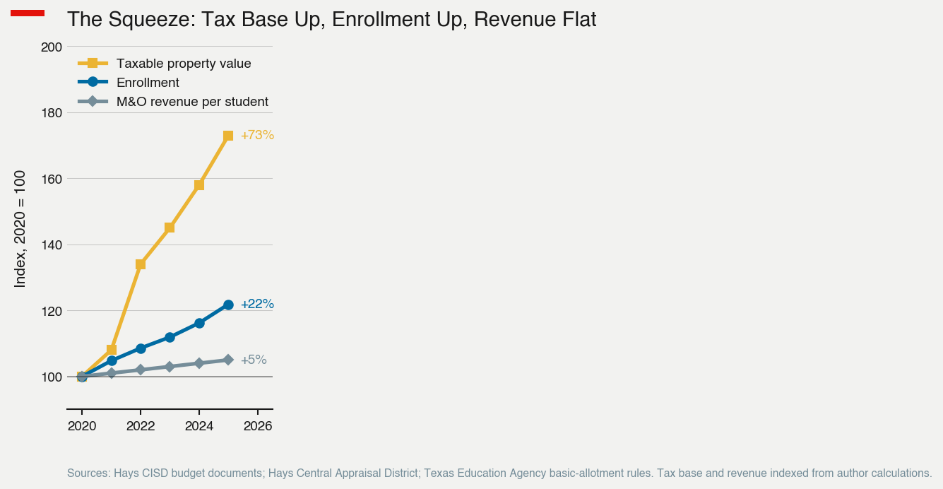
Across five posts, the same pattern has appeared in different forms. Hays County is growing very fast. The institutions managing the growth were not designed for the scale. The water study is fifteen years late. The road bond is in legal limbo. The school district’s tax base is rising faster than its enrollment, but the state forces the operating rate down, and voters have rejected the workaround. The MUDs are doing what MUDs were designed to do — building infrastructure for new subdivisions — but with no overall coordination of how the pieces fit together.</p>

<p>None of this is unique to Hays County. It is the Texas growth model, more visible here because Hays is growing faster than almost anywhere else in the country. The places that figure out how to manage growth at this scale, with this institutional framework, will be doing something genuinely new. The places that do not will be living inside the structure this series has described, paying ten layers of property taxes to entities that do not talk to each other, and hoping that whatever they collectively produce is enough.</p>

<p>The next series on Southbound 35 will move from Hays County to other Texas corridors — but the questions will be familiar. Public finance and economic development in Texas are increasingly questions of institutional design, not just policy. The institutions are the constraint.</p>

<hr />

<h2 id="sources">Sources</h2>

<p><strong>Hays County government and structure</strong></p>

<ul>
  <li>Hays County: <a href="https://www.hayscountytx.gov/emergency-services-districts">Emergency Services Districts</a> and <a href="https://www.hayscountytx.gov/">main county website</a></li>
  <li>Hays Central Appraisal District: <a href="https://hayscad.com/">hayscad.com</a> — tax rates and structure of the appraisal district board</li>
  <li>District Directory: <a href="https://districtdirectory.org/hays-county/">Hays County special purpose districts</a></li>
</ul>

<p><strong>Special districts (MUDs, WCIDs)</strong></p>

<ul>
  <li>Community Impact News: <a href="https://communityimpact.com/austin/san-marcos-buda-kyle/election/2025/04/10/several-municipal-utility-districts-on-ballot-in-hays-county-area/">Several MUDs on ballot in Hays County</a></li>
  <li>Hays County MUD No. 4: <a href="https://www.hcmud4.org/">hcmud4.org</a></li>
</ul>

<p><strong>Water authorities</strong></p>

<ul>
  <li><a href="https://www.gbra.org/">Guadalupe-Blanco River Authority (GBRA)</a></li>
  <li><a href="https://www.lcra.org/">Lower Colorado River Authority (LCRA)</a></li>
  <li><a href="https://www.edwardsaquifer.org/">Edwards Aquifer Authority</a></li>
  <li><a href="https://haysgroundwater.com/">Hays Trinity Groundwater Conservation District</a></li>
</ul>

<p><strong>Texas local-government framework</strong></p>

<ul>
  <li>Texas Comptroller: <a href="https://comptroller.texas.gov/economy/local/index.php">Local economy / districts</a></li>
  <li>Texas Municipal League: <a href="https://www.tml.org/241/Local-Authority-and-Land-Use">Local Authority and Land Use</a></li>
</ul>

<p><strong>Property tax composition</strong></p>

<ul>
  <li>BPTP: <a href="https://www.ballardpropertytaxprotest.com/post/hays-county-property-tax-rate">Hays County Property Tax Rate by Taxing Entity, 2025</a></li>
</ul>

<p>Replication code: <a href="https://github.com/scottlangford2/southbound-35/tree/main/posts/hays-governance">southbound-35/posts/hays-governance</a></p>

<h2 id="disclosure">Disclosure</h2>

<p>This blog post was written with the assistance of Claude (Anthropic). Claude helped with data research, structuring the institutional cast, and drafting. All analysis and editorial judgment are the author’s.</p>]]></content><author><name>W. Scott Langford, PhD</name><email>scottlangford@txstate.edu</email></author><category term="economic-development" /><category term="public-finance" /><category term="Hays County" /><category term="Texas" /><category term="public finance" /><category term="governance" /><summary type="html"><![CDATA[A typical homeowner in Hays County is governed by Hays County, Hays CISD, the city they live in (or, if unincorporated, no city at all), an Emergency Services District, possibly a Municipal Utility District or Water Control and Improvement District, the Hays Trinity Groundwater Conservation District or Edwards Aquifer Authority, a river authority (GBRA or LCRA), the Hays Central Appraisal District, and — for most subdivisions built since 2000 — a homeowners association.]]></summary></entry><entry><title type="html">Who’s actually clutch on Sunday? Eight years of PGA Tour data.</title><link href="https://scottlangford.com/posts/2026/05/golf-clutch-pga-tour/" rel="alternate" type="text/html" title="Who’s actually clutch on Sunday? Eight years of PGA Tour data." /><published>2026-05-19T00:00:00+00:00</published><updated>2026-05-19T00:00:00+00:00</updated><id>https://scottlangford.com/posts/2026/05/golf-clutch-pga-tour</id><content type="html" xml:base="https://scottlangford.com/posts/2026/05/golf-clutch-pga-tour/"><![CDATA[<p>If you watch enough golf, you’ve absorbed a piece of folk wisdom: the leader after 54 holes plays worse on Sunday. The lead shrinks, the back nine eats people alive, and somebody you’d never bet on walks off with the trophy. Commentators reach for the word <em>choke</em>. Players reach for the word <em>pressure</em>. The flip side of the same coin is <em>clutch</em>: the player who shows up on Sunday and plays like the moment isn’t there.</p>

<p>I wanted to know whether you can see that pattern in the data — and, more importantly, whether the apparent gap between contenders and the rest of the field on Sunday is actually about handling pressure or just statistics doing what statistics do.</p>

<p>This is not a new question. Pope and Schweitzer (2011) used PGA ShotLink data to show that tour pros putt worse for birdie than for par on otherwise identical putts — a loss-aversion result that is the closest thing the literature has to a “smoking gun” for pressure-induced underperformance. Hickman and Metz (2015) showed that putting performance further deteriorates with the monetary stakes of the putt. What follows is a tournament-level cousin of those results, using publicly available leaderboard data and a within-player design.</p>

<p>Short answer: about nine-tenths of what looks like Sunday underperformance in contention is regression to the mean. A small, real cost-of-contention residual survives — averaging roughly four-tenths of a stroke. The “back-nine collapse” essentially does not exist. And individual players differ enough that you can pick out reliable names at both ends of the clutch distribution.</p>

<h2 id="the-pattern-that-gets-people-excited">The pattern that gets people excited</h2>

<p>I pulled every PGA Tour stroke-play event from 2018 through 2025 — 329 tournaments, 23,727 player-tournament observations after dropping non-completers, team events, and weather-shortened weeks. For each player at each tournament, I compute a “Sunday surprise”:</p>

<blockquote>
  <p>Δ = (Round 4 score to par) − (mean of Rounds 1–3 to par for that same player at that same event)</p>
</blockquote>

<p>If you played consistently all week, Δ ≈ 0. If you played worse on Sunday, Δ &gt; 0.</p>

<p>Sort players by where they stood after Round 3 and the pattern is enormous:</p>

<p><img src="https://raw.githubusercontent.com/scottlangford2/scott_langford/master/images/golf-clutch-1-naive.png" alt="Naive pattern: leaders shoot much worse on Sunday" /></p>

<p>Leaders play their Sunday round <strong>3.5 strokes worse</strong> than their own Thursday-through-Saturday average. The back-of-pack reference (players 21st or worse entering the round) plays essentially to form. Monotonically, the closer you are to the lead, the worse Sunday goes for you.</p>

<p>If you stopped here, you’d write the obvious headline. You’d be wrong.</p>

<h2 id="why-the-obvious-headline-is-wrong">Why the obvious headline is wrong</h2>

<p>Leaders are leaders <em>because</em> they have just played three rounds well. Three rounds well in this sport requires a mix of skill and luck — making mid-range putts you usually miss, flying the right line off the tee with the wind shifting. By Saturday night, the player in the lead is by construction sitting on top of a hot streak that was always going to revert.</p>

<p>This is just regression to the mean. It doesn’t require any pressure, any psychology, any nerves. If you randomly reshuffled what shots fell on Thursday vs. Sunday, you’d still see the leaders shoot worse on Sunday on average, simply because the labels “leader” and “back-marker” select on the prior rounds.</p>

<p>So the question is: <strong>once we strip out regression to the mean, does anything remain?</strong></p>

<h2 id="the-cleaner-test">The cleaner test</h2>

<p>Within each event, I rank players by their through-R3 score to par. To separate leverage from regression to the mean, I run a fixed-effects regression of Δ on indicators for after-R3 position bins (Lead, T2–3, T4–5, T6–10, T11–20, vs. 21+ as the reference), while controlling flexibly for the player’s actual through-R3 score:</p>

<blockquote>
  <p>Δ<sub>ie</sub> = β · position_bin<sub>ie</sub> + γ · through_R3<sub>ie</sub> + δ · through_R3<sub>ie</sub><sup>2</sup> + α<sub>i</sub> + θ<sub>e</sub> + ε<sub>ie</sub></p>
</blockquote>

<p>Player fixed effects (α<sub>i</sub>) absorb skill. Event fixed effects (θ<sub>e</sub>) absorb course difficulty, weather, and field strength. The quadratic in through-R3 score is the workhorse that absorbs regression to the mean: among players with the <em>same</em> three-round score, position is determined by who else happens to be near them on the leaderboard. That residual variation in position — the part not driven by your own scoring — identifies the leverage effect.</p>

<p>Result:</p>

<p><img src="https://raw.githubusercontent.com/scottlangford2/scott_langford/master/images/golf-clutch-2-adjusted.png" alt="After absorbing skill, course, and mean reversion" /></p>

<table>
  <thead>
    <tr>
      <th>Position after R3</th>
      <th style="text-align: right">Naive Δ</th>
      <th style="text-align: right">Adjusted Δ</th>
    </tr>
  </thead>
  <tbody>
    <tr>
      <td>Lead</td>
      <td style="text-align: right">+3.49</td>
      <td style="text-align: right"><strong>+0.43</strong> (p = 0.03)</td>
    </tr>
    <tr>
      <td>T2–3</td>
      <td style="text-align: right">+2.89</td>
      <td style="text-align: right"><strong>+0.35</strong> (p = 0.02)</td>
    </tr>
    <tr>
      <td>T4–5</td>
      <td style="text-align: right">+2.58</td>
      <td style="text-align: right"><strong>+0.31</strong> (p = 0.02)</td>
    </tr>
    <tr>
      <td>T6–10</td>
      <td style="text-align: right">+2.14</td>
      <td style="text-align: right"><strong>+0.29</strong> (p &lt; 0.01)</td>
    </tr>
    <tr>
      <td>T11–20</td>
      <td style="text-align: right">+1.46</td>
      <td style="text-align: right">+0.03 (n.s.)</td>
    </tr>
  </tbody>
</table>

<p>Roughly <strong>88 percent of the naive Sunday gap is mean reversion</strong>. But a real residual remains: players in the top 10 entering Sunday give back somewhere between 0.3 and 0.4 strokes relative to their own pace from earlier in the week, and the effect is significant. The leader cost (≈0.4 strokes) is essentially the same as the cost for T6–10, suggesting it’s “being in contention” that exacts the toll, not specifically “being in the lead.” Put another way: even the average tour pro gives back about four-tenths of a stroke to their own Thu–Sat form when they’re in contention on Sunday. The question that interests me is which players give back more — and which give back less, or none at all.</p>

<h2 id="sanity-check-famous-sundays-on-the-leaderboard">Sanity check: famous Sundays on the leaderboard</h2>

<p>Before drawing conclusions from a regression coefficient, it helps to verify the data agree with everyone’s memory. A few well-known final rounds, with Δ computed as above (negative = clutch, positive = gave strokes back):</p>

<table>
  <thead>
    <tr>
      <th>Player, event (year)</th>
      <th style="text-align: right">Pos after R3</th>
      <th style="text-align: right">Δ (strokes)</th>
    </tr>
  </thead>
  <tbody>
    <tr>
      <td>Jordan Spieth, <a href="https://en.wikipedia.org/wiki/2018_Masters_Tournament">Masters (2018)</a> — Sunday 64</td>
      <td style="text-align: right">9</td>
      <td style="text-align: right"><strong>−6.33</strong></td>
    </tr>
    <tr>
      <td>Tony Finau, <a href="https://en.wikipedia.org/wiki/2018_Masters_Tournament">Masters (2018)</a> — Sunday 66</td>
      <td style="text-align: right">15</td>
      <td style="text-align: right"><strong>−5.67</strong></td>
    </tr>
    <tr>
      <td>Rory McIlroy, <a href="https://en.wikipedia.org/wiki/2024_U.S._Open_(golf)">U.S. Open (2024)</a> — Pinehurst missed putts</td>
      <td style="text-align: right">2</td>
      <td style="text-align: right">+0.33</td>
    </tr>
    <tr>
      <td>Bryson DeChambeau, <a href="https://en.wikipedia.org/wiki/2024_Masters_Tournament">Masters (2024)</a> — led R1, finished 6th</td>
      <td style="text-align: right">5</td>
      <td style="text-align: right">+2.00</td>
    </tr>
    <tr>
      <td>Will Zalatoris, <a href="https://en.wikipedia.org/wiki/2022_PGA_Championship">PGA Championship (2022)</a> — lost playoff</td>
      <td style="text-align: right">2</td>
      <td style="text-align: right">+3.00</td>
    </tr>
    <tr>
      <td>Cameron Smith, <a href="https://en.wikipedia.org/wiki/2022_Masters_Tournament">Masters (2022)</a> — final group, finished T3</td>
      <td style="text-align: right">2</td>
      <td style="text-align: right">+3.00</td>
    </tr>
    <tr>
      <td>Brooks Koepka, <a href="https://en.wikipedia.org/wiki/2023_Masters_Tournament">Masters (2023)</a> — led, shot 75</td>
      <td style="text-align: right">1</td>
      <td style="text-align: right"><strong>+6.67</strong></td>
    </tr>
  </tbody>
</table>

<p>The famous clutch rounds (Spieth’s 64, Finau’s 66) and the famous give-it-back rounds (Koepka, Zalatoris, Smith) are all visibly in the panel. The pattern lives where you’d expect.</p>

<h2 id="the-back-nine-is-a-myth">The back nine is a myth</h2>

<p>The most romantic version of the choking narrative is specifically about the back nine on Sunday. The lead evaporates over the closing stretch. Amen Corner does its work. Augusta’s 12th hole eats Jordan Spieth.</p>

<p>I re-ran the same regression on Sunday <em>back-nine</em> scoring only, controlling for the same things. After mean-reversion adjustment:</p>

<p><img src="https://raw.githubusercontent.com/scottlangford2/scott_langford/master/images/golf-clutch-3-back9.png" alt="Back-nine effect after mean-reversion control" /></p>

<p>Nothing. The leader’s back-nine cost is +0.12 strokes with a confidence interval that comfortably contains zero. The entire back-nine collapse story, once you strip out regression to the mean, is a story we tell ourselves because we remember the salient finishes and forget the routine ones.</p>

<p>Where does the residual leverage effect live, then? In the front nine and in being-in-the-mix more broadly, not in the back-nine kill shot.</p>

<h2 id="where-clutch-matters-most">Where clutch matters most</h2>

<p>Here is the part I did not see coming. Split the same regression by tournament type:</p>

<table>
  <thead>
    <tr>
      <th>Sub-sample</th>
      <th style="text-align: right">Lead-effect β</th>
      <th style="text-align: right">n (obs / events)</th>
    </tr>
  </thead>
  <tbody>
    <tr>
      <td>All events</td>
      <td style="text-align: right"><strong>+0.43</strong> (p = 0.03)</td>
      <td style="text-align: right">23,727 / 329</td>
    </tr>
    <tr>
      <td>Non-majors only</td>
      <td style="text-align: right"><strong>+0.40</strong> (p = 0.05)</td>
      <td style="text-align: right">21,564 / 298</td>
    </tr>
    <tr>
      <td>Majors only</td>
      <td style="text-align: right">−0.53 (p = 0.47)</td>
      <td style="text-align: right">2,163 / 31</td>
    </tr>
  </tbody>
</table>

<p>The contention cost is concentrated in regular Tour stops. In the majors — the four events the pressure narrative is built around — the leader effect is not detectable. The major-only sample is small (31 events, wide confidence interval), so I can’t quite say “the field as a whole is clutch in majors.” But I can say: <strong>the data do not support a larger contention cost at majors than at the Travelers</strong>, and the point estimate goes the other way.</p>

<p>This is consistent with a selection story. Majors have the strongest fields; by the time anyone reaches the 54-hole lead at Augusta or Pinehurst, they have already self-selected for being able to handle that situation. The cost of contention is something you see at the Sony Open more than at the Masters.</p>

<p>There’s also a temporal split worth noting. The effect is stronger in 2018–2021 (β = +0.59, p = 0.03) and weaker in 2022–2025 (β = +0.32, p = 0.21). With this much data I can’t tell whether the field is getting more clutch on average or whether 2018–21 was the unusual sub-period. Worth revisiting in three years.</p>

<h2 id="most-to-least-clutch">Most to least clutch</h2>

<p>The average effect is small, but individuals differ enough to matter. I residualized each player-tournament Δ on player FE, event FE, and the quadratic in through-R3 score — leaving only the part of each Sunday score that the controls don’t explain — then averaged across each player’s contention appearances. A negative residual means a player consistently outplays their own three-round baseline when they’re in the mix. A positive residual means the opposite.</p>

<p>A first cut using top-5 entering R4 produced an interpretable distribution (figure below) with one problem at the tails: Jon Rahm, a multi-major winner, came in near the bottom of the clutch rankings. Inspecting his rounds revealed why. Rahm routinely converts huge 54-hole leads — at the <a href="https://en.wikipedia.org/wiki/2020_Memorial_Tournament">2020 Memorial Tournament</a>, for example, he led at −12 through three rounds, shot a +3 Sunday round of 75, and still won by three strokes — and the mean-reversion control, which is a quadratic, cannot fully neutralize the protective Sunday play that very large leads invite. That’s a front-runner effect, not a pressure effect. Of his 30 top-5 appearances in the panel, six were outright wins.</p>

<p>A cleaner cut restricts attention to events where the top-5 spread entering Sunday was four strokes or fewer — <em>actually</em> close races. On that subsample (1,351 contention rounds, 47 players with at least eight appearances), the rankings sharpen.</p>

<p><img src="https://raw.githubusercontent.com/scottlangford2/scott_langford/master/images/golf-clutch-4-players.png" alt="Heterogeneity across players in contention" /></p>

<p><strong>Most clutch in tight contention</strong> (mean residual in strokes, more negative = more clutch; n = appearances):</p>

<table>
  <thead>
    <tr>
      <th style="text-align: right">Rank</th>
      <th>Player</th>
      <th style="text-align: right">Δ̃</th>
      <th style="text-align: right">n</th>
    </tr>
  </thead>
  <tbody>
    <tr>
      <td style="text-align: right">1</td>
      <td>Tony Finau</td>
      <td style="text-align: right"><strong>−1.59</strong> (t = −2.6)</td>
      <td style="text-align: right">12</td>
    </tr>
    <tr>
      <td style="text-align: right">2</td>
      <td>Viktor Hovland</td>
      <td style="text-align: right">−1.22</td>
      <td style="text-align: right">13</td>
    </tr>
    <tr>
      <td style="text-align: right">3</td>
      <td>Matt Fitzpatrick</td>
      <td style="text-align: right">−0.84</td>
      <td style="text-align: right">9</td>
    </tr>
    <tr>
      <td style="text-align: right">4</td>
      <td>Webb Simpson</td>
      <td style="text-align: right">−0.68</td>
      <td style="text-align: right">9</td>
    </tr>
    <tr>
      <td style="text-align: right">5</td>
      <td>Patrick Cantlay</td>
      <td style="text-align: right">−0.56</td>
      <td style="text-align: right">17</td>
    </tr>
    <tr>
      <td style="text-align: right">6</td>
      <td>Scottie Scheffler</td>
      <td style="text-align: right">−0.54</td>
      <td style="text-align: right">26</td>
    </tr>
    <tr>
      <td style="text-align: right">7</td>
      <td>Rory McIlroy</td>
      <td style="text-align: right">−0.44</td>
      <td style="text-align: right">27</td>
    </tr>
  </tbody>
</table>

<p>This is a striking list. McIlroy, who has a <a href="https://www.bbc.com/sport/golf/articles/cd6e5y2ww25o">public reputation for losing leads in majors</a> (the 2011 Masters collapse and his 2024 U.S. Open finish at Pinehurst being the canonical references), is on the clutch side once you control for skill and mean reversion — interesting because it suggests his most-remembered major Sundays loom larger in memory than his routine tight non-major contention does. Scheffler ranking sixth on 26 appearances is the kind of evidence the underlying narrative will eventually catch up with. Finau’s number leads the list and is the most statistically robust result in the table — the only player whose individual t-statistic clears 2.</p>

<p><strong>Least clutch in tight contention</strong> (gives the most strokes back):</p>

<table>
  <thead>
    <tr>
      <th style="text-align: right">Rank</th>
      <th>Player</th>
      <th style="text-align: right">Δ̃</th>
      <th style="text-align: right">n</th>
    </tr>
  </thead>
  <tbody>
    <tr>
      <td style="text-align: right">1</td>
      <td>Sam Burns</td>
      <td style="text-align: right">+2.12 (t = 2.6)</td>
      <td style="text-align: right">14</td>
    </tr>
    <tr>
      <td style="text-align: right">2</td>
      <td>Patrick Rodgers</td>
      <td style="text-align: right">+1.41 (t = 4.0)</td>
      <td style="text-align: right">8</td>
    </tr>
    <tr>
      <td style="text-align: right">3</td>
      <td>Jon Rahm</td>
      <td style="text-align: right">+1.31 (t = 2.4)</td>
      <td style="text-align: right">18</td>
    </tr>
    <tr>
      <td style="text-align: right">4</td>
      <td>Russell Henley</td>
      <td style="text-align: right">+1.14</td>
      <td style="text-align: right">10</td>
    </tr>
    <tr>
      <td style="text-align: right">5</td>
      <td>Adam Scott</td>
      <td style="text-align: right">+1.10</td>
      <td style="text-align: right">9</td>
    </tr>
    <tr>
      <td style="text-align: right">6</td>
      <td>Rickie Fowler</td>
      <td style="text-align: right">+1.10</td>
      <td style="text-align: right">9</td>
    </tr>
  </tbody>
</table>

<p>Rahm still appears here even after tightening the sample, which suggests the label is at least partly real and not purely a front-runner artifact — but the caveat above means I’d not lead a story about Rahm with this evidence alone. The Burns and Rodgers rows are statistically robust on their own.</p>

<p>Standard caveats: with 8–27 appearances per player, individual t-statistics are mostly between 1 and 2 in absolute value, with the Finau result and the Burns/Rodgers rows the most statistically defensible. You wouldn’t bet a season on any single name in the middle of the distribution. But the <em>cross-player variance</em> in residualized clutch is several times what noise alone would generate.</p>

<h2 id="what-does-clutch-actually-buy-you">What does clutch actually buy you?</h2>

<p>A small enough number that the natural next question is: should anyone care?</p>

<p>Yes, because Sunday leaderboards are tight. In the panel, <strong>52 percent of events</strong> are decided by a margin of one stroke or less, and 72 percent by two strokes or less. The top of a Sunday leaderboard is densely packed: among the top-10 entering R4, the average density at the leaderboard’s median is <strong>1.7 players per stroke</strong>. So 0.4 strokes is worth about 0.7 leaderboard positions — close to one full spot, every time you find yourself in contention.</p>

<p>Translated to money: at the <a href="https://www.golfdigest.com/story/2024-masters-tournament-prize-money-payouts-augusta-national">2024 Masters payout structure</a>, the average per-position drop in the top 10 is $340,000. So 0.4 strokes is roughly <strong>$230,000 of expected prize money per Sunday in contention</strong> at a major. Even at a <a href="https://www.pgatour.com/article/news/latest/2024/01/02/2024-pga-tour-schedule-purses-prize-money-fedex-cup-payouts">regular Tour stop with flatter payouts</a> (closer to $50K–$100K between top-10 positions), 0.7 leaderboard positions is still tens of thousands of dollars per Sunday. For a player like Tony Finau at the top of the clutch rankings, the rough back-of-envelope value of his “clutch premium” over the eight-year window is a few million dollars relative to a typical pro of the same skill — and the inverse for the players at the bottom of the table.</p>

<p>Translated to wins is harder, but consider: more than half of tournaments are decided by one stroke or fewer. A reliable 1-stroke clutch swing on Sunday is enough, over a career, to turn several near-misses into wins — or the other way.</p>

<h2 id="what-this-isnt">What this isn’t</h2>

<p>The biggest threat I haven’t fully addressed is that “in contention” isn’t randomly assigned. Maybe the players who tend to give strokes back also play unusually carefully on Saturday — laying back from pins, two-putting from 25 feet — and that’s why they end up in contention with mediocre through-R3 numbers. The regression treats them as facing similar pressure as someone who got there by playing aggressive and great, but their underlying disposition is different.</p>

<p>Also: this entire exercise uses <strong>stroke totals</strong>, not shot-level data. The gold standard is ShotLink — every shot, every lie, conditional expectations of strokes from each position (Broadie 2012, 2014). With ShotLink you could ask whether clutch is concentrated in putts inside ten feet versus tee shots — the kind of granularity that maps onto the psychological story, and that Pope &amp; Schweitzer and Hickman &amp; Metz exploit. ESPN’s free leaderboard gives you four numbers per player per week. It’s enough to settle the headline question, not enough to settle the mechanism.</p>

<h2 id="bottom-line">Bottom line</h2>

<p>You can observe clutch statistically in golf, but only after you take regression to the mean seriously. The naive Sunday gap between leaders and the rest of the field is 3.5 strokes; the genuine leverage-induced cost is closer to 0.4. The back-nine collapse is something we narrate ourselves into. The cost of contention lives at regular Tour stops more than at the majors. And individual players vary enough that there is a stable, if noisy, ordering of who handles contention well: Tony Finau, Viktor Hovland, Matt Fitzpatrick, Scottie Scheffler, and Rory McIlroy at the top end; Sam Burns, Patrick Rodgers, and (with the front-runner caveat) Jon Rahm at the other.</p>

<p>If a commentator tells you a leader is “due to give back strokes” on Sunday, they’re mostly right — but for the wrong reason. And if they say it about a major, they may not be right at all.</p>

<hr />

<h2 id="references">References</h2>

<ul>
  <li>Broadie, Mark (2012). “Assessing Golfer Performance on the PGA Tour.” <em>Interfaces</em> 42(2): 146–165. <a href="https://doi.org/10.1287/inte.1120.0626">doi:10.1287/inte.1120.0626</a></li>
  <li>Broadie, Mark (2014). <em>Every Shot Counts: Using the Revolutionary Strokes Gained Approach to Improve Your Golf Performance and Strategy</em>. Gotham Books. <a href="https://www.worldcat.org/isbn/9781592408139">ISBN 978-1592408139</a></li>
  <li>Connolly, Robert A., and Richard J. Rendleman, Jr. (2008). “Skill, Luck, and Streaky Play on the PGA Tour.” <em>Journal of the American Statistical Association</em> 103(481): 74–88. <a href="https://doi.org/10.1198/016214507000000310">doi:10.1198/016214507000000310</a></li>
  <li>Hickman, Daniel C., and Neil E. Metz (2015). “The impact of pressure on performance: Evidence from the PGA Tour.” <em>Journal of Economic Behavior &amp; Organization</em> 116: 319–330. <a href="https://doi.org/10.1016/j.jebo.2015.04.007">doi:10.1016/j.jebo.2015.04.007</a></li>
  <li>Pope, Devin G., and Maurice E. Schweitzer (2011). “Is Tiger Woods Loss Averse? Persistent Bias in the Face of Experience, Competition, and High Stakes.” <em>American Economic Review</em> 101(1): 129–157. <a href="https://doi.org/10.1257/aer.101.1.129">doi:10.1257/aer.101.1.129</a></li>
</ul>

<p><em>Data and code: leaderboards retrieved from <a href="https://site.web.api.espn.com/apis/site/v2/sports/golf/leaderboard?league=pga">ESPN’s PGA leaderboard API</a>, 329 stroke-play events, 2018–2025. Full replication package — six numbered scripts, all raw and processed data, and the regression output files this post quotes from — is at <a href="https://github.com/scottlangford2/golf-clutch-replication">github.com/scottlangford2/golf-clutch-replication</a>. Every numerical claim in this post is reproducible end-to-end on a laptop in under five minutes.</em></p>]]></content><author><name>W. Scott Langford, PhD</name><email>scottlangford@txstate.edu</email></author><category term="detours" /><category term="golf" /><category term="sports analytics" /><category term="statistical methods" /><summary type="html"><![CDATA[If you watch enough golf, you’ve absorbed a piece of folk wisdom: the leader after 54 holes plays worse on Sunday. The lead shrinks, the back nine eats people alive, and somebody you’d never bet on walks off with the trophy. Commentators reach for the word choke. Players reach for the word pressure. The flip side of the same coin is clutch: the player who shows up on Sunday and plays like the moment isn’t there.]]></summary></entry><entry><title type="html">How Do You Pay for the Schools?</title><link href="https://scottlangford.com/posts/2026/05/hays-county-schools/" rel="alternate" type="text/html" title="How Do You Pay for the Schools?" /><published>2026-05-18T00:00:00+00:00</published><updated>2026-05-18T00:00:00+00:00</updated><id>https://scottlangford.com/posts/2026/05/hays-county-schools</id><content type="html" xml:base="https://scottlangford.com/posts/2026/05/hays-county-schools/"><![CDATA[<p>Hays CISD voters approved <a href="https://communityimpact.com/austin/san-marcos-buda-kyle/education/2025/05/03/unofficial-votes-show-4-out-of-5-hays-cisd-bond-propositions-earn-voter-approval/">$968.65 million in school bonds</a> in May 2025. Six months later, the same district asked them to raise the operating tax rate by 12 cents per $100 of valuation. They said no — <a href="https://communityimpact.com/austin/san-marcos-buda-kyle/election/2025/11/04/voters-reject-hays-cisd-tax-rate-proposition/">60 percent to 40 percent</a>.</p>

<p>The two votes summarize the strange logic of Texas school finance. Hays County is one of the fastest-growing places in America. The school district is <a href="https://www.hayscisd.net/o/hcisd/page/back-to-school-2025-2026">adding roughly 900 students a year</a>. The property tax base is rising even faster. By any normal accounting, this is a district swimming in revenue. And yet the district is staring at a <a href="https://communityimpact.com/austin/san-marcos-buda-kyle/education/2025/11/07/hays-cisd-budget-cuts-to-come-following-tax-rate-rejection/">$20 million budget shortfall</a> and has announced cuts for the 2026–27 school year.</p>

<p>How does that work?</p>

<h2 id="two-pots-of-money">Two pots of money</h2>

<p>Texas school districts have two tax rates, and they pay for different things.</p>

<p><strong>Maintenance and operations (M&amp;O)</strong> pays for everything that happens after the school is built: teachers, supplies, buses, electricity, lunches, special education services. M&amp;O is what funds the day-to-day operation of the schools. Hays CISD’s <a href="https://communityimpact.com/austin/san-marcos-buda-kyle/education/2024/08/20/hays-cisd-property-values-up-883-lower-tax-rate-considered/">M&amp;O rate in 2025</a> was $0.6669 per $100 of taxable value.</p>

<p><strong>Interest and sinking (I&amp;S)</strong> pays for the debt service on bonds the district has issued to build, expand, and renovate facilities. I&amp;S is what builds new schools. Hays CISD’s I&amp;S rate was $0.4877 per $100. The <a href="https://communityimpact.com/austin/san-marcos-buda-kyle/education/2025/02/24/hays-cisd-voters-to-see-96865m-bond-on-may-ballot/">May 2025 bond</a> — $968.65 million across four passing propositions — funds new schools, safety upgrades, technology, transportation, and athletic facilities.</p>

<p>The voters who approved the bond in May and rejected the M&amp;O increase in November were largely the same people. They said yes to building new schools and no to paying to operate them.</p>

<p><img src="https://raw.githubusercontent.com/scottlangford2/scott_langford/master/images/hays/hays_schools_split_vote.png" alt="Six months apart, opposite answers" /></p>

<p>There is a coherent logic to that split, even if it produces an impossible budget. Bond debt is paid by all taxpayers across the district, including commercial property and second homes, and is spread over thirty years. The cost shows up on tax bills slowly, in small annual increments. An M&amp;O rate increase is recurring, immediately visible, and almost entirely paid by homeowners. After several years of rising property values, asking those homeowners to vote themselves a 12-cent rate increase was — for most of them — a hard no.</p>

<h2 id="the-squeeze">The squeeze</h2>

<p>Here is the strange part. Even with the M&amp;O rate held flat, you might expect a district whose tax base just <a href="https://communityimpact.com/austin/san-marcos-buda-kyle/education/2024/08/20/hays-cisd-property-values-up-883-lower-tax-rate-considered/">grew 8.83 percent</a> to have substantially more money to spend per student. It does not.</p>

<p><img src="https://raw.githubusercontent.com/scottlangford2/scott_langford/master/images/hays/hays_schools_squeeze.png" alt="The squeeze: tax base up, enrollment up, revenue flat" /></p>

<p>Between 2020 and 2025, the Hays CISD tax base grew about 73 percent. Enrollment grew about 22 percent. M&amp;O revenue per student grew about 5 percent — barely above inflation in any one year, and below it in real terms cumulatively.</p>

<p>The reason is the structure of Texas school funding. The state’s <a href="https://tea.texas.gov/finance-and-grants/state-funding">Foundation School Program</a> contributes the difference between what a district raises locally and a target funding level set by the legislature. When local property values rise, the state forces a corresponding cut to the M&amp;O rate — a process called <em>compression</em> — to keep total per-student revenue roughly flat. This has been one of the main ways the legislature has delivered “property tax relief” over the past several years.</p>

<p>The result is that even when a district’s property values rise 9 percent, its M&amp;O revenue per student grows much more slowly — often barely at all in real terms. A growing district like Hays CISD ends up running harder to stand still. Enrollment grows, salary costs rise with inflation, special education needs increase, and the state’s basic allotment stays at $6,160 per student, where it has been since 2019. Voting against the M&amp;O rate increase did not save Hays CISD homeowners much, because most of any tax-rate reduction would have been clawed back by the state. But it did deny the district a tool it badly wanted to use.</p>

<h2 id="recapture">Recapture</h2>

<p>If a district’s tax base rises far enough relative to its enrollment, it eventually crosses into territory where the state determines it has “more than its share” of local wealth. At that point, <a href="https://tea.texas.gov/finance-and-grants/state-funding/excess-local-revenue">Chapter 49 of the Texas Education Code</a> — the so-called <a href="https://recapturetexas.org/">Robin Hood provision</a> — requires the district to send a portion of its local tax collections back to the state for redistribution to property-poor districts.</p>

<p><a href="https://www.kut.org/education/2022-02-11/austin-isd-paid-hundreds-of-millions-more-than-other-districts-in-texas-recapture-program">Austin ISD, just up the highway, sends back over a billion dollars per year</a>. Eanes ISD, which serves the wealthy enclaves around Westlake, sends back more than half of its local property tax collections. These transfers are often the largest single item in the district’s budget.</p>

<p>Hays CISD is not currently a recapture district. As of the most recent reporting, the district is property-poor enough to receive state aid rather than send it back. But it is, in the <a href="https://www.kut.org/education/2022-04-27/recapture-austin-isd-property-taxes-texas">words of one local report</a>, “getting there.” Property values have grown faster than enrollment for several years running, and the math is moving in one direction.</p>

<p>If Hays CISD becomes a recapture district — which is increasingly plausible given the trajectory — a portion of every additional dollar collected from Hays homeowners would flow back to the state rather than to Hays schools. The district would face the worst version of the squeeze: a tax base that looks rich on paper, a student population that is overwhelmingly middle-class and growing, and a transfer obligation that compounds the problem.</p>

<h2 id="san-marcos-has-the-opposite-problem">San Marcos has the opposite problem</h2>

<p>The other school district in the county, San Marcos CISD, faces a different version of the same constraints.</p>

<p>SMCISD is not property-wealthy and is not subject to recapture. About <a href="https://schools.texastribune.org/districts/san-marcos-cisd/funding/">75 percent of its students are classified as economically disadvantaged</a>. The district depends heavily on state aid, federal Title I funding, and (where voters approve it) supplemental local revenue raised through a <a href="https://www.smcisd.net/Page/6268">Voter-Approval Tax Rate Election</a>. Its 2024 VATRE — which would generate about $5.5 million annually — passed.</p>

<p>The SMCISD challenge is the inverse of HCISD’s: not too much property value relative to enrollment, but too little. The student population has higher needs, the tax base is smaller and slower-growing, and the state’s basic allotment has not kept up with the cost of educating students who arrive at school behind grade level, learning English, or from families dealing with housing instability.</p>

<p>Both districts are in Hays County. Both serve students whose families chose Texas in part for the affordability. Both face a state funding system that has not kept up with the actual cost of public education.</p>

<h2 id="what-this-looks-like-next-year">What this looks like next year</h2>

<p>The $20 million HCISD shortfall is real and immediate. The district has announced budget cuts for the 2026–27 school year. The natural first targets are personnel costs — fewer teachers per student, larger class sizes, frozen salary schedules, reductions to non-instructional staff.</p>

<p>The bond projects, separately, will keep going. The new high school will get built. Tom Green and Kyle elementaries will be expanded. The buses will be purchased. The 2025 voters approved that money already, and it is locked into thirty-year debt service.</p>

<p>So the picture in 2027 in Kyle and Buda will be: new schools, expanded campuses, more square footage and more facilities per student than ever — and fewer teachers, larger classes, and tighter operating budgets. The buildings are coming. The funding to staff them at current levels is not.</p>

<h2 id="the-bigger-question">The bigger question</h2>

<p>The Hays CISD vote in November 2025 was not really about Hays CISD. It was about the structure of Texas school finance — a structure that has compressed local M&amp;O rates, frozen the basic allotment, expanded recapture, and asked voters to fund the gap through a series of separate local elections.</p>

<p>Voters in fast-growing districts are increasingly being asked to do two things at once: pay for the schools that need to be built right now, and pay for the operating costs that the state has effectively stopped covering. They can do one. The November result suggests they cannot easily do both.</p>

<p>That is a problem nobody in Texas school finance has solved. It is also a problem the next post in this series — on overlapping local jurisdictions, MUDs, ESDs, and the question of who actually governs Hays County — will return to. The schools are not the only entity asking voters for more money in a place that already feels expensive.</p>

<hr />

<h2 id="sources">Sources</h2>

<p><strong>Hays CISD elections and budget</strong></p>

<ul>
  <li>Community Impact News: <a href="https://communityimpact.com/austin/san-marcos-buda-kyle/election/2025/11/04/voters-reject-hays-cisd-tax-rate-proposition/">Voters reject Hays CISD tax rate proposition</a> (Nov 4, 2025)</li>
  <li>Community Impact News: <a href="https://communityimpact.com/austin/san-marcos-buda-kyle/education/2025/11/07/hays-cisd-budget-cuts-to-come-following-tax-rate-rejection/">Hays CISD budget cuts to come following tax rate rejection</a> (Nov 7, 2025)</li>
  <li>Community Impact News: <a href="https://communityimpact.com/austin/san-marcos-buda-kyle/education/2025/05/03/unofficial-votes-show-4-out-of-5-hays-cisd-bond-propositions-earn-voter-approval/">Unofficial votes show 4 out of 5 Hays CISD bond propositions earn voter approval</a> (May 3, 2025)</li>
  <li>Community Impact News: <a href="https://communityimpact.com/austin/san-marcos-buda-kyle/education/2025/02/24/hays-cisd-voters-to-see-96865m-bond-on-may-ballot/">Hays CISD voters to see $968.65M bond on May ballot</a> (Feb 24, 2025)</li>
  <li>Community Impact News: <a href="https://communityimpact.com/austin/san-marcos-buda-kyle/education/2024/08/20/hays-cisd-property-values-up-883-lower-tax-rate-considered/">Hays CISD property values up 8.83%; lower tax rate considered</a> (Aug 20, 2024)</li>
  <li>KXAN: <a href="https://www.kxan.com/news/local/hays/it-was-a-bad-time-hays-cisd-and-many-other-texas-tax-rate-elections-failed-this-year-heres-why/">Hays CISD and many other Texas tax rate elections failed this year — here’s why</a></li>
  <li>KUT: <a href="https://www.kut.org/education/2025-11-06/voters-property-tax-rate-austin-schools-districts">Voters reject tax rate increases for three Austin-area school districts</a></li>
  <li>Hays CISD: <a href="https://www.hayscisd.net/page/election2025nov">Election 2025 November</a> and <a href="https://www.hayscisd.net/o/hcisd/page/back-to-school-2025-2026">Back to School 2025–2026</a> enrollment</li>
</ul>

<p><strong>San Marcos CISD</strong></p>

<ul>
  <li>San Marcos CISD: <a href="https://www.smcisd.net/Page/6268">VATRE 2024 / FAQ</a></li>
  <li>Texas Tribune Schools Explorer: <a href="https://schools.texastribune.org/districts/san-marcos-cisd/funding/">San Marcos CISD funding</a></li>
</ul>

<p><strong>Texas school finance / recapture</strong></p>

<ul>
  <li>Texas Education Agency: <a href="https://tea.texas.gov/finance-and-grants/state-funding/excess-local-revenue">Excess Local Revenue (recapture)</a> and <a href="https://tea.texas.gov/finance-and-grants/state-funding">Foundation School Program</a></li>
  <li>Recapture Texas: <a href="https://recapturetexas.org/">recapturetexas.org</a></li>
  <li>Texas Policy Research: <a href="https://www.texaspolicyresearch.com/understanding-recapture-in-texas-public-school-finance/">Understanding Recapture in Texas Public School Finance</a></li>
  <li>Texas School Coalition: <a href="https://txsc.org/texas-school-finance-faqs/">Texas School Finance FAQs</a></li>
  <li>KUT: <a href="https://www.kut.org/education/2022-02-11/austin-isd-paid-hundreds-of-millions-more-than-other-districts-in-texas-recapture-program">Austin ISD paid hundreds of millions more than other districts in Texas’ recapture program</a> and <a href="https://www.kut.org/education/2022-04-27/recapture-austin-isd-property-taxes-texas">Soaring housing costs bump up payments Central Texas school districts must send to the state</a></li>
</ul>

<p><strong>Property values</strong></p>

<ul>
  <li><a href="https://hayscad.com/">Hays Central Appraisal District</a> — district tax rates and parcel-level values</li>
</ul>

<p>Replication code: <a href="https://github.com/scottlangford2/southbound-35/tree/main/posts/hays-schools">southbound-35/posts/hays-schools</a></p>

<h2 id="disclosure">Disclosure</h2>

<p>This blog post was written with the assistance of Claude (Anthropic). Claude helped with data research, analysis, and drafting. All analysis and editorial judgment are the author’s.</p>]]></content><author><name>W. Scott Langford, PhD</name><email>scottlangford@txstate.edu</email></author><category term="economic-development" /><category term="public-finance" /><category term="Hays County" /><category term="Texas" /><category term="public finance" /><category term="schools" /><summary type="html"><![CDATA[Hays CISD voters approved $968.65 million in school bonds in May 2025. Six months later, the same district asked them to raise the operating tax rate by 12 cents per $100 of valuation. They said no — 60 percent to 40 percent.]]></summary></entry><entry><title type="html">Where the Water Will Come From</title><link href="https://scottlangford.com/posts/2026/05/hays-county-water/" rel="alternate" type="text/html" title="Where the Water Will Come From" /><published>2026-05-11T00:00:00+00:00</published><updated>2026-05-11T00:00:00+00:00</updated><id>https://scottlangford.com/posts/2026/05/hays-county-water</id><content type="html" xml:base="https://scottlangford.com/posts/2026/05/hays-county-water/"><![CDATA[<p>The previous two posts looked at how fast Hays County is growing and at the range of forecasts for how big it might get. Both ended on the same question that nobody in the county can dodge for much longer. Where will the water come from?</p>

<p>The county sits on top of two aquifers and beside one big surface-water provider. Each of those three sources has its own rules, its own boundaries, and its own ceiling. Stacking them together is what the growth depends on. Pulling them apart is the only way to see whether the math works.</p>

<h2 id="the-aquifers">The Aquifers</h2>

<p>The Edwards Aquifer runs in a narrow band across the eastern edge of Hays County. The Edwards is famous because Barton Springs in Austin and the San Marcos Springs in San Marcos are both fed by it, and because everything that lands on the recharge zone west of I-35 eventually winds up in those springs. The Edwards is also the most heavily regulated groundwater in Texas. Pumping in the Barton Springs segment is governed by the Barton Springs/Edwards Aquifer Conservation District, which has hard permit caps and aggressive drought triggers. When Barton Springs flow drops, pumping cuts follow.</p>

<p>The Trinity Aquifer sits underneath most of the rest of the county. It is the source for Wimberley, Dripping Springs, the unincorporated subdivisions stretched across the western half of the county, and a lot of the new growth on the FM 150 corridor. Trinity is where the political fights are. The aquifer recharges slowly, the wells go deep, and the regulatory authority is the <a href="https://haysgroundwater.com/">Hays Trinity Groundwater Conservation District</a>, which historically <a href="https://texasgroundwater.org/news-events/news/monthly-feature/edf-case-study-on-hays-trinity-gcd/">has been limited to new-well-construction, permit-renewal, and service-connection fees</a> rather than the production fees most other Texas GCDs are authorized to charge. Jacob’s Well, the iconic Trinity-fed swimming hole at Wimberley, has <a href="https://www.kut.org/energy-environment/2023-08-02/jacobs-well-swimming-hole-spring-water-flow-wimberley-texas-hill-country">stopped flowing six times since 2000</a>, most recently in 2021, 2022, and 2023. That is not a metaphor. It is the underlying water table dropping below the spring vent.</p>

<p>These two aquifers do not talk to each other in any meaningful sense. A subdivision on the Trinity cannot pump out of the Edwards even if Edwards has water, and vice versa. So the geographic accident of which aquifer your parcel sits on top of largely determines what your water future looks like.</p>

<p><img src="https://raw.githubusercontent.com/scottlangford2/scott_langford/master/images/hays/hays_aquifer_map.png" alt="Hays County aquifer coverage: Trinity covers most of the county; Edwards runs in a narrow band along the eastern corridor" /></p>

<p>The map above is the spatial fact that drives everything else. Trinity covers most of the county. Edwards runs in a narrow north-south band along the eastern corridor where the population is densest. Buda, Kyle, and the eastern half of San Marcos sit on top of Edwards. Wimberley and Dripping Springs sit on Trinity. Niederwald, in the southeast, falls outside both major aquifer footprints and depends on imported supply through its retail provider.</p>

<h2 id="the-districts">The Districts</h2>

<p>Texas does not have a single water regulator. It has groundwater conservation districts, which are local, and surface-water authorities, which are regional. In Hays County the relevant districts are:</p>

<ul>
  <li><a href="https://bseacd.org/">Barton Springs/Edwards Aquifer Conservation District</a> (BSEACD), for the Edwards on the east side.</li>
  <li><a href="https://haysgroundwater.com/">Hays Trinity Groundwater Conservation District</a> (HTGCD), for the Trinity on most of the rest.</li>
  <li><a href="https://www.edwardsaquifer.org/">Edwards Aquifer Authority</a> (EAA), for the part of the Edwards that feeds San Marcos Springs and points south.</li>
  <li><a href="https://www.gbra.org/">Guadalupe-Blanco River Authority</a> (GBRA), for surface water flowing through the county.</li>
</ul>

<p>A house in northeast Hays might be in BSEACD’s territory. A house ten miles west might be in HTGCD’s. A municipal customer in San Marcos is buying water that came through GBRA from Canyon Lake. The patchwork is not an oversight. It reflects the geology.</p>

<p><img src="https://raw.githubusercontent.com/scottlangford2/scott_langford/master/images/hays/hays_gcd_map.png" alt="Hays County groundwater conservation districts: HTGCD (west), BSEACD (northeast), EAA (south)" /></p>

<p>The district map shows the patchwork directly. HTGCD covers the western two-thirds of the county. BSEACD covers the northeastern corner. EAA covers a southern wedge that includes San Marcos. The small unshaded area near Niederwald is a real gap, not a drawing artifact, and it is part of why the eastern edge of the county has the kind of supply story it has.</p>

<p>What the districts have in common is that they are creatures of the legislature. Their authority comes from <a href="https://statutes.capitol.texas.gov/Docs/WA/htm/WA.36.htm">chapter 36 of the water code</a> and from special legislation, and that authority varies. BSEACD can shut off pumping during drought. HTGCD has historically had to fight in Austin for even basic production-fee authority on existing wells. The 89th legislature attempted to expand HTGCD’s authority through <a href="https://capitol.texas.gov/tlodocs/89R/analysis/html/SB02660I.htm">SB 2660</a>, which would have authorized pumpage fees not to exceed 38 cents per thousand gallons; that bill did not become law. The political economy of the two districts is therefore very different. One has tools. The other has had to ask for them.</p>

<h2 id="what-gma-9-does">What GMA-9 Does</h2>

<p>Sitting above the local districts is <a href="https://www.twdb.texas.gov/groundwater/management_areas/GMA9.asp">Groundwater Management Area 9</a>, which is a coordinating body that covers the Hill Country including Hays. Every five years GMA-9 sets what is called a Desired Future Condition, or <a href="https://www.twdb.texas.gov/groundwater/dfc/index.asp">DFC</a>, for each aquifer in the area. The DFC is, in effect, a target for how much the aquifer can fall in average drawdown over the planning horizon. Once the DFC is set, the Texas Water Development Board calculates what is called the Modeled Available Groundwater, or MAG, which is the implied annual pumping ceiling consistent with that condition.</p>

<p>The MAG is what permits get measured against. If a district’s permits already add up to the MAG, additional pumping requests are supposed to be denied or reallocated. In practice the DFC-MAG-permit chain has been contested for years, and the Trinity numbers in particular have been the subject of repeated legislative and legal attention. The mechanism is real, but it does not move quickly, and it does not by itself stop a subdivision from being approved before the supply is locked in.</p>

<p>This is the gap that has shaped the last decade of growth on the Trinity side of the county. Subdivisions get platted. Wells get drilled. Some of those wells produce. Some of them do not. By the time the regional groundwater story catches up, the rooftops are already there.</p>

<p><img src="https://raw.githubusercontent.com/scottlangford2/scott_langford/master/images/hays/hays_water_demand.png" alt="Hays County water demand, historical and projected" /></p>

<p>The chart above is the heart of the planning problem. Municipal demand has been the dominant category since the 2000s, and it is the line that scales with rooftops. Irrigation, mining, and manufacturing are roughly flat. So whatever growth scenario you accept from the previous post, it translates almost one for one into more municipal demand on top of the same fixed-supply Edwards and Trinity systems.</p>

<h2 id="kyles-move">Kyle’s Move</h2>

<p>Kyle is the clearest example of what a fast-growing Hays city has had to do to keep ahead of the supply curve. The city sits on the eastern edge of the county and was historically dependent on a mix of GBRA surface water and local sources. As the population roughly doubled through the 2010s, both city staff and the council recognized that the existing portfolio would not get them to a build-out population well above today’s count.</p>

<p>The answer was the <a href="https://alliancewater.org/what-we-do">Alliance Regional Water Authority</a>, which Kyle co-founded along with San Marcos, Buda, and the Canyon Regional Water Authority. ARWA’s signature project is a Carrizo-Wilcox aquifer wellfield in eastern Caldwell and northern Gonzales counties, well outside the Hill Country, with treated water piped back into the I-35 corridor. The Carrizo treatment plant is being built out toward a <a href="https://kfriese.com/projects/alliance-water-phase-1b-segment-b-pipeline-design/">design capacity of 39.5 MGD</a> across all of the partner cities.</p>

<p><img src="https://raw.githubusercontent.com/scottlangford2/scott_langford/master/images/hays/hays_arwa_ramp.png" alt="ARWA imported supply, phase ramp-up" /></p>

<p>The Carrizo-Wilcox is a different aquifer entirely. It is regulated by a different groundwater conservation district, in a different basin, paid for through utility bills and through long-term debt issued by the participating cities. From a Hays County perspective, the deal effectively imports water across county and basin lines. That debt shows up in the cities’ annual financial reports and is one of the reasons that water-system operating costs are rising even when household consumption is roughly flat.</p>

<p>ARWA also carries a kind of political importance that goes beyond the cubic-feet-per-second numbers. It demonstrates that the cities along the corridor can pool capital to buy out-of-basin supply. That is good news for anyone whose growth scenario depends on more water arriving. It is less good news for taxpayers in the participating cities, because the cost of that water is now a structural fixed cost on the utility’s books, not a variable bill that scales with how much it rains.</p>

<h2 id="two-maps-that-matter">Two Maps That Matter</h2>

<p>If you want a single mental picture of the Hays County water story, hold two maps in your head at once.</p>

<p>The first is the aquifer map. The Edwards recharge zone runs in a thin diagonal band along I-35. Move west of the band and you are on the Trinity. Move east of it and you are on the Edwards proper, where the springs come out and the regulation is tighter. That geography sets the rules each parcel plays by.</p>

<p>The second is the city service area map. Kyle, Buda, and San Marcos can draw on ARWA, GBRA, and their own groundwater wells. Step outside their service areas, into the unincorporated parts of the county or into a small water utility that is not part of those agreements, and the supply story collapses back to whatever water can be produced from the well on the lot or in the subdivision. That is most of the western half of the county.</p>

<p>The two maps overlap in ways that are unintuitive. A subdivision technically inside a city ETJ but located on the Trinity might not be served by ARWA water. A new development east of San Marcos might be on the Edwards but tied to a small private utility with its own permitting story.</p>

<p>Where these maps disagree is where the supply risk lives.</p>

<h2 id="what-comes-next">What Comes Next</h2>

<p>The forecasts in the previous post implied roughly two more Hays Counties’ worth of people over the next several decades. The water question is whether the existing supply portfolio can be stacked tall enough to serve that population at the per-capita demand levels Texas cities have historically planned around, or whether build-out is going to require either additional out-of-basin imports or a real change in what residential water demand looks like.</p>

<p>Three things are worth watching. First, the next round of GMA-9 DFCs, which will set the Trinity ceiling for the next planning cycle and will be contested. Second, ARWA’s phase-two and phase-three expansions, which determine how much imported water the partner cities can plan around. Third, the small utilities and the unincorporated subdivisions on the Trinity, which are where the supply story is most likely to break first.</p>

<p>The economic development story in Hays County is a story about water as much as it is a story about jobs or roads or rooftops. The infrastructure is being built. The bills are being issued. The aquifers are being measured. Whether all three add up is the question the next decade is going to answer.</p>

<hr />

<h2 id="sources">Sources</h2>

<p><strong>Aquifers and groundwater regulation</strong></p>
<ul>
  <li>Texas Water Development Board, <a href="https://www.twdb.texas.gov/mapping/gisdata.asp">Major Aquifers GIS shapefile</a>.</li>
  <li>Texas Water Development Board, <a href="https://www.twdb.texas.gov/groundwater/management_areas/GMA9.asp">Groundwater Management Area 9</a> and <a href="https://www.twdb.texas.gov/groundwater/dfc/index.asp">Desired Future Conditions overview</a>.</li>
  <li><a href="https://bseacd.org/">Barton Springs/Edwards Aquifer Conservation District</a>.</li>
  <li><a href="https://haysgroundwater.com/">Hays Trinity Groundwater Conservation District</a>.</li>
  <li><a href="https://www.edwardsaquifer.org/">Edwards Aquifer Authority</a>.</li>
  <li>Texas Alliance of Groundwater Districts, <a href="https://texasgroundwater.org/news-events/news/monthly-feature/edf-case-study-on-hays-trinity-gcd/">EDF case study on the Hays Trinity GCD</a>.</li>
  <li>Texas Special District Local Laws Code, <a href="https://statutes.capitol.texas.gov/Docs/SD/htm/SD.8843.htm">Chapter 8843 (HTGCD enabling statute)</a>.</li>
  <li>Texas Water Code, <a href="https://statutes.capitol.texas.gov/Docs/WA/htm/WA.36.htm">Chapter 36 (groundwater conservation districts)</a>.</li>
  <li>89th Texas Legislature, <a href="https://capitol.texas.gov/tlodocs/89R/analysis/html/SB02660I.htm">SB 2660 bill analysis</a>.</li>
</ul>

<p><strong>Springs and drought</strong></p>
<ul>
  <li>KUT, <a href="https://www.kut.org/energy-environment/2023-08-02/jacobs-well-swimming-hole-spring-water-flow-wimberley-texas-hill-country">Jacob’s Well stops flowing for sixth time in recorded history (Aug 2023)</a>.</li>
  <li>Texas Monthly, <a href="https://www.texasmonthly.com/news-politics/jacobs-well-drought-water/">Who’s Killing Jacob’s Well?</a>.</li>
</ul>

<p><strong>Water demand and planning</strong></p>
<ul>
  <li>Texas Water Development Board, <a href="https://www.twdb.texas.gov/waterplanning/waterusesurvey/estimates/">Historical Water Use Estimates</a>.</li>
  <li>Texas Water Development Board, <a href="https://www.twdb.texas.gov/waterplanning/data/projections/2027/municipal.asp">2026 RWP Board-Adopted Demand Projections (municipal)</a> and <a href="https://www.twdb.texas.gov/waterplanning/data/projections/2027/projections.asp">non-municipal</a>.</li>
  <li><a href="https://www.twdb.texas.gov/waterplanning/rwp/regions/index.asp">South Central Texas Regional Water Planning Group (Region L)</a>.</li>
</ul>

<p><strong>ARWA and surface water</strong></p>
<ul>
  <li><a href="https://alliancewater.org/what-we-do">Alliance Regional Water Authority</a>.</li>
  <li><a href="https://www.gbra.org/">Guadalupe-Blanco River Authority</a>.</li>
  <li>City of Kyle, <a href="https://www.cityofkyle.gov/city-services/water-utilities/about-kyle-water/alliance-water-partnership/">Alliance Water partnership</a>.</li>
</ul>

<p><strong>Replication code and figures</strong></p>
<ul>
  <li><a href="https://github.com/scottlangford2/southbound-35/tree/main/posts/hays-water">github.com/scottlangford2/southbound-35/posts/hays-water</a>.</li>
</ul>

<h2 id="disclosure">Disclosure</h2>

<p>This post was drafted with the assistance of Claude (Anthropic). Claude helped with research, drafting, map rendering, and code. All analytical decisions and editorial judgment are the author’s.</p>

<p>The author is an assistant professor at Texas State University in San Marcos and writes here in a personal capacity. The views expressed are his own and do not represent his employer or any of the entities discussed.</p>]]></content><author><name>W. Scott Langford, PhD</name><email>scottlangford@txstate.edu</email></author><category term="economic-development" /><category term="public-finance" /><category term="Hays County" /><category term="Texas" /><category term="public finance" /><category term="water" /><summary type="html"><![CDATA[The previous two posts looked at how fast Hays County is growing and at the range of forecasts for how big it might get. Both ended on the same question that nobody in the county can dodge for much longer. Where will the water come from?]]></summary></entry><entry><title type="html">Did LIV Golfers Get Worse After They Defected?</title><link href="https://scottlangford.com/posts/2026/04/liv-defectors-majors/" rel="alternate" type="text/html" title="Did LIV Golfers Get Worse After They Defected?" /><published>2026-04-30T00:00:00+00:00</published><updated>2026-04-30T00:00:00+00:00</updated><id>https://scottlangford.com/posts/2026/04/liv-defectors-majors</id><content type="html" xml:base="https://scottlangford.com/posts/2026/04/liv-defectors-majors/"><![CDATA[<p>Since 2022, more than thirty PGA Tour pros have left for the Saudi-backed LIV
Golf league, lured by guaranteed contracts reportedly worth tens or hundreds
of millions of dollars. The complaint from those who stayed has been blunt:
LIV’s 54-hole, no-cut, shotgun-start format is “exhibition golf,” and players
who take the money will get rusty. The defectors say the opposite — that the
lighter schedule lets them practice harder and play fresher. So who’s right?</p>

<p>The clean way to ask the question is to look at the four times a year when
defectors and stayers play the same course in the same field on the same
days: the majors. I scraped every round of every men’s major from 2018
through the 2026 Masters from Wikipedia — 31 tournaments, ~17,500
player-rounds — and ran a difference-in-differences regression. Each
defector’s strokes-versus-the-field is compared, before vs. after they
signed with LIV, against the same shift among comparable stayers in the
same rounds. Because every player is being compared to the same field on
the same day, course difficulty and field strength cancel out.</p>

<p>The headline answer is: <strong>on average, defectors got about half a stroke per
round worse — but the average hides almost everything interesting.</strong> Once
you split by player type, the story is much sharper.</p>

<h2 id="the-story-is-in-the-heterogeneity">The story is in the heterogeneity</h2>

<p>Splitting the 30 defectors into three buckets — <em>stars</em> (pre-defection
scoring at least 1.5 strokes better than the major field, on average),
<em>older</em> (38+ at defection, not stars), and <em>journeymen</em> (everyone else) —
gives this:</p>

<p><img src="https://raw.githubusercontent.com/scottlangford2/scott_langford/master/images/liv-defectors-majors/heterogeneity.png" alt="Effect by player type" /></p>

<p>The stars — Brooks Koepka, Cameron Smith, Dustin Johnson, Jon Rahm, Louis
Oosthuizen, Patrick Reed, and Pat Perez — got dramatically worse:
<strong>+1.58 strokes per round at majors</strong> (SE 0.33), large enough that the
95% CI clears zero by a wide margin. Translated to a 4-round major, that’s
roughly the difference between contending and missing the cut. The older
defectors and the journeymen, by contrast, are statistically
indistinguishable from no effect (and the journeyman point estimate is
actually <em>negative</em>).</p>

<p>The popular narrative — “LIV makes you rusty” — turns out to apply
specifically to the players who arrived at LIV at the top of their game.
Older defectors were declining anyway; journeymen weren’t good enough at
majors for LIV to obviously hurt their relative standing.</p>

<h2 id="how-robust-is-the-average-effect">How robust is the average effect?</h2>

<p>The aggregate +0.48 stroke estimate holds up across specifications:</p>

<p><img src="https://raw.githubusercontent.com/scottlangford2/scott_langford/master/images/liv-defectors-majors/spec_comparison.png" alt="Spec comparison" /></p>

<p>Adding age + age² (to net out normal aging) barely moves the estimate.
Restricting to all four rounds pulls it down slightly to +0.40; R3+R4 only
gives +0.29. Most importantly, when I build a <em>matched</em> control group —
three nearest-neighbor stayers per defector, matched on pre-period skill,
age, and major appearances — the estimate falls to <strong>+0.25 strokes</strong>
(SE 0.32). That last spec is the cleanest read because it compares each
defector to a handful of stayers who looked very similar pre-2022. Across
all five specs the standard errors are wide enough that we can’t reject
zero, but every point estimate sits to the right of it.</p>

<h2 id="cuts">Cuts</h2>

<p>A separate outcome — the probability of making the cut at a major —
points the same way:</p>

<p><img src="https://raw.githubusercontent.com/scottlangford2/scott_langford/master/images/liv-defectors-majors/cut_rates.png" alt="Cut rates pre vs. post" /></p>

<p>Each dot is one defector; the dashed line is “no change.” Most dots sit
below the line. The DiD estimate is a <strong>−7.9 percentage point</strong> drop in
cut probability after defection (SE 5.6). The visual standouts are Phil
Mickelson (73% → 36%), Bubba Watson (69% → 25%), Dustin Johnson (76% →
60%), and Cameron Smith (84% → 54%).</p>

<p>Cut rates are tricky for a different reason: many defectors lost OWGR
points and major exemptions over time, so the post-period cut rate is
conditional on still getting <em>into</em> the major. Defectors who kept showing
up were positively selected on quality, which biases the apparent decline
<em>downward</em>. A simple Lee-style bound, trimming the top of the post-period
distribution to match the appearance rate, says the true effect on cuts
could be anywhere from a small drop (−6.9pp) to a much larger one
(−57.8pp). The point estimate is the optimistic end of that range.</p>

<h2 id="bryson-dechambeau-is-a-real-counterexample">Bryson DeChambeau is a real counterexample</h2>

<p>The clear exception to the “stars got worse” story is Bryson DeChambeau,
who became a one-man rebuttal to the rust narrative — and won the 2024 US
Open as a LIV member.</p>

<p><img src="https://raw.githubusercontent.com/scottlangford2/scott_langford/master/images/liv-defectors-majors/dechambeau.png" alt="DeChambeau time series" /></p>

<p>His scoring has been <em>better</em> relative to major fields after the move
than before. He’s classified as a journeyman in my buckets only because
he was injured and underperforming in the year right before he signed; if
you’d asked anyone in 2020 (the year he won the US Open the first time),
“star” would have been the obvious bucket. So the existence-proof is
real: LIV play does not, by itself, prevent peak major performance.
Whatever is hurting Brooks Koepka and Cameron Smith is not just “fewer
rounds against good players.”</p>

<h2 id="what-this-doesnt-tell-us">What this doesn’t tell us</h2>

<p>A few honest caveats:</p>

<ul>
  <li><strong>Major-eligibility selection.</strong> The post-period sample is selected on
still being <em>invited</em> to majors — which positively selects on play. The
Lee bound on cuts says this could matter a lot.</li>
  <li><strong>Pre-trend issue.</strong> A formal event study (in the <a href="#appendix">appendix</a>)
shows defectors were unusually <em>good</em> three majors before they signed,
which fails a parallel-trends test. The matched-control spec is partly
designed around this; it gives the smallest estimate (+0.25).</li>
  <li><strong>Mechanism.</strong> I can’t tell from this whether the decline is from less
competitive play, fewer rounds per year, different course types on LIV,
or something psychological. Strokes-gained data (which LIV doesn’t
publish) would be needed to decompose.</li>
  <li><strong>Small post-period for late defectors.</strong> Tyrrell Hatton, who shows up
as the biggest <em>improver</em>, has played only nine majors as a LIV member.</li>
</ul>

<h2 id="bottom-line">Bottom line</h2>

<p>The popular “LIV makes you rusty” claim is <strong>mostly true for the stars</strong> —
Brooks, Smith, DJ, Rahm, Oosthuizen, Reed — who got noticeably worse at
majors after defecting, by an amount large enough to materially affect
their results. It’s <strong>not really true for everyone else</strong>: the older and
journeyman defectors look indistinguishable from how they’d have done
anyway. And <strong>DeChambeau is a real existence proof</strong> that the right
player can be a peak major performer while playing only LIV golf the rest
of the year.</p>

<p>If you want one number, it’s: among defectors who were elite before they
left, expect about <strong>1.5 fewer strokes of edge per round at majors</strong>,
going from “regularly contend” to “regularly make the cut and finish
mid-pack.” If you’re an older or middling defector, the major-tournament
evidence is consistent with no real change.</p>

<p>Code, scraped data, and all figures are in the <a href="https://github.com/scottlangford2/southbound-35/tree/main/posts/liv-defectors-majors">replication
package</a>.</p>

<hr />

<h2 id="appendix">Appendix</h2>

<p>Supplementary figures and discussion. Per-defector breakdown, formal event
study, distribution view, round-specific effects, and the sample
definitions.</p>

<h3 id="a1--per-defector-breakdown">A1 — Per-defector breakdown</h3>

<p>Each defector’s average strokes-vs-field at majors, before vs. after
defection (R1+R2 only, so no cut selection):</p>

<p><img src="https://raw.githubusercontent.com/scottlangford2/scott_langford/master/images/liv-defectors-majors/player_deltas.png" alt="Per-defector deltas" /></p>

<p>Roughly half the defectors got worse and about a third got better, with
the magnitudes among the worst movers (Oosthuizen, Watson, DJ, Grace) far
larger than among the best (Hatton, Westwood, Poulter, Burmester). The
small-sample defectors (Westwood, Poulter, Munoz at n = 2 rounds) are
essentially one major’s data and shouldn’t be over-read. The “n =” labels
on each bar are post-defection player-rounds in the R1+R2 sample.</p>

<p>The unweighted distribution explains why the regression gives the picture
it does: the worst movers are mostly players who were already very good
(DJ, Smith, Brooks) and slipped a lot, while the improvers are journeymen
or older players whose pre-period bars were already close to the field
mean.</p>

<h3 id="a2--formal-event-study">A2 — Formal event study</h3>

<p>Letting the data say <em>when</em> the change happened: separate coefficients at
each event time relative to defection, with player FE, major×round FE,
and an age polynomial as controls. Event time t = −1 (the major
immediately before defection) is omitted as the reference period.</p>

<p><img src="https://raw.githubusercontent.com/scottlangford2/scott_langford/master/images/liv-defectors-majors/event_study.png" alt="Event study" /></p>

<p>The post-defection coefficients (in red) are mostly positive — defectors
are scoring worse relative to the field than they did at t = −1 — but the
confidence intervals are wide and there’s no clean step-function jump.
Nothing dramatic happens <em>exactly</em> at the defection point; the
post-period averages drift positive over time.</p>

<p>The bigger problem is on the pre-defection side. The leads at t = −2 and
t = −1 sit close to zero (good — that’s what parallel trends would
predict), but the t = −3 coefficient is about −1.6 strokes — defectors
were <em>unusually good</em> three majors before they signed. The maximum
absolute t-statistic across the pre-period leads is <strong>2.24</strong>, which fails
a conventional parallel-trends test.</p>

<p>Two stories could explain that dip:</p>

<ol>
  <li><strong>Reverse causation in selection.</strong> A strong major run might have
helped attract LIV’s offer (or at least raised the player’s
reservation wage). If players sign during or just after a hot streak,
the t = −3 to t = −1 window naturally shows above-trend performance,
and any decline post-signing partly reflects mean reversion.</li>
  <li><strong>Noise.</strong> With ~20 players observable at t = −3 and a single major’s
worth of data, a t-stat of 2.24 isn’t extraordinary.</li>
</ol>

<p>The matched-control specification in the main post is partly designed
around this issue. It compares each defector to similar stayers in the
same calendar year, which absorbs much of any reversion-to-mean trend
that’s common across the cohort. That spec gives the smallest estimate
(+0.25 strokes), consistent with the idea that some of the headline
+0.48 is mean reversion rather than a LIV effect.</p>

<h3 id="a3--distribution-view">A3 — Distribution view</h3>

<p>For readers who prefer raw distributions to point estimates, here’s the
density of defector rounds (R1+R2, full field) before and after defection:</p>

<p><img src="https://raw.githubusercontent.com/scottlangford2/scott_langford/master/images/liv-defectors-majors/distribution.png" alt="Distribution of defector rounds" /></p>

<p>The pre-LIV distribution (grey) is centered slightly to the left of the
post-LIV distribution (red), and the post-LIV side has a slightly fatter
right tail — more genuine blowup rounds. The means differ by about 0.3
strokes, which is consistent with the regression estimates. The huge
overlap is why the standard errors are wide: a defector’s typical round
is well within the noise of any single major.</p>

<h3 id="a4--round-specific-effects">A4 — Round-specific effects</h3>

<p>The DiD coefficient broken out by round (each is a separate regression
with player FE, major×round FE, and age controls):</p>

<table>
  <thead>
    <tr>
      <th>Round</th>
      <th>β</th>
      <th>SE</th>
      <th>N rounds</th>
    </tr>
  </thead>
  <tbody>
    <tr>
      <td>1</td>
      <td>+0.31</td>
      <td>0.34</td>
      <td>2,904</td>
    </tr>
    <tr>
      <td>2</td>
      <td>+0.60</td>
      <td>0.38</td>
      <td>2,871</td>
    </tr>
    <tr>
      <td>3</td>
      <td>+0.34</td>
      <td>0.41</td>
      <td>1,516</td>
    </tr>
    <tr>
      <td>4</td>
      <td>+0.36</td>
      <td>0.39</td>
      <td>1,514</td>
    </tr>
  </tbody>
</table>

<p>There’s no obvious “Sunday pressure” story — the effect doesn’t ramp up
through the rounds. The R2 estimate is the largest of the four, but the
differences across rounds are within standard-error distance.</p>

<h3 id="a5--sample-and-definitions">A5 — Sample and definitions</h3>

<ul>
  <li><strong>Universe.</strong> All four men’s major championships from 2018 through the
2026 Masters: Masters, PGA Championship, US Open, Open Championship.
31 tournaments, 17,532 player-round observations.</li>
  <li><strong>Defectors.</strong> Thirty named PGA Tour pros who signed multi-year LIV
contracts between June 2022 and February 2024. Defection date = first
LIV event played.</li>
  <li><strong>Outcome.</strong> Strokes vs. round-field-mean. The “field” is every
player who posted a score that round; for R3 and R4 that’s
cut-makers only. Lower scores = better.</li>
  <li><strong>Player typing.</strong> <em>Star</em> if average pre-LIV strokes-vs-field
≤ −1.5 (so player was scoring at least 1.5 strokes better than the
major field on average pre-defection). <em>Older</em> if 38+ at first LIV
event, not a star. <em>Journeyman</em> otherwise.</li>
  <li><strong>Birthdates.</strong> Hardcoded for the 30 defectors. For the rest of the
field (~500 players), scraped from Wikipedia infobox <code class="language-plaintext highlighter-rouge">class="bday"</code>
microformat with a few manual corrections for disambiguation errors
(golfers who shared names with historical figures).</li>
</ul>

<h2 id="disclosure">Disclosure</h2>

<p>This post was drafted with the assistance of Claude (Anthropic). Claude helped with data scraping, statistical analysis, and drafting the narrative text. All analytical decisions, data interpretation, and editorial judgment are the author’s.</p>]]></content><author><name>W. Scott Langford, PhD</name><email>scottlangford@txstate.edu</email></author><category term="detours" /><category term="data analysis" /><category term="sports" /><category term="golf" /><category term="causal inference" /><summary type="html"><![CDATA[Since 2022, more than thirty PGA Tour pros have left for the Saudi-backed LIV Golf league, lured by guaranteed contracts reportedly worth tens or hundreds of millions of dollars. The complaint from those who stayed has been blunt: LIV’s 54-hole, no-cut, shotgun-start format is “exhibition golf,” and players who take the money will get rusty. The defectors say the opposite — that the lighter schedule lets them practice harder and play fresher. So who’s right?]]></summary></entry><entry><title type="html">Where Is All of This Going?</title><link href="https://scottlangford.com/posts/2026/04/hays-county-projections/" rel="alternate" type="text/html" title="Where Is All of This Going?" /><published>2026-04-13T00:00:00+00:00</published><updated>2026-04-13T00:00:00+00:00</updated><id>https://scottlangford.com/posts/2026/04/hays-county-projections</id><content type="html" xml:base="https://scottlangford.com/posts/2026/04/hays-county-projections/"><![CDATA[<p>Hays County has roughly 300,000 people today. How many will it have in
2040? In 2060?</p>

<p>The answer depends on who you ask and what method they use. Population
projections are not predictions — they are conditional estimates, each
built on a different set of assumptions about how growth works. Some
assume recent trends continue mechanically. Others model the underlying
dynamics. None of them are right. All of them are useful.</p>

<p>I compiled six projection strategies and put them on the same chart.
Three are published estimates from official planning agencies — the
Texas Demographic Center (TDC) and the Capital Area Metropolitan
Planning Organization (CAMPO) — plotted here as reported, not
re-estimated. Three are statistical fits I estimated directly from 26
years of annual Census population data. The spread is striking.</p>

<p><img src="https://raw.githubusercontent.com/scottlangford2/scott_langford/master/images/hays/hays_projection.png" alt="Hays County: six projection strategies compared" /></p>

<p>By 2060, the estimates range from roughly 460,000 to nearly 1.4 million.
That is not a typo. The range reflects the fact that different methods
make fundamentally different assumptions about what drives growth and
whether it has limits. Understanding the differences is more useful than
picking a single number.</p>

<hr />

<h2 id="the-official-projections">The Official Projections</h2>

<p>The <strong>TDC</strong> — the state demographer’s office —
publishes county-level projections through 2060 under three migration
scenarios. Migration is the dominant driver of growth in Hays County
(far more than births and deaths), so the scenario you choose matters
enormously.</p>

<ul>
  <li>
    <p>The <strong>low migration scenario</strong> (0.0) assumes net migration drops to
near zero — essentially, the county stops attracting new residents.
Under this scenario, Hays County reaches about 460,000 by 2060.
Growth continues through natural increase and residual momentum, but
it slows dramatically.</p>
  </li>
  <li>
    <p>The <strong>mid migration scenario</strong> (0.5) assumes migration continues at
roughly half the pace of the 2010–2020 decade. This is the scenario
most commonly cited in planning documents. It produces about 612,000
by 2060 — a doubling from today.</p>
  </li>
  <li>
    <p>The <strong>high migration scenario</strong> (1.0) assumes the 2010–2020 migration
rate continues indefinitely. Under this scenario, the county reaches
about 870,000 by 2060 — nearly tripling.</p>
  </li>
</ul>

<p>The shaded band on the chart shows the range between the low and high
scenarios. The TDC’s mid estimate — 612,000 — sits in the middle of
that band and is the number most often cited.</p>

<p><strong>CAMPO</strong> uses
its own demographic forecast for the six-county Austin region.
CAMPO’s earlier planning documents projected Hays County could approach
628,000 by 2040, which is more aggressive than the TDC’s mid scenario
but consistent with the TDC’s high scenario. CAMPO also projects
that the county will more than triple its employment levels over the
planning horizon — a signal that the county is expected to develop its
own economic base, not just serve as a bedroom community for Austin.</p>

<hr />

<h2 id="the-statistical-fits">The Statistical Fits</h2>

<p>The TDC and CAMPO projections are outputs of cohort-component
demographic models — they use age-sex-race specific fertility, mortality,
and migration assumptions to project forward. Those models are run
internally by the agencies; what is published (and plotted above) are
the resulting population estimates, not the models themselves.</p>

<p>A complementary approach is to fit statistical models directly to the
historical population series and extrapolate. This is simpler — it
ignores the demographic mechanics — but it is fully transparent and
replicable. Using the 26 annual Census population estimates for Hays
County (2000–2025), three standard curve-fitting approaches produce
usefully different results:</p>

<p><strong>Linear fit</strong> extrapolates a straight line through the historical data
(R² = 0.98). It assumes the county adds roughly the same number of
people each year — about 7,900 — regardless of how large it gets. This
is the most conservative statistical approach, and it produces the
lowest estimate: about 561,000 by 2060. The linear model treats growth
as additive, which tends to understate growth in places where the
population is large enough to generate compounding effects.</p>

<p><strong>Exponential fit</strong> assumes a constant percentage growth rate — the
population grows by the same <em>proportion</em> each year, not the same
number (R² = 0.99). This is the standard compound-growth model. Applied
to the annual estimates, it produces a growth rate of about 4.4 percent
per year and a 2060 projection of roughly 1.4 million. That is clearly
too high. The exponential model is useful for short-run extrapolation,
but it has no built-in ceiling. It assumes growth never slows, which
makes it unreliable over long horizons. It does, however, illustrate
what happens if you simply extend the county’s recent growth rate
forward without accounting for constraints.</p>

<p><strong>Logistic fit</strong> models growth as following an S-curve — rapid early
acceleration that gradually slows as the population approaches a
carrying capacity (R² = 0.99). The carrying capacity is estimated from
the data itself via nonlinear least squares, not assumed in advance. For
Hays County, the model estimates a carrying capacity of roughly 1.9
million and a 2060 population of about 971,000 — close to the TDC’s
high migration scenario and CAMPO’s estimate. The logistic model is
attractive because it captures the intuition that growth rates eventually
decline, though the estimated carrying capacity is sensitive to the
functional form assumed.</p>

<hr />

<h2 id="what-the-spread-tells-you">What the Spread Tells You</h2>

<p>The range — 460,000 to 1.4 million — is not a failure of the methods.
It is the methods doing their job. Each one isolates a different
assumption and shows where it leads:</p>

<ul>
  <li><strong>If migration slows dramatically</strong>, the county still reaches 460,000
on momentum alone (TDC low).</li>
  <li><strong>If migration continues at half the recent pace</strong>, the county doubles
to about 612,000 (TDC mid).</li>
  <li><strong>If recent migration patterns hold</strong>, the county approaches 850,000–
970,000 (TDC high, CAMPO, logistic).</li>
  <li><strong>If growth compounds at the historical rate without any constraints</strong>,
the county approaches 1.4 million (exponential — and this is why
exponential models are not used for long-range planning).</li>
</ul>

<p>The exponential model is a useful warning label. It shows what happens
when you assume nothing changes — no water constraints, no land limits,
no shifts in housing markets. The fact that it produces an absurd number
is itself informative. It means that <em>something</em> will have to change.
Growth at Hays County’s historical rate is not sustainable indefinitely,
and the interesting question is what will slow it down: deliberate
planning, resource constraints, or some combination of both.</p>

<hr />

<h2 id="what-the-projections-assume--and-what-they-dont">What the Projections Assume — and What They Don’t</h2>

<p>All of these projections share a common limitation: they assume the
future will resemble the past in some structural way. None of them
account for:</p>

<ul>
  <li>
    <p><strong>Water supply constraints.</strong> The Texas Water Development Board (TWDB) builds
its demand forecasts on the assumption that supply will be available.
If it is not — if the Edwards Aquifer, the Trinity, or the Guadalupe-
Blanco system cannot sustain projected demand — growth will be
constrained by physics regardless of what the demographic models say.</p>
  </li>
  <li>
    <p><strong>Policy changes.</strong> A county-level moratorium on water-heavy
development, stricter subdivision regulations, or shifts in state
annexation law could all slow growth in ways that are not captured by
trend extrapolation.</p>
  </li>
  <li>
    <p><strong>Economic shocks.</strong> A recession, a shift in remote work patterns, or
a major employer relocation could alter migration flows in either
direction.</p>
  </li>
  <li>
    <p><strong>The affordability gap closing.</strong> The growth engine — Hays County
being $135,000 cheaper than Travis County — is not fixed. If Austin
prices fall or Hays County prices rise, the engine weakens.</p>
  </li>
</ul>

<p>The projections are best understood as a range of plausible futures, not
as forecasts. The TDC mid scenario (612,000 by 2060) is a reasonable
central estimate, but reasonable central estimates have a way of being
wrong in both directions.</p>

<hr />

<h2 id="the-planning-question">The Planning Question</h2>

<p>The most important thing about these projections may not be the numbers
themselves. It may be the gap between the scale of growth they describe
and the scale of planning that is currently in place.</p>

<p>Kyle’s comprehensive plan — Kyle 2030 — projects the city reaching about
75,000 by the end of this decade. But Kyle is already approaching 70,000
and has been ranked the second-fastest-growing city in America. San
Marcos adopted a new comprehensive plan in October 2024 and projects
needing 42,000 to 54,000 additional housing units by 2050. Texas State
University enrolled over 44,000 students in fall 2025, up from 40,000
just a year earlier. At the county level, a development regulation
rewrite is expected by late 2026.</p>

<p>These are encouraging steps. The question — as with everything in Hays
County right now — is whether the pace of planning can match the pace of
growth.</p>

<p>The projections say the growth is coming. Whether it lands at 460,000 or
870,000 depends on assumptions that are themselves uncertain. What is not
uncertain is that the decisions being made today — about water, roads,
schools, and land use — will shape a county that looks fundamentally
different from the one that exists now.</p>

<hr />

<h2 id="sources">Sources</h2>

<p>Texas Demographic Center, Vintage 2024 population projections (0.0, 0.5,
1.0 migration scenarios). CAMPO 2045 Regional Transportation Plan
demographic forecast. Texas Water Development Board, 2026 Regional Water
Planning municipal projections. City of Kyle, Kyle 2030 Comprehensive
Plan. City of San Marcos, Vision SMTX Comprehensive Plan (adopted
October 2024). Texas State University enrollment data. Hays County
Commissioners Court.</p>

<p>Statistical fits (exponential, linear, logistic) estimated from 26
annual Census Bureau population estimates (Population Estimates Program
and American Community Survey, 2000–2025).</p>

<p>Replication code: <a href="https://github.com/scottlangford2/southbound-35/tree/main/posts/hays-projections">southbound-35/posts/hays-projections</a></p>

<h2 id="disclosure">Disclosure</h2>

<p>This blog post was written with the assistance of Claude (Anthropic).
Claude helped with data research, statistical modeling, and drafting.
All analysis and editorial judgment are the author’s.</p>]]></content><author><name>W. Scott Langford, PhD</name><email>scottlangford@txstate.edu</email></author><category term="economic-development" /><category term="public-finance" /><category term="Hays County" /><category term="Texas" /><category term="public finance" /><summary type="html"><![CDATA[Hays County has roughly 300,000 people today. How many will it have in 2040? In 2060?]]></summary></entry><entry><title type="html">Hevel on the Back Nine</title><link href="https://scottlangford.com/posts/2026/04/scheffler-ecclesiastes/" rel="alternate" type="text/html" title="Hevel on the Back Nine" /><published>2026-04-10T00:00:00+00:00</published><updated>2026-04-10T00:00:00+00:00</updated><id>https://scottlangford.com/posts/2026/04/scheffler-ecclesiastes</id><content type="html" xml:base="https://scottlangford.com/posts/2026/04/scheffler-ecclesiastes/"><![CDATA[<p>There is an image of Scottie Scheffler that I cannot stop thinking about.</p>

<p>It is 6:30 in the morning in Louisville, Kentucky. It is May. The sky is
that bruised gray-purple it gets before dawn in the Ohio Valley. A man
has just been killed by a shuttle bus outside Valhalla Golf Club. Traffic
is rerouted. There are flashing lights. And the best golfer on the
planet — the number-one player in the world, a man who has won nineteen
times in four years, who has four major championships and an Olympic gold
medal, who has earned over a hundred million dollars hitting a ball into
a hole — is standing in an orange jumpsuit in the Louisville Metro jail,
getting his mugshot taken.</p>

<p>He will be released in two hours. He will arrive at Valhalla with less
than an hour before his tee time. He will shoot 5-under 66.</p>

<p>All charges will be dismissed with prejudice. Three officers will be
found to have violated policy. The arresting detective will be
disciplined for not activating his body camera.</p>

<p>I keep coming back to this image not because it is funny — though it is
absurd in the way only real life can be — but because it captures
something about Scheffler that I think most people are missing. There is
a book that explains him. It is not a golf book. It is 2,300 years old,
and it predicted him almost perfectly.</p>

<hr />

<p>The book is Ecclesiastes. The verse is 9:11.</p>

<blockquote>
  <p><em>I returned and saw under the sun that the race is not to the swift, nor
the battle to the strong … but time and chance happen to them all.</em></p>
</blockquote>

<p>This is the most directly athletic verse in the Bible, and it is also
the most annoying. The Teacher — the author, traditionally identified as
Solomon — is not saying that speed and strength don’t matter. He is
saying they are not <em>sufficient</em>. Something else intervenes. He calls it
time and chance. What happened to Scheffler outside Valhalla was time and
chance in its purest form: a shuttle bus, a predawn traffic pattern, a
detective without a body camera.</p>

<p>And then Scheffler went out and shot 66. Because the race is not
<em>always</em> to the swift — but it usually is. The verse holds both truths.
That is the genius of Ecclesiastes. It refuses to simplify.</p>

<hr />

<p>Here is the thing about Scheffler that makes him different from every
other dominant athlete I have watched.</p>

<p>He keeps saying it doesn’t matter.</p>

<p>Not in the defeated way, not in the false-humble way you hear from
athletes who have been media-trained to say “I’m just blessed.” He says
it in the specific, detailed, almost clinical way of a man who has
examined his own experience and is reporting his findings. Like a
scientist describing an experiment that produced an unexpected result.</p>

<p>At the 2025 Open Championship — days before he would win the Claret
Jug by four strokes — Golf Digest called his press conference the
deepest answer they had ever heard from a professional athlete. He
described winning the Byron Nelson, his hometown event outside Dallas,
where he had shot 31-under. He described the feeling that followed. You
work your entire life for a moment like that. You celebrate, you hug your
family, your sister is there. And then immediately the thought shifts to
something like what to have for dinner.</p>

<p>Life just goes on.</p>

<p>He said he wasn’t out there to inspire someone to become the best player
in the world, because what would be the point of that? He described
professional golf as fulfilling in a sense of accomplishment, but not
fulfilling in the deepest places of the heart. He said winning doesn’t
fill the deepest wants and desires. He said golf doesn’t define him. His
faith does. He said if golf ever started affecting his home life or his
relationship with his wife or son, that would be his last day playing
for a living.</p>

<p>Then he went and won the Open.</p>

<p>After lifting the Claret Jug, he said it again: this doesn’t fulfill the
deepest desires of his heart.</p>

<p>I want to be very precise here. The man who has everything his profession
can offer — four majors, world number one for 141 consecutive weeks, a
gold medal, a hundred million dollars, four straight Player of the Year
awards, a résumé that only Tiger Woods can match in the modern era — is
saying, on the record, to the assembled global sports media, that none
of it is enough.</p>

<p>And he means it. I am fairly certain he means it. Which is what makes
it so interesting.</p>

<hr />

<p>There is a Hebrew word for what Scheffler is describing. It is <em>hevel</em>.</p>

<p>If you have read Ecclesiastes in English, you have almost certainly
encountered a bad translation of it. The King James gives you “vanity.”
The NIV gives you “meaningless.” Both are misleading in a way that
matters.</p>

<p><em>Hevel</em> literally means breath. Vapor. Smoke. It appears 38 times in
Ecclesiastes, five times in the famous opening line: <em>hevel havalim,
hevel havalim, hakol hevel</em>. Vapor of vapors, vapor of vapors, all is
vapor.</p>

<p>The difference between “meaningless” and “vapor” is not cosmetic. It
changes the entire book. If everything is meaningless, Ecclesiastes is
nihilism, and the Teacher is a depressive who needs therapy, not a sage
worth reading. If everything is vapor, Ecclesiastes is something else
entirely — a clear-eyed account of what it feels like to live inside
time, where every beautiful thing is passing.</p>

<p>“Meaningless” makes the book sound like it debunks life. “Vapor” makes
it sound like weather. Something real that you live inside. Beautiful and
impossible to hold.</p>

<p>The Teacher conducted a systematic experiment in achievement. He pursued
wisdom, pleasure, wealth, and labor. He got them all. His conclusion was
not that they were pointless. His conclusion was that they were
<em>ungraspable</em>. Real, warm, beautiful — and they slipped through his
fingers like smoke.</p>

<p>This is Scheffler’s dinner moment. The Byron Nelson win happened. It was
real. It was warm. His family was there. And within minutes it was vapor.</p>

<hr />

<p>Scholars fight about this book, and the fight is worth knowing because
it determines whether Ecclesiastes is a warning or a guide.</p>

<p>Tremper Longman, in his commentary for the New International Commentary
on the Old Testament, reads the Teacher as a foil. A brilliant pessimist
whose raw honesty the epilogist — the narrator who appears in the final
verses, 12:9–14 — ultimately corrects. On Longman’s reading, the
Teacher pushed human wisdom to its absolute limit and discovered it
could not hold him. The epilogue then reframes everything: fear God and
keep his commandments, for this is the whole duty of man. The Teacher’s
words are true as far as they go, Longman argues, but they do not go far
enough. They are the testimony of a man reasoning “under the sun” —
within the bounds of what observation can reach — without the full
revelation that comes from above it.</p>

<p>Duane Garrett, writing in the New American Commentary, disagrees. He
reads the Teacher not as a foil but as a believing sage who is doing
theology, not merely complaining. And the key evidence, on Garrett’s
reading, is the seven “enjoy life” refrains scattered through the book.
They are not consolation prizes. They are not the Teacher reluctantly
admitting that things could be worse. They are his positive theology.
His actual answer.</p>

<p>And they escalate.</p>

<p>The first refrain, at 2:24, is resigned. Passive. There is nothing
<em>better</em> for a person than to eat and drink. The language sounds like a
man who arrived at this conclusion by process of elimination rather than
enthusiasm. By the third, at 3:22, he is slightly more confident: there
is nothing better than that a man should <em>rejoice</em> in his work. By the
sixth, at 9:7, resignation has given way entirely to imperative: <em>Go</em>,
eat your bread with joy, and drink your wine with a merry heart, for God
has already approved what you do. And by the seventh, at 11:9, he is
speaking directly to the young: <em>Rejoice</em>, O young man, in your youth,
and let your heart cheer you.</p>

<p>Garrett reads this progression as the Teacher arriving at his answer.
Not through syllogism. Through lived experience. The answer is not that
achievement is bad or that toil should be avoided. The answer is that joy
is not <em>earned</em> by achievement. It is <em>received</em> as a gift from God.</p>

<p>Derek Kidner, in <em>The Message of Ecclesiastes</em>, offers a structural
insight that holds Longman and Garrett together. He identifies a
two-voice architecture: the Teacher provides the raw testimony — the
honest, sometimes brutal, first-person account of what it feels like to
achieve everything and find it vapor — and the epilogist provides the
frame that makes the testimony bearable. Kidner’s key point is that the
book <em>needs both voices</em>. Without the Teacher, the epilogue is a
platitude. Without the epilogue, the Teacher’s words are despair.
Together they produce something neither voice can produce alone: a
realistic faith.</p>

<p>Peter Enns, in his commentary for the Two Horizons series, pushes this
further. Ecclesiastes is not finally a pessimistic book, he argues. Nor
an optimistic one. It is an <em>honest</em> one. It names the experience that
every high achiever knows but few will say out loud: that the thing you
gave your life to get, once you have it, cannot hold you. The value of
the book is precisely that it refuses to resolve the tension cheaply. It
does not say achievement is bad. It does not say try harder. It says:
this is what it is. Now — given that — how will you live?</p>

<hr />

<p>Here is what is remarkable about Scottie Scheffler, and the reason I
think Ecclesiastes explains him better than any sportswriter has managed
to: he is both voices at once.</p>

<p>When he describes the dinner moment — the vapor-quality of winning, the
inability of the highest accomplishment to fill the deepest places — he
is the Teacher. Raw testimony. First person. No theological gloss. Just
the observation: I won everything, and within minutes I was thinking
about dinner.</p>

<p>When he says his identity is not a golf score, that his faith defines
him, that he would quit tomorrow if the game harmed his family — he is
the epilogist. The frame. The voice that says: fear God, because
everything else is passing.</p>

<p>Most athletes who talk about faith sound like they are adding a
disclaimer. A footnote. The thing you say because you are supposed to say
it. Scheffler sounds like he is reading from Ecclesiastes without
knowing it. The dinner moment <em>is</em> hevel — not as a philosophical
abstraction, but as lived experience described with the specificity of a
man who has actually felt it. The win was real. It was beautiful. It was
warm. And it could not hold him.</p>

<p>There is a verse near the end of the Teacher’s testimony that I think
about whenever Scheffler talks. Ecclesiastes 5:20:</p>

<blockquote>
  <p><em>He will not much remember the days of his life because God keeps him
occupied with joy in his heart.</em></p>
</blockquote>

<p>This is perhaps the strangest verse in the book. The person who receives
joy as a gift from God “will not much remember the days of his life.”
Not because the days were bad. Because he was too occupied with gladness
to grip them. He held them loosely. They passed. He was, somehow, fine.</p>

<p>Scheffler keeps winning. He keeps saying it doesn’t satisfy. He keeps
playing. He seems — by every account from people who know him — content.
Not despite the vapor-quality of his achievements. Inside it.</p>

<hr />

<p>The question Ecclesiastes poses is not <em>whether</em> achievement is vapor.
That is stipulated. The race is not always to the swift. Time and chance
happen to them all.</p>

<p>The question is what you do once you know.</p>

<p>The Teacher’s answer — which Scottie Scheffler is living out on the PGA
Tour in real time, nineteen wins deep and counting — is that you keep
playing. You enjoy the toil. Not because it will satisfy, but because
the enjoyment itself is a gift, received from a hand that is not your
own, in a life that is passing like breath.</p>

<p>And sometimes, on the way to the tee box from a jail cell, you shoot 66.</p>

<hr />

<h2 id="sources-and-further-reading">Sources and Further Reading</h2>

<p><strong>Golf reporting</strong>: PGA Tour, ESPN, NBC Sports, Golf Digest, CBS Sports,
Sportico, Sports Spectrum, The Gospel Coalition, Religion Unplugged.</p>

<p><strong>Ecclesiastes commentaries cited</strong>:</p>
<ul>
  <li>Longman, Tremper III. <em>The Book of Ecclesiastes</em>. New International
Commentary on the Old Testament. Eerdmans, 1998.</li>
  <li>Garrett, Duane A. <em>Proverbs, Ecclesiastes, Song of Songs</em>. New American
Commentary. Broadman &amp; Holman, 1993.</li>
  <li>Kidner, Derek. <em>The Message of Ecclesiastes</em>. The Bible Speaks Today.
InterVarsity Press, 1976.</li>
  <li>Enns, Peter. <em>Ecclesiastes</em>. Two Horizons Old Testament Commentary.
Eerdmans, 2011.</li>
</ul>

<h2 id="disclosure">Disclosure</h2>

<p>This blog post was written with the assistance of Claude (Anthropic).
Claude helped with research, commentary synthesis, and drafting the
narrative text. All theological interpretation and editorial judgment
are the author’s.</p>]]></content><author><name>W. Scott Langford, PhD</name><email>scottlangford@txstate.edu</email></author><category term="detours" /><category term="golf" /><category term="theology" /><summary type="html"><![CDATA[There is an image of Scottie Scheffler that I cannot stop thinking about.]]></summary></entry><entry><title type="html">How Dangerous Is Spring Break, Really?</title><link href="https://scottlangford.com/posts/2026/04/spring-break-mortality/" rel="alternate" type="text/html" title="How Dangerous Is Spring Break, Really?" /><published>2026-04-08T00:00:00+00:00</published><updated>2026-04-08T00:00:00+00:00</updated><id>https://scottlangford.com/posts/2026/04/spring-break-mortality</id><content type="html" xml:base="https://scottlangford.com/posts/2026/04/spring-break-mortality/"><![CDATA[<p>Every March, cable news runs the same reel: ambulances on the beach, students
on stretchers, a grim-faced anchor reading the latest death toll. The coverage
makes spring break look like the most dangerous week on the American calendar.
But is it?</p>

<p>I pulled federal crash data, scraped a decade of news reports, and ran some
back-of-the-envelope statistics to find out. The answer is more nuanced than
either “spring break kills” or “it’s totally fine” — and the real story has
some surprises.</p>

<hr />

<h2 id="part-1--what-the-headlines-say">Part 1 — What the Headlines Say</h2>

<h3 id="the-news-count">The news count</h3>

<p>To build a raw death count I searched Google News and Bing News for every
reported spring-break-related fatality from 2016 through 2025 — car crashes,
drownings, balcony falls, alcohol poisoning, the works. The year-by-year
totals:</p>

<p><img src="https://raw.githubusercontent.com/scottlangford2/scott_langford/master/images/spring-break/blog_deaths_trend.png" alt="News-scraped spring break death counts, 2016–2025" /></p>

<p>The trend line (excluding the COVID dip in 2020–21) is slightly upward, but
the numbers bounce around a lot. In any given year the count lands somewhere
between 60 and 100. That range matters for what comes next.</p>

<h3 id="sanity-checking-the-number">Sanity-checking the number</h3>

<p>Are 60–100 deaths plausible, or is the news over- or under-counting?</p>

<p>A quick Monte Carlo simulation can tell us. The CDC puts the all-cause
mortality rate for 18-to-24-year-olds at about 79 per 100,000 per year. If
roughly 1.5–3 million students travel for spring break, stay 7–14 days, and
face 1.5–3x their normal daily risk of dying (from alcohol, driving,
swimming, sleep deprivation), how many deaths should we expect?</p>

<p><img src="https://raw.githubusercontent.com/scottlangford2/scott_langford/master/images/spring-break/blog_monte_carlo.png" alt="Monte Carlo simulation of expected deaths" /></p>

<p>The simulation’s median lands right in the 60–100 window the news reports.
That’s reassuring: the news isn’t wildly inflating the count, and the
underlying assumptions aren’t crazy. But ~80 deaths out of ~2 million
travelers is a rate of about 4 per 100,000 — which sounds bad until you
realize that’s roughly the <em>normal</em> daily mortality rate for this age group,
scaled up by a modest behavioral risk factor.</p>

<hr />

<h2 id="part-2--what-the-federal-data-say">Part 2 — What the Federal Data Say</h2>

<p>News scraping is noisy. For more rigorous evidence I turned to the Fatality
Analysis Reporting System (FARS), which records every traffic fatality on U.S.
roads. I filtered to ages 18–24 and looked at 2016–2023.</p>

<h3 id="seasonal-pattern">Seasonal pattern</h3>

<p>If spring break were uniquely deadly, March and April should jump out of the
monthly pattern. They don’t — at least not in the way you’d expect:</p>

<p><img src="https://raw.githubusercontent.com/scottlangford2/scott_langford/master/images/spring-break/blog_monthly_bars.png" alt="Seasonal deviation in 18–24 traffic deaths" /></p>

<p>March and April are <em>below</em> the annual mean. The real killing season for young
drivers is summer: June, July, and August. That doesn’t mean spring break is
safe — it means the seasonal signal is dominated by three straight months of
warm weather, long days, and road trips, not a two-week party window.</p>

<h3 id="destination-vs-everywhere-else">Destination vs. everywhere else</h3>

<p>A smarter test: compare states that receive large numbers of spring breakers
(Florida, Texas, California, Arizona, Nevada, etc.) against the rest of the
country. If spring break drives excess deaths, destination states should spike
in March–April relative to their own baseline <em>and</em> relative to
non-destination states. That’s a difference-in-differences design:</p>

<p><img src="https://raw.githubusercontent.com/scottlangford2/scott_langford/master/images/spring-break/blog_did.png" alt="DiD: destination vs. other states" /></p>

<p>The DiD estimate is positive — destination states do see a relative uptick —
but the effect is modest and imprecisely estimated. Spring break probably adds
<em>some</em> risk at the destination, but it’s not the bloodbath the headlines
suggest.</p>

<h3 id="are-we-even-googling-the-right-thing">Are we even Googling the right thing?</h3>

<p>One reason spring break deaths feel enormous is that we <em>notice</em> them. Google
Trends data for the search query “spring break death” shows massive spikes
every March — but those spikes track individual viral stories, not actual death
counts:</p>

<p><img src="https://raw.githubusercontent.com/scottlangford2/scott_langford/master/images/spring-break/blog_google_trends.png" alt="Google Trends search interest" /></p>

<p>A single dramatic incident (a balcony collapse, a mass-casualty crash) can
spike search interest 10x even though total deaths are flat. Media salience
and actual risk are barely correlated.</p>

<h3 id="geographic-concentration">Geographic concentration</h3>

<p>Spring break deaths aren’t spread evenly. A handful of destination counties —
South Padre Island, Panama City Beach, Miami-Dade, Myrtle Beach — account for
a disproportionate share:</p>

<p><img src="https://raw.githubusercontent.com/scottlangford2/scott_langford/master/images/spring-break/blog_concentration.png" alt="Deaths per county per week" /></p>

<p>But here’s the catch: those same counties are dangerous year-round, not just
during spring break. They have beaches, highways, nightlife, and warm weather
365 days a year. The concentration of deaths during spring break largely
reflects the concentration of risk factors that exist independent of the
spring break calendar.</p>

<hr />

<h2 id="part-3--four-counterfactuals">Part 3 — Four Counterfactuals</h2>

<p>Raw comparisons can mislead. To get closer to the <em>causal</em> effect of spring
break, I ran four counterfactual analyses — each asking a different version of
“compared to what?”</p>

<h3 id="cf1-what-if-they-stayed-home">CF1: What if they stayed home?</h3>

<p>Spring break weekends are dangerous. But so are Labor Day weekends, 4th of
July, Memorial Day, and Thanksgiving. When you compute per-day death rates
for 18-to-24-year-olds across all major holiday weekends, spring break is in
the pack — not an outlier:</p>

<p><img src="https://raw.githubusercontent.com/scottlangford2/scott_langford/master/images/spring-break/blog_cf_weekends.png" alt="Spring break vs. other high-activity weekends" /></p>

<p>The per-day death rate on spring break weekends is comparable to the 4th of
July and summer weekends generally. Young people die on long weekends. Spring
break isn’t special in that regard.</p>

<h3 id="cf2-deaths-per-million-attendees">CF2: Deaths per million attendees</h3>

<p>How does spring break compare to other mass gatherings on a
deaths-per-million-attendees basis?</p>

<p><img src="https://raw.githubusercontent.com/scottlangford2/scott_langford/master/images/spring-break/blog_cf_gatherings.png" alt="Deaths per million attendees vs. other mass gatherings" /></p>

<p>Spring break’s rate is elevated — but not dramatically so compared to Sturgis,
Mardi Gras, or even a season of college football Saturdays. The denominator
matters: spring break is <em>big</em>. When you normalize by the sheer number of
people participating, the per-capita risk is less alarming than the raw count
suggests.</p>

<h3 id="cf3-risk-substitution">CF3: Risk substitution</h3>

<p>Here’s a question nobody asks: if spring breakers <em>didn’t</em> go to Florida, would
they just die somewhere else?</p>

<p>If spring break merely relocates risk (students would be driving, drinking,
and partying at home instead), then banning spring break wouldn’t save lives —
it would just move the dots on the map. To test this, I looked at whether
non-destination states get <em>safer</em> during spring break weeks (as their risky
young people leave):</p>

<p><img src="https://raw.githubusercontent.com/scottlangford2/scott_langford/master/images/spring-break/blog_cf_substitution.png" alt="Risk substitution: non-destination counties" /></p>

<p>The distribution is centered near zero with a slight negative skew: some
states may get marginally safer when their students leave, but the effect is
small. This suggests spring break is <em>mostly</em> additive risk — the
combination of travel, unfamiliar roads, heavy drinking, and sleep deprivation
creates danger that wouldn’t exist at home — but there’s a substitution
component too.</p>

<h3 id="cf4-how-many-deaths-are-actually-because-of-spring-break">CF4: How many deaths are actually <em>because of</em> spring break?</h3>

<p>Finally, the big question. I applied the death rate from non-destination
counties to the destination-county population to build a counterfactual:
how many 18-to-24-year-olds <em>would have died</em> in destination counties during
March 1 – April 15, even without spring break?</p>

<p><img src="https://raw.githubusercontent.com/scottlangford2/scott_langford/master/images/spring-break/blog_cf_causal.png" alt="Actual vs. counterfactual deaths" /></p>

<p>The gap between the red and blue bars is the <em>causal excess</em> — deaths
attributable to the spring break concentration effect. In most years, the
excess is positive but modest: on the order of 10–30 additional deaths
nationally during the six-week window.</p>

<hr />

<h2 id="the-bottom-line">The Bottom Line</h2>

<p>Spring break kills people. That’s real. But the magnitude is smaller than the
headlines suggest, and the mechanism is more mundane than you’d think:</p>

<ol>
  <li>
    <p><strong>The raw count is real but not extraordinary.</strong> 60–100 deaths per year
among ~2 million travelers is tragic but roughly in line with what you’d
predict from baseline mortality rates scaled by behavioral risk.</p>
  </li>
  <li>
    <p><strong>Summer is deadlier.</strong> The seasonal peak for young-adult traffic deaths is
June–August, not March–April.</p>
  </li>
  <li>
    <p><strong>Destination counties are always dangerous.</strong> The geographic concentration
of spring break deaths largely reflects year-round risk factors, not a
spring-break-specific effect.</p>
  </li>
  <li>
    <p><strong>Spring break is comparable to other holiday weekends.</strong> Per-day death
rates for 18-to-24-year-olds are similar across spring break, the 4th of
July, and Labor Day.</p>
  </li>
  <li>
    <p><strong>The causal excess is modest.</strong> After accounting for baseline risk, spring
break likely causes 10–30 additional deaths per year — meaningful, but far
from the hundreds implied by breathless coverage.</p>
  </li>
  <li>
    <p><strong>Media salience ≠ risk.</strong> Google Trends spikes track viral stories, not
death tolls. One dramatic incident generates more search interest than a
dozen routine crashes.</p>
  </li>
</ol>

<p>None of this means spring break is safe, or that universities and
municipalities shouldn’t invest in harm reduction. It means the <em>marginal</em>
risk of spring break — the risk <em>above and beyond</em> what these young people
would face anyway — is smaller than you think. The most effective
interventions won’t target “spring break” as a category; they’ll target the
underlying behaviors (binge drinking, impaired driving, water safety) that
kill young people year-round.</p>

<hr />

<h2 id="methodology-notes">Methodology Notes</h2>

<ul>
  <li><strong>FARS data</strong>: NHTSA Fatality Analysis Reporting System, 2016–2023. Person-level
records filtered to fatal injuries (<code class="language-plaintext highlighter-rouge">inj_sev == 4</code>) aged 18–24.</li>
  <li><strong>News scrape</strong>: Google News and Bing News searches for spring-break-related
fatalities, 2016–2025. Manual review to de-duplicate and exclude non-U.S.
incidents.</li>
  <li><strong>Monte Carlo</strong>: 50,000 simulations using CDC all-cause mortality rate
(79.1/100,000/year for ages 18–24), uniform distributions for traveler count
(1.5–3M), duration (7–14 days), and behavioral risk multiplier (1.5–3x).</li>
  <li><strong>DiD</strong>: OLS with heteroskedasticity-robust (HC3) standard errors. Destination
states defined by FIPS codes for the 12 states receiving the largest spring
break inflows.</li>
  <li><strong>Counterfactual excess</strong>: Non-destination Mar–Apr death rate applied to an
estimated destination-county population of ~5 million 18-to-24-year-olds.</li>
</ul>

<p>Replication code: <a href="https://github.com/scottlangford2/spring-break-mortality">scottlangford2/spring-break-mortality</a></p>

<h2 id="disclosure">Disclosure</h2>

<p>This blog post was written with the assistance of Claude (Anthropic). Claude
helped with code development, data analysis workflow, and drafting the
narrative text. All analytical decisions, data interpretation, and editorial
judgment are the author’s.</p>]]></content><author><name>W. Scott Langford, PhD</name><email>scottlangford@txstate.edu</email></author><category term="detours" /><category term="data analysis" /><category term="public health" /><category term="traffic safety" /><summary type="html"><![CDATA[Every March, cable news runs the same reel: ambulances on the beach, students on stretchers, a grim-faced anchor reading the latest death toll. The coverage makes spring break look like the most dangerous week on the American calendar. But is it?]]></summary></entry><entry><title type="html">254 Counties, One Interstate: The Hays County Growth Story</title><link href="https://scottlangford.com/posts/2026/04/hays-county-growth/" rel="alternate" type="text/html" title="254 Counties, One Interstate: The Hays County Growth Story" /><published>2026-04-06T00:00:00+00:00</published><updated>2026-04-06T00:00:00+00:00</updated><id>https://scottlangford.com/posts/2026/04/hays-county-growth</id><content type="html" xml:base="https://scottlangford.com/posts/2026/04/hays-county-growth/"><![CDATA[<p>If you drive south from Austin on I-35, you can feel the moment you
cross into Hays County. Not because of a sign — though there is one —
but because the landscape opens up. New subdivisions in various stages
of completion. Warehouse pads with fresh concrete. A strip center
waiting for tenants. The feeling of a place in motion — growing into
something, and doing it quickly.</p>

<p>Hays County was the fastest-growing large county in the United States
between 2010 and 2020. The Census Bureau measured it at 53.4 percent
growth in a single decade, more than any other U.S. county with a
population over 100,000. Between 2020 and 2023, the pace continued —
second-fastest in the nation, adding another 16 percent.</p>

<p>The county had 97,000 people in 2000. It has roughly 300,000 today. It
tripled in a quarter century.</p>

<p><img src="https://raw.githubusercontent.com/scottlangford2/scott_langford/master/images/hays/hays_population.png" alt="Hays County population, 1990–2025" /></p>

<p>The growth has not been uniform across the county. Kyle — a city with
5,314 residents at the 2000 census — now has roughly 70,000. The Census
Bureau ranked it the second-fastest-growing city in America among those
over 50,000 in population. San Marcos, anchored by Texas State
University, has doubled since 2010 and is approaching 91,000. Dripping
Springs, on the county’s western edge, nearly quadrupled off a small
base. Buda, sitting between Kyle and Austin, grew more modestly — an
interesting contrast that deserves its own post down the road, because
two cities five miles apart on the same interstate with very different
growth trajectories is a story worth understanding.</p>

<p><img src="https://raw.githubusercontent.com/scottlangford2/scott_langford/master/images/hays/hays_cities.png" alt="Hays County cities: 2010 vs. 2025" /></p>

<hr />

<h2 id="the-engine">The Engine</h2>

<p>The growth has a straightforward cause. For many families, Hays County
is where the math starts to work.</p>

<p>The median home in Travis County costs roughly $490,000. In Hays County,
it is about $355,000 — $135,000 less for a home that is, in many cases,
20 minutes farther south on the same highway. I-35 connects the two
counties seamlessly, and families looking for more affordable options
have steadily moved south along the corridor.</p>

<p><img src="https://raw.githubusercontent.com/scottlangford2/scott_langford/master/images/hays/hays_affordability.png" alt="The growth engine: median home prices, 2025" /></p>

<p>This is a familiar pattern in Central Texas. Williamson County
experienced a similar wave north of Austin a generation earlier. Hays
County is now absorbing that same energy — but faster, off a smaller
base, and with infrastructure still catching up.</p>

<p>Kyle has been especially proactive in welcoming the growth. The Kyle/35
Logistics Park — five warehouse facilities totaling over a million
square feet, representing $115 million in capital investment — was the
first spec project of that scale ever built in the corridor. Developers
are now building-to-finish rather than building-to-spec, with buildings
leased before completion. The city is not just growing residentially — it
is becoming a regional logistics hub.</p>

<hr />

<h2 id="two-things-worth-watching">Two Things Worth Watching</h2>

<p>Beyond the headline growth numbers, two developments stand out as
particularly important for the county’s future.</p>

<p><strong>The county recently commissioned its first comprehensive water study
since 2011.</strong> The population has nearly doubled since the last one,
which means the county has been navigating a period of extraordinary
growth without an updated picture of its most constrained resource. The
study was approved by the Commissioners Court in January 2026 and will
take time to complete. In the meantime, mandatory water restrictions are
in effect in parts of the county, and boil water notices have become
more frequent — a single notice in northern Hays County affected 11,000
customers. The county judge has proposed a moratorium on water-heavy
industrial projects, though questions have been raised about whether
Texas counties have the legal authority to impose one under recent state
legislation.</p>

<p>Updating the water picture is an important step. The timing underscores
how quickly the county has grown relative to its planning infrastructure.</p>

<p><strong>In November 2024, voters approved a $440 million road bond for
transportation improvements.</strong> Fifty-six percent voted yes. It covered
31 projects across mobility, safety, and regional connectivity, with a
projected tax impact of two cents per hundred dollars of assessed value.
In June 2025, however, a judge voided the bond, ruling that the
Commissioners Court did not properly comply with the Texas Open Meetings
Act when calling the special election. The ruling was about process, not
substance — not the projects themselves, but the way the meeting was
noticed. The county judge has since formed a transportation task force to
chart a path forward, and as of this writing, $440 million in
voter-approved infrastructure remains unresolved.</p>

<p>These are the kinds of challenges that come with rapid growth — not
failures of will, but situations where the pace of development has
outrun the pace of institutional capacity. They are worth understanding,
and worth getting right.</p>

<hr />

<h2 id="what-comes-next">What Comes Next</h2>

<p>This is not a story about whether Hays County will keep growing. The
affordability gap is significant, the corridor is well-connected, and
the momentum is strong. CAMPO — the Capital Area Metropolitan Planning
Organization — estimates the county could approach 628,000 people by
2040.</p>

<p>The more interesting question is how the county manages that growth —
how it plans for water, funds infrastructure, educates a growing
student population, and coordinates across the many jurisdictions that
share responsibility for governing the county.</p>

<hr />

<h2 id="sources">Sources</h2>

<p>U.S. Census Bureau (decennial census 1990–2020, ACS 2023). City of Kyle
Economic Development. City of San Marcos. Redfin. CBA Realtors. KXAN.
KUT. Community Impact News. TxDOT. Hays County Commissioners Court.</p>

<p>Replication code: <a href="https://github.com/scottlangford2/southbound-35/tree/main/posts/hays-growth">southbound-35/posts/hays-growth</a></p>

<h2 id="disclosure">Disclosure</h2>

<p>This blog post was written with the assistance of Claude (Anthropic).
Claude helped with data research and drafting. All analysis and
editorial judgment are the author’s.</p>]]></content><author><name>W. Scott Langford, PhD</name><email>scottlangford@txstate.edu</email></author><category term="economic-development" /><category term="public-finance" /><category term="Hays County" /><category term="Texas" /><category term="public finance" /><summary type="html"><![CDATA[If you drive south from Austin on I-35, you can feel the moment you cross into Hays County. Not because of a sign — though there is one — but because the landscape opens up. New subdivisions in various stages of completion. Warehouse pads with fresh concrete. A strip center waiting for tenants. The feeling of a place in motion — growing into something, and doing it quickly.]]></summary></entry></feed>