Chapter 12: Communicating Findings, Ethics, and the Evaluation Report
Epigraphs
“The aim of evaluation is to provide useful information to those who have a legitimate interest in the program.” — Peter H. Rossi, Mark W. Lipsey, and Gary T. Henry, Evaluation: A Systematic Approach (2019)
Opening Case: Reporting the Job-Training Results to a Workforce Board
You have spent the term analyzing the National Supported Work (NSW) job-training evaluation from Chapters 10 and 11. The analysis is sound: a randomized design, a clear experimental effect on 1978 earnings of about +$1,794 (treated $6,349 vs. control $4,555), and a cost-benefit analysis whose verdict depends on the program’s true cost and the discount rate. You are proud of the work.
Now you have twenty minutes on a workforce board’s agenda and a five-page memo limit. The board members are a retired schoolteacher, a small-business owner, two attorneys, and a software engineer — none of them statisticians. The board’s chair has already told a reporter she expects the evaluation to “prove the program is a success.” One member, skeptical of the whole effort, is looking for any reason to cut its funding. Your beautifully specified regression means nothing to this audience until you can explain what it found, how confident they should be, and what they should do about it.
The hardest part is not the analysis you already finished. It is deciding how to present a result that is positive but contingent — strong on the earnings effect, genuinely uncertain on whether benefits beat costs — and resisting the pull, from the chair’s office and from your own pride, to overstate it. Throughout this chapter we will draw on all five programs you have studied — NSW job training, the MTO housing-voucher lottery, a Texas economic-development sales tax, Texas countywide vote centers, and the Perry Preschool nonprofit — as running examples of how to report honestly.
Guiding Questions
- How should an evaluation report be structured so a busy, non-technical decision-maker can act on it?
- How do you report uncertainty and threats to validity honestly without burying or overselling your findings?
- What ethical standards govern the evaluator, and how do those standards apply to new tools like AI?
Why This Chapter Matters
An evaluation that no one understands, trusts, or uses is a failed evaluation, however rigorous its methods. The skills in this final chapter — clear structure, honest reporting, effective visualization, and ethical conduct — are what convert analysis into influence. They are also where the profession’s integrity lives. The technical chapters taught you to find a credible answer; this one teaches you to deliver it without distorting it, and to recognize that the most important number in a report is sometimes the one that admits what you do not know.
Structuring the Report for Decision-Makers
Decision-makers read top-down and stop early. Structure the report so the most important content comes first and the technical justification follows for those who want it.
- Executive summary (one page). The single most-read section. State the question, the headline finding, the degree of confidence, and the recommendation — in plain language, with no jargon and no equations. Assume some readers read nothing else.
- Background and questions. What program, what problem, what the evaluation set out to answer.
- Methods. Design, data, and analysis — enough for a knowledgeable reader to judge credibility, written so a layperson can follow the logic.
- Findings. The results, led by the main effect, supported by tables and figures. Report magnitude and uncertainty.
- Limitations. An honest accounting of threats to validity. This section builds trust rather than undermining it.
- Recommendations. Concrete, actionable, and tied to the findings — and proportionate to how strong those findings actually are.
Briefing: Write the executive summary as if it is the only page that will be read, because for most of your audience it is.
Reporting Uncertainty and Threats to Validity Honestly
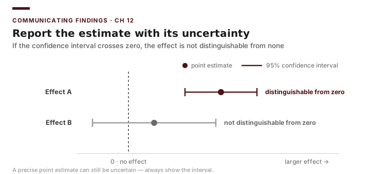
Every estimate carries uncertainty, and every design carries threats to validity. Reporting them is not a confession of weakness; it is the core of professional honesty. State confidence intervals or margins of error in words a layperson grasps: “Our best estimate is that job training raised annual earnings by about $1,794, and a range of plausible values surrounds that figure.” Distinguish statistical uncertainty (sampling noise) from design threats (selection bias, attrition, spillovers from earlier chapters) — a tight confidence interval around a biased estimate is precise and wrong. The NSW case is the most vivid warning of all: a naive comparison of trainees to a survey sample put the effect at roughly −$8,498, a confidently wrong number whose error was selection, not sampling. The randomized estimate of +$1,794 is believable not because its interval is tight but because the design removed the bias.
The five cases also illustrate the different limitations you must name honestly:
- NSW (RCT): the strongest design, but report partial relevance to today’s labor market and that benefits beat costs for some subgroups (e.g., long-term welfare recipients) more than others.
- MTO (RCT with partial take-up): report the gap between intention-to-treat and treatment-on-the-treated — many offered families never moved — and note that the large earnings gains (about 31%) accrued to children who moved young, not to all participants.
- Texas economic-development sales tax (city): a quasi-experimental design; name the comparison-city assumption and the risk that adopting cities differ from non-adopters in unobserved ways.
- Texas countywide vote centers (county): name spillovers and the difficulty of separating the policy’s effect from concurrent changes in turnout or administration.
- Perry Preschool (small-N RCT): the randomization is sound, but report the wide uncertainty that comes with only 123 children, and that a small, intensive 1960s program may not generalize — the case for scaling rests on replication, not on this one study alone.
Briefing: A confidence interval describes sampling noise only; it says nothing about whether your design has eliminated selection bias. Report both kinds of uncertainty, and never let a small p-value substitute for a credible design — NSW’s −$8,498 artifact is the cautionary tale.
Resist three temptations: overstating a marginal result to please a sponsor, hiding a limitation that a critic might exploit, and implying causation that the design cannot support. If the sales-tax or vote-center comparison group is imperfect, say so, and say what it means for the conclusion. A report that names its own weaknesses is far harder to attack than one that pretends to have none.
Data Visualization for Non-Technical Audiences
A figure should make one point, instantly. For a council audience, prefer a clean bar chart of group means over a scatterplot of residuals; show the effect, not the machinery. A few durable principles:
- One message per chart. If you cannot state the chart’s point in a sentence, it is doing too much.
- Label directly. Put numbers on bars and labels on lines; make the reader’s eye do no work.
- Show uncertainty when you can. Error bars on a bar chart visually communicate “we are not certain of the exact height,” reinforcing honest reporting.
- Avoid distortion. A bar chart’s vertical axis should start at zero; truncating it exaggerates differences and is a classic way to mislead.
- Strip the clutter. Drop 3-D effects, heavy gridlines, and decorative color. Ink that does not carry information distracts from the point.
Briefing: The most ethical chart and the clearest chart are usually the same chart — honesty and clarity rarely conflict.
Worked Example: An Honest Board Figure in Excel
You want one chart comparing 1978 earnings for the NSW treatment and control arms, with the uncertainty visible. Your data are the real experimental means: the treatment arm averaged $6,349 and the control arm $4,555, a gap of about $1,794. Suppose your standard-error calculation yields a margin of error of about $1,000 on the treatment-arm estimate.
Step 1 — Lay out the data. Two rows (Treatment, Control) with the mean earnings in column B and the margin of error in column C.
Step 2 — Build the chart. Select the means and Insert ▸ Column Chart (Clustered). Right-click the axis, set the minimum to 0, and delete the chart’s gridlines and title clutter.
Step 3 — Add error bars. With the series selected, Chart Design ▸ Add Chart Element ▸ Error Bars ▸ More Options, choose Custom, and point both the plus and minus values to the margin-of-error column (C). Now the treatment bar visibly carries its uncertainty.
Step 4 — Label directly. Add data labels so each bar shows its dollar value, and replace the legend with a one-line, plain-language title: “Job-training participants earned more, on average, the year after the program.”
| Group | 1978 earnings | Margin of error |
|---|---|---|
| Treatment | $6,349 | \(\pm \$1{,}000\) |
| Control | $4,555 | — |
The chart makes the roughly $1,794 gap obvious while the error bar quietly reminds the board that the exact size is uncertain — clarity and honesty in a single image.
Returning to the Case: You open your board presentation with this one chart and a one-sentence headline, then give the magnitude with its range in plain words. When the chair presses you to call the program “a proven success,” you hold the line professionally: the earnings effect is real and experimentally identified (this was a true randomized trial), but whether the program pays for itself depends on its cost and the discount rate, and the published evidence is stronger for some subgroups (long-term welfare recipients) than others. The honest recommendation is to continue while gathering better cost data and watching subgroup results — not to declare blanket victory. That measured framing is exactly what makes your report credible to the skeptical board member, and it is what professional standards require.
Evaluation Ethics and Professional Standards
The evaluation field has codified its obligations. The Joint Committee on Standards for Educational Evaluation organizes them into categories that translate cleanly to public administration:
- Utility. The evaluation should serve the information needs of its users — the right questions, answered usefully and on time.
- Feasibility. Methods should be practical and proportionate to the resources and stakes.
- Propriety. The evaluation should be legal, ethical, and respectful of the rights and welfare of those involved — protecting confidentiality, avoiding harm, and disclosing conflicts of interest.
- Accuracy. Findings should be technically sound and conclusions justified by the evidence.
Briefing: When a sponsor’s wish and the evidence conflict, accuracy and propriety outrank utility — an evaluator’s first loyalty is to the truth of the findings, not to the client’s preferred story.
Protecting stakeholders is a concrete duty, not an abstraction: de-identify individual records, never report cells so small that a person could be re-identified, and disclose who funded the work and any stake you hold in the result. In MTO, where outcomes were drawn from confidential federal tax records, this duty was paramount — individual families’ earnings were analyzed only in protected environments and reported only as group averages. The same rule governs your NSW memo: a participant’s name and exact earnings never appear in a public report; only arm-level means like $6,349 and $4,555 do.
The Responsible Use of AI Tools in Evaluation
AI tools can now draft a methods section, suggest an Excel formula, or summarize a literature in seconds. Used well, they speed the drafting of an evaluation. Used carelessly, they manufacture confident falsehoods — invented statistics, fabricated citations, plausible-but-wrong reasoning — that an unwary analyst will sign their name to.
The professional standard is simple and strict: AI assists drafting; it never substitutes for judgment. Concretely:
- Verify every number. If an AI tool reports a figure, recompute it yourself or trace it to the primary source. An AI might confidently state that MTO raised young movers’ earnings by “31%” or that NSW’s effect was “$1,794” — both happen to be right, traceable to Chetty, Hendren, and Katz (2016) and to LaLonde (1986) respectively — but it might just as easily report a plausible-sounding wrong figure. You cannot tell which without checking, so check every one.
- Verify every citation. AI tools fabricate references that look real — correct-sounding author, journal, and year for a paper that does not exist. Confirm each source exists and actually says what you claim before it enters a report. The studies behind these cases (LaLonde 1986; Dehejia and Wahba 1999; Kling, Liebman, and Katz 2007; Chetty, Hendren, and Katz 2016) are real and locatable; a citation you cannot locate is a citation you cannot use.
- Verify every claim. Treat AI-generated reasoning as a draft from an unvetted intern — useful, occasionally wrong, always to be checked against the data and the design. An AI that “explains” the −$8,498 naive NSW estimate as the program’s true effect would be making exactly the selection-bias error this course exists to prevent.
- Own the output. Your name on the report means you vouch for it. Responsibility is not delegable to a tool.
- Protect confidential data. Do not paste identifiable stakeholder records — MTO-style tax data, named NSW participants — into external AI systems.
Briefing: AI changes how fast you can draft, not what you are accountable for. Every number, citation, and claim that reaches a decision-maker must be one you have personally verified.
Common Pitfalls
- Burying the headline. Forcing a board member to read to page four for the main finding wastes your one chance to be heard.
- Overstating to please a sponsor. Letting the board chair’s preferred conclusion outrun the evidence destroys your credibility the first time a critic checks your work.
- Hiding limitations. A weakness you disclose builds trust; one a critic discovers destroys it — report MTO’s partial take-up and NSW’s subgroup variation rather than averaging them away.
- Misleading charts. Truncated axes and 3-D effects exaggerate differences and erode the honesty the whole report depends on.
- Trusting AI output unchecked. A fabricated statistic or citation under your name is your error, not the tool’s — even when the right answer (NSW +$1,794) was a verification away.
- Confusing precision with validity. A tight confidence interval around a biased estimate is confidently wrong; NSW’s −$8,498 naive figure is the archetype.
Practice and Application
- Executive summary. Write a one-page executive summary of the NSW job-training evaluation for the workforce board: question, headline finding (+$1,794 earnings effect) with its uncertainty, and a recommendation, in plain language with no equations.
- Honest chart. Using the worked-example NSW data ($6,349 vs. $4,555 with a $1,000 margin of error), build the clustered bar chart in Excel with a zero-based axis, custom error bars, and direct data labels. Then build a deliberately misleading version (truncated axis, no error bars) and write two sentences explaining how each choice changes the reader’s impression.
- Limitations section. Pick one of the five course cases (NSW, MTO, the Texas economic-development sales tax, Texas countywide vote centers, or Perry Preschool) and draft a limitations paragraph that names two specific threats to validity and states honestly what each means for the conclusion. (For Perry, the small sample and the generalizability of a 1960s program are the natural two.)
- Standards application. Take a realistic dilemma — a sponsor asks you to report only MTO’s overall average and drop the finding that the gains were concentrated among children who moved young — and explain which Joint Committee standards are in tension and how you would resolve it.
- AI verification log. Suppose an AI tool drafts a paragraph claiming “the MTO experiment raised participants’ earnings by 31%” and cites “Chetty, Hendren, and Katz (2016).” Write the checklist of verification steps you would perform — including what the 31% figure actually refers to (which children, measured when) — before either the number or the citation could appear in your report.
Conclusion: Becoming a Critical Producer and Consumer of Evidence
Over thirteen weeks you have built a complete evaluator’s toolkit. You learned to specify what a program is supposed to do and how to measure whether it does it. You learned the difference between a correlation and a cause, and the family of designs — from randomized controlled trials through difference-in-differences and matching to careful regression — that let you defend a causal claim or, just as importantly, admit when you cannot. The real programs you studied made those lessons concrete: the MTO housing-voucher lottery showed how random assignment turns a neighborhood “effect” into a credible cause and why partial take-up forces us to separate the offer from the move; the NSW job-training experiment showed, in a single sign-flipping contrast, that a randomized +$1,794 and a naive −$8,498 cannot both be right; Perry Preschool showed that a nonprofit randomizing just 123 children can still produce credible, policy-moving evidence — and the field’s most famous cost-benefit result; and the Texas economic-development sales tax and Texas countywide vote centers showed how quasi-experimental designs reach for the same counterfactual without the luxury of a lottery. You learned to ask not only whether a program works but whether it is worth its cost, discounting future dollars and confronting your own assumptions through sensitivity analysis. And in this final chapter you learned to carry all of that into a room full of decision-makers and deliver it clearly, honestly, and ethically.
Throughout, your tool was Microsoft Excel — AVERAGEIF and the Regression dialog, the NPV function and What-If Data Tables, clustered bar charts with honest error bars. The tool was deliberately humble, because the point was never the software. The point was judgment: knowing which question a method can answer, how much to trust a number, and when to say “the evidence does not support that claim.”
That judgment makes you two things at once. As a producer of evidence, you can design and report an evaluation that a city council can act on without being misled. As a consumer of evidence — which you will be far more often — you can read someone else’s evaluation, or an AI-generated summary of one, and ask the right questions: What was the comparison group? How large is the effect and how uncertain? What was left in the costs and out of the benefits? Whose interests funded this, and what does the report decline to mention?
Public administration runs on claims about what works. The graduate of this course is the person in the room who can tell a credible claim from a convincing one, produce evidence worthy of trust, and refuse to overstate what the data will bear. That discipline — equal parts technical skill and intellectual honesty — is the real subject of PA 5312, and it is yours to practice for the rest of your career.