Chapter 3: Evaluation Questions, Designs, and Causal Inference
Epigraphs
“No causation without manipulation.” — Paul W. Holland, Journal of the American Statistical Association (1986)
“The fundamental problem of causal inference is that we can observe at most one of the potential outcomes for each unit.” — paraphrasing the framework of Donald B. Rubin and Paul W. Holland
Opening Case: The $10,000 Mistake — NSW Under Two Comparisons
A job-training program either works or it does not, and the data should tell us which. The National Supported Work (NSW) Demonstration (Case C) is the most famous proof that the data alone do not tell us — that the answer depends entirely on the comparison group we choose.
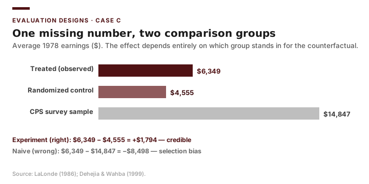
NSW was run as a randomized experiment. Treated men earned $6,349 in 1978 (n = 185); the randomized control group earned $4,555 (n = 260). The program’s effect is the difference: +$1,794. Because assignment was random, the control group is a credible stand-in for what the treated men would have earned without the program, and we can trust this number.
Now suppose a well-meaning analyst, lacking an experiment, does what evaluators do every day: she compares the treated men to a large group of demographically similar people drawn from a national survey — the Current Population Survey, n ≈ 16,000 — who did not enroll. That comparison group earned far more than $4,555 (about $14,847), because they were not, in fact, comparable: they had not been selected into a program designed for the long-term unemployed and disadvantaged. The naive estimate is $6,349 − $14,847 = −$8,498. The program appears to destroy more than $8,000 of earnings.
The same treated men, the same $6,349, two comparison groups, and the estimate swings from +$1,794 to −$8,498 — a gap of more than $10,000 and a flipped sign. This is the result Robert LaLonde (1986) used to indict nonexperimental evaluation, and that Dehejia and Wahba (1999) turned into the canonical teaching dataset. It is the entire subject of this chapter: a causal claim is only as good as its counterfactual, and choosing the wrong comparison group can make an effective program look harmful.
Guiding Questions
- What exactly do we mean when we say NSW “caused” a change in earnings?
- Why do the experimental control group and the CPS comparison group give such different answers?
- Which research designs reproduce the trustworthy +$1,794, and which produce the misleading −$8,498?
Why This Chapter Matters
The decision a manager faces is almost always causal: if we adopt (or keep, or cut) this program, what will happen? Yet the data that arrive on a manager’s desk are almost always correlational. The skill that separates a competent evaluator from a credulous one is the ability to specify the causal question precisely, to recognize the threats that make a naive comparison misleading, and to choose a design whose credibility matches the stakes of the decision. This chapter is the conceptual hinge of the course; every later method — t-tests, regression, difference-in-differences, RD, RCTs — is a tool for closing the gap between correlation and cause.
Briefing: Managers ask causal questions; raw data answer correlational ones. Evaluation design is the discipline of closing that gap honestly.
Turning Questions into Designs
A well-posed evaluation question names four things: the program (the treatment), the population (whose outcomes we care about), the outcome (the specific, measurable change), and the comparison (relative to what). The naive NSW analysis got the first three right — the program (subsidized work), the population (the 185 treated men), the outcome (1978 earnings, $6,349) — and botched the fourth. “Treated men earned $6,349” has no comparison; “treated men earned $1,794 more than they would have without the program” names a comparison — and immediately raises the question of how we could possibly know the second quantity. Design is the answer to that question.
The Counterfactual and Potential Outcomes
The modern way to make “caused” precise is the potential-outcomes framework. For each unit \(i\) (here, a worker in NSW) consider two potential outcomes:
\[Y_i(1) = \text{earnings if worker } i \text{ gets the program}, \qquad Y_i(0) = \text{earnings if not.}\]The causal effect of the program for worker \(i\) is the difference between these two potential worlds:
\[\tau_i = Y_i(1) - Y_i(0).\]Here is the difficulty, which Holland (1986) called the fundamental problem of causal inference: for any given worker we observe only one of these. A treated worker reveals \(Y_i(1)\); his \(Y_i(0)\) — what he would have earned without the program — is forever unobserved. That missing quantity is the counterfactual. We can never measure an individual effect \(\tau_i\) directly.
What we can hope to estimate is an average effect across a group, the average treatment effect:
\[\text{ATE} = E[\,Y_i(1) - Y_i(0)\,] = E[\,Y_i(1)\,] - E[\,Y_i(0)\,].\]Estimating the ATE requires a credible stand-in for the unobserved \(E[Y_i(0)]\) — a comparison group whose outcomes approximate what the treated group would have earned without treatment. In NSW, the experiment’s control group estimates \(E[Y_i(0)]\) as $4,555; the CPS comparison group estimates it as $14,847. Both are candidate stand-ins for the same missing quantity, and only the randomized one is credible. Every design in this chapter is, at bottom, a different strategy for constructing that stand-in.
Briefing: A program’s effect is the difference between two potential outcomes, one of which is never observed; the comparison group is our estimate of the missing counterfactual.
Selection Bias
Why not simply compare the treated workers to the CPS comparison group? Because the two groups differ for reasons unrelated to the program. Decompose the naive difference in observed outcomes between treated (\(D=1\)) and untreated (\(D=0\)) groups:
\[\underbrace{E[Y_i \mid D=1] - E[Y_i \mid D=0]}_{\text{naive comparison}} = \underbrace{E[Y_i(1) - Y_i(0) \mid D=1]}_{\text{effect on the treated}} + \underbrace{\big(E[Y_i(0) \mid D=1] - E[Y_i(0) \mid D=0]\big)}_{\text{selection bias}}.\]The second term is selection bias: the difference in the untreated potential outcome between the groups. NSW makes the term concrete. The disadvantaged men who entered the program would have earned far less, even without it, than a general-population CPS sample: \(E[Y_i(0)\mid D=1] \approx \$4{,}555\) (the experimental control), while the CPS comparison sits around $14,847, so \(E[Y_i(0)\mid D=0] \approx \$14{,}847\). The selection-bias term is therefore strongly negative — roughly \(\$4{,}555 - \$14{,}847 = -\$10{,}292\) — and it swamps the true $1,794 effect, dragging the naive estimate all the way to −$8,498. Selection bias is not a flaw in arithmetic; it is a flaw in whom we are comparing. The whole art of design is making the selection-bias term go to zero, or bounding it. Randomization, as in NSW and MTO (Case D), forces it to zero by construction.
One term above deserves a name: \(E[Y_i(1) - Y_i(0) \mid D=1]\) is the average effect on the treated (the ATT), which can differ from the average effect on everyone (the ATE) whenever the treated would respond differently from the untreated — as a self-selected, severely disadvantaged group like NSW’s trainees plausibly would. Randomization collapses the two at once: it drives the selection-bias term to zero and, by making the treated a random draw from the population, makes the ATT equal the ATE. Most quasi-experimental designs recover only the treated-group effect, which is why later chapters flag difference-in-differences and regression-discontinuity estimates as local — to the treated group, or to units right at the cutoff.
Briefing: A naive treated-minus-untreated comparison equals the true effect plus selection bias; credible designs are the ones that eliminate or bound that bias term.
Internal and External Validity
Two distinct questions govern a design’s credibility. Internal validity asks whether the study correctly identifies the causal effect for the units and setting studied — is the estimated effect really the program’s, free of selection bias and other confounds? The NSW experiment has high internal validity; the CPS comparison does not. External validity asks whether that effect generalizes — would NSW’s +$1,794 hold for a different population, in a different labor market, at a different program dosage? The two often trade off. NSW’s randomized estimate is internally airtight but applies to a specific 1970s population of the severely disadvantaged; the EDC sales-tax panel (Case A) covers all 1,180 Texas cities and speaks to the whole state but is riddled with selection bias, since cities choose whether to levy the tax. An evaluator must be explicit about which kind of validity the decision requires.
Briefing: Internal validity = “is the effect real here?”; external validity = “does it travel there?” Strengthening one frequently weakens the other.
Classic Threats to Internal Validity
Shadish, Cook, and Campbell (2002) catalog the recurring ways a before-after or non-equivalent-group comparison can fool you. Five are essential.
- History. An external event coinciding with the program affects the outcome. A macroeconomic boom during NSW, or a high-salience presidential race in the year a county adopts vote centers (Case B), can move earnings or turnout independently of the program.
- Maturation. Units change naturally over time regardless of the program — the disadvantaged workers in NSW would have had some earnings recovery on their own; fast-growing Texas cities keep adding taxable sales. A before-after rise can be pure maturation.
- Selection. Treated and untreated groups differ at baseline — exactly the NSW-vs-CPS problem, where the treated were far more disadvantaged than the comparison pool. This is the threat that produces selection bias, and it is why the naive NSW estimate is −$8,498.
- Regression to the mean. When units are chosen because they had an extreme value (e.g., a city offered help after an unusually bad sales year), their later values tend to drift back toward average even with no program at all, mimicking an effect.
- Attrition. Units drop out of the study non-randomly. If the least successful NSW participants stop responding to the earnings survey, the surviving treated sample looks artificially successful.
A sixth worth naming is testing/instrumentation — changes in how the outcome is measured over time, such as a revised sales-tax reporting rule or a change in how earnings are recorded, which can masquerade as a real change.
A Menu of Designs
Designs form a rough ladder of causal credibility. The right rung depends on the decision’s stakes and on what is feasible.
Experimental Designs
In a randomized controlled trial (RCT), units are assigned to treatment or control by chance. Randomization makes the two groups equivalent in expectation on everything — observed and unobserved — so \(E[Y_i(0)\mid D=1] = E[Y_i(0)\mid D=0]\) and the selection-bias term vanishes. NSW (Case C), MTO (Case D), and Perry Preschool (Case E) are all RCTs: NSW randomized individual workers into the subsidized-work program, MTO used a lottery to allocate housing vouchers, and the Perry study randomly assigned 123 children to preschool or no preschool. This is why their estimates — the +$1,794, the $3,477 young-mover earnings gain, and Perry’s 20-point graduation gap — are the benchmark for internal validity (Gertler et al., 2016, build their entire impact-evaluation toolkit around this point). The limits are practical and ethical: you cannot randomize whether a Texas city levies an economic-development sales tax (Case A) or whether a county opens vote centers (Case B). MTO also shows the practical wrinkle of partial take-up — randomizing the offer is not the same as randomizing the treatment received, which forces the intention-to-treat versus treatment-on-the-treated distinction. Perry adds the small-sample lesson: randomizing only 123 children still zeroes out selection bias, so the design is internally sound — but with so few units the estimate carries wide uncertainty, and its external validity leans on replication in later studies rather than on a large sample.
Quasi-Experimental Designs
When randomization is impossible — as for Cases A and B — quasi-experiments construct a comparison group by other means and lean on assumptions to defend it. Difference-in-differences compares the before-after change in adopters to the before-after change in non-adopters, differencing out fixed differences and common trends — the natural design for a city that adopts the EDC sales tax (Case A) or a county that switches to vote centers (Case B) in a known year (Chapter 8). Regression discontinuity exploits a sharp eligibility cutoff (Chapter 9). Matching and regression with controls (Chapter 7) adjust for observed differences between groups; remarkably, Dehejia and Wahba (1999) showed that careful matching on pre-program characteristics could recover the experimental +$1,794 from the same nonexperimental NSW–CPS data that naively gave −$8,498. These designs are credible to the extent their identifying assumptions hold — and an honest evaluator states those assumptions.
Observational and Descriptive Designs
A plain observational comparison of treated and untreated units, or a before-after (pre-post) comparison with no comparison group, controls for nothing and is exposed to every threat above; it is the naive NSW–CPS comparison that produced −$8,498. Descriptive designs make no causal claim at all — they characterize a population or trend (how Texas city EDC sales-tax allocations are distributed: 2024 mean $395, median $276, SD $596, right-skewed; or how 2020 county turnout differed between metro and non-metro counties, 0.554 vs. 0.580). Descriptive work is honest and useful precisely because it does not overreach.
Briefing: Credibility climbs from descriptive to observational to quasi-experimental to experimental, as the comparison group’s defense against selection bias gets stronger.
Worked Example: The NSW Sign-Flip and the Selection-Bias Decomposition in Excel
We can reproduce LaLonde’s famous result in a few cells and watch the selection-bias term do its damage. The inputs are the published NSW means: the treated 1978 earnings, the experimental control mean, and the CPS comparison mean.
In Excel, lay out the three group means and build up both estimates plus the decomposition:
- Treated mean in B2 (
6349), experimental control in B3 (4555), CPS comparison in B4 (14847). - Experimental effect in B6:
=B2-B3— the trustworthy estimate, because randomization makes the control a valid \(E[Y_i(0)]\). - Naive observational estimate in B7:
=B2-B4. - Selection bias in B8:
=B3-B4— the difference in the untreated potential outcome between the two candidate comparison groups. - Verify the identity in B9:
=B7-(B6+B8), which should return exactly0. (Naive = true effect + selection bias.) - Format B2:B9 as currency via Home → Number → Accounting Format.
| Quantity | Value |
|---|---|
| Treated mean (n=185) | $6,349 |
| Experimental control mean (n=260) | $4,555 |
| CPS comparison mean (n≈16,000) | $14,847 |
| Experimental effect (treated − control) | +$1,794 |
| Naive estimate (treated − CPS) | −$8,498 |
| Selection bias (control − CPS) | −$10,292 |
The arithmetic of the decomposition is exact: the naive −$8,498 is the true +$1,794 effect plus a selection-bias term of −$10,292. The bias term is not noise; it is the predictable consequence of comparing a deeply disadvantaged treated group to a general-population survey. Randomization is what set that term to zero in the experiment. Dehejia and Wahba (1999) then showed that with careful matching on observed pre-program characteristics, the nonexperimental data could be coaxed back toward the experimental +$1,794 — a preview of Chapter 7.
Returning to the Case: The $10,000 mistake was never about the treated workers’ $6,349; it was about the counterfactual. Naming the estimand — the precise quantity you are trying to estimate, here \(E[Y_i(0)]\) for the treated (what the trainees would have earned without the program) — recognizing that the CPS comparison estimates it at $14,847 while the randomized control estimates it at $4,555, and choosing the credible comparison turns a number that condemns the program into one that vindicates it. That choice — not the outcome data — is the evaluator’s central act.
The Credibility Revolution and Research Transparency
The NSW story — where the same data yield either a helpful or a harmful program depending on choices the analyst makes — is exactly why the empirical social sciences spent the last two decades raising their standards for what counts as credible evidence. Angrist and Pischke (2010) called this the credibility revolution: a shift away from elaborate modeling toward research designs whose assumptions are transparent and defensible, of the kind this chapter has laid out. For a practicing evaluator, the lesson is not just to pick a good design but to work in a way that lets others check it.
Three professional norms now travel with credible evidence. First, pre-registration and pre-analysis plans: before seeing the outcome data, serious analysts write down the questions they will ask, the comparisons they will make, and the outcomes they will report. This guards against the very human temptation to keep trying comparison groups until one gives a pleasing answer — the NSW result is a permanent reminder of how much the choice of comparison can move an estimate. Second, replication and open data and code: the raw data and the exact steps from data to result are shared so that a skeptical reader can reproduce the number. The NSW–CPS data became a canonical teaching set precisely because LaLonde, then Dehejia and Wahba, made it available for others to re-analyze. Third, honest reporting of magnitude and uncertainty: report the effect size and its confidence interval — a range like “+$1,794, plausibly between roughly $550 and $3,000” — rather than fixating on whether an estimate earns a statistical-significance “star.” The American Statistical Association’s formal statement on p-values (Wasserstein and Lazar, 2016) warns bluntly that statistical significance is not the same as practical importance and should never be the sole basis for a decision. A tiny, policy-irrelevant effect can be “significant” in a large sample, and a decision-relevant effect can miss the threshold in a small one.
These are expectations for producing credible work and for consuming it. When you read an evaluation, ask: was the analysis planned in advance or fished from the data? Can the result be reproduced? Does the author report how big the effect is and how uncertain, or hide behind a single asterisk? An evaluator who cannot answer these questions about her own work — or a study she is asked to trust — has not finished the job.
Briefing: Credible evidence now comes with professional habits: plan the analysis before seeing outcomes, share data and code so others can reproduce it, and report effect sizes with confidence intervals instead of chasing significance stars.
Common Pitfalls
- Reporting a correlation as a cause. “Treated workers earned $6,349” is not “the program raised earnings”; the comparison group decides the answer.
- Comparing groups that selected themselves. The NSW treated were far more disadvantaged than a CPS sample — exactly the selection that produced −$8,498.
- Ignoring a coinciding shock. A macroeconomic swing or a high-turnout election year can drive the outcome instead of the program (history).
- Mistaking regression to the mean for an effect. Programs that target the worst performers will look effective even if they do nothing.
- Overclaiming external validity. NSW’s effect for the severely disadvantaged in the 1970s need not hold for a different population or labor market.
Practice and Application
- Define the effect. For NSW (Case C), write the potential outcomes \(Y_i(1)\) and \(Y_i(0)\) in words for a single worker, and explain in one sentence why \(\tau_i\) can never be observed directly.
- Decompose the bias (Excel). Recreate the worked-example block from the three NSW means. Confirm the identity in B9 returns 0, then write two sentences explaining why the selection-bias term is so large and negative for the NSW–CPS comparison.
- Name the threats. List the five classic internal-validity threats and give a concrete example of each drawn from NSW (Case C), vote centers (Case B), or the EDC sales tax (Case A).
- County panel selection bias (Excel). Using the Texas County Panel (Case B), compare mean 2020 turnout in metro versus non-metro counties with an
AVERAGEIFformula (you should find roughly 0.554 vs. 0.580). Explain why this difference is not the causal effect of being metro on turnout, identifying at least one confounder. - Match design to decision. For three real decisions — expand NSW-style job training (C), adopt the EDC sales tax in a Texas city (A), and roll out countywide vote centers (B) — name the most credible feasible design and justify the internal/external validity trade-off it makes. Note which of these could in principle be randomized and which cannot.
Transition to Chapter 4
We now know what we want to estimate (a treatment effect against a counterfactual) and which designs can credibly deliver it. But a design is only as good as the numbers fed into it: even NSW’s clean experiment rests on accurately measured 1978 earnings, and a difference-in-differences on mismeasured sales data (Case A) or a turnout comparison built on an inconsistent voter file (Case B) will mislead no matter how clean the design. Chapter 4 turns to measurement and administrative data — how to define indicators, judge their reliability and validity, and wrangle the messy real-world records that public agencies actually keep — so that the elegant logic of this chapter rests on data worth analyzing.