Chapter 4: Measurement and Data Collection
Epigraphs
“Not everything that can be counted counts, and not everything that counts can be counted.” — William Bruce Cameron, Informal Sociology (1963)
“The measure of a thing is never the thing itself.” — paraphrase commonly used in measurement theory; treat it as a maxim, not a citation
Opening Case: Measuring “Workforce Success” in the National Supported Work Demonstration
In the mid-1970s, the National Supported Work (NSW) Demonstration randomly assigned hard-to-employ applicants — long-term welfare recipients, ex-offenders, former drug users, school dropouts — to a subsidized work-experience program or to a control group that received nothing. Because assignment was random, the evaluation had the cleanest possible design. But a clean design still has to decide what to count. What, precisely, is “workforce success,” and where do the numbers come from?
The NSW evaluators settled on earnings as the headline outcome, measured in 1978 (after the program), with employment status as a secondary indicator. Those choices look obvious until you ask how earnings are actually recorded. Self-reported earnings on a follow-up survey are subject to recall error and attrition; earnings drawn from administrative Unemployment Insurance (UI) wage records are more consistent but miss off-the-books work, cash jobs, and out-of-state employment that never reaches a state’s UI file. The same person can have two different “earnings” depending on which source you trust.
The payoff of getting measurement right is enormous here, because NSW became the most famous test case in evaluation. Comparing the randomized treatment and control groups, treated workers earned $6,349 in 1978 versus $4,555 for controls — an experimental effect of +$1,794 (LaLonde 1986; Dehejia & Wahba 1999). Yet when LaLonde discarded the randomized controls and instead compared the trainees to a non-experimental comparison group drawn from national survey data, the same program appeared to lower earnings by roughly $8,498. Same outcome concept, same trainees, opposite conclusion — because the comparison and the measurement changed. Before any evaluation can say whether a program works, it has to settle a more basic question: what, precisely, are we measuring, and how much can we trust the numbers we have?
Guiding Questions
- How do we move from an abstract concept (“workforce success”) to a specific, defensible indicator we can put in a spreadsheet column?
- What makes a measure valid and reliable, and how would we know if ours is neither?
- When evaluation rides on administrative data we did not collect — like UI wage records — what can go wrong, and how do we check for it before we trust it?
Why This Chapter Matters
Every method in the rest of this course — group comparisons, regression, difference-in-differences — assumes you have already done the unglamorous work of this chapter well. A flawless statistical analysis of a badly measured outcome produces a precise, confident, wrong answer. In public administration this is not a hypothetical risk: most evaluations run on data that some agency generated for compliance, billing, or case management, then handed to you for a purpose it was never designed to serve. Learning to interrogate a measure before you analyze it is the difference between an evaluator and a calculator.
This book returns throughout to five real evaluation settings, and each one forces a measurement choice:
- Case A — Texas economic-development sales tax. Cities adopt a Type A or Type B local sales tax to fund economic development. The administrative outcomes come from the Comptroller’s records: per-capita sales-tax allocation, taxable sales, and the count of business outlets in a city.
- Case B — Texas countywide vote centers. Counties adopt vote centers (vote-anywhere polling places) in place of precinct voting. The outcome is turnout, operationalized as votes cast divided by voting-age population, from county canvass records.
- Case C — National Supported Work (NSW). The job-training RCT of the opening case. Outcomes are 1978 earnings and employment, drawn from surveys and UI wage records (LaLonde 1986; Dehejia & Wahba 1999).
- Case D — Moving to Opportunity (MTO). HUD randomly assigned families in five cities to housing vouchers that required a move to a low-poverty neighborhood. Outcomes include neighborhood poverty rate (the proximate, administratively measured outcome) and children’s later adult earnings from tax records (Chetty, Hendren & Katz 2016).
- Case E — Perry Preschool. A nonprofit randomly assigned 123 children to preschool or not. Its outcomes are mostly binary — did the person graduate high school, earn above a threshold, get arrested — a reminder that not every measure is a dollar amount, and that a yes/no indicator (a proportion) is its own measurement decision with its own descriptive statistics (Chapter 5).
From Concepts to Indicators: Operationalization
Evaluation questions arrive as concepts — success, need, efficiency, fiscal stress. None of these can be entered into a cell. Operationalization is the process of specifying the concrete, observable indicator that will stand in for the concept in your analysis. It is a series of choices, and each choice should be defended in writing.
Consider “voter engagement” in the Texas county vote-center evaluation (Case B). We cannot measure engagement directly, so we operationalize it as turnout, defined as ballots cast divided by some population base. But which base? Voting-age population, registered voters, or citizen voting-age population each yields a different denominator and a different number. The Case B panel uses votes divided by voting-age population — across all 254 counties in 2020 that yields a mean turnout of about 0.57 — but a program that appears to boost turnout under one denominator can appear to do nothing under another. The concept did not change; the operational definition did.
Briefing: Operationalization is not a technicality you settle once. The choice of denominator, time window, and inclusion rule can move your headline number more than the program ever did.
A useful discipline is to write, for every outcome in your evaluation, a one-sentence operational definition that another analyst could follow to reproduce your column exactly. “Workforce success” in the NSW opening case fails this test until it is pinned down; “total individual earnings in calendar year 1978, in nominal dollars, from the follow-up records” passes it — and is exactly the definition behind the $6,349-versus-$4,555 contrast.
Validity and Reliability of Measures
Two properties separate a usable indicator from a misleading one.
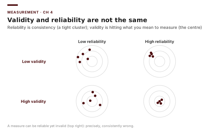
Construct validity asks whether the indicator actually captures the concept it claims to. In NSW (Case C), 1978 earnings have strong construct validity for “workforce success” because earnings are exactly what a job program is meant to raise; a measure like “hours of class attended” would have weaker validity, since attendance is not the goal. In MTO (Case D), the neighborhood poverty rate a family lands in has good validity for “did the voucher change their environment,” but it is only a proxy for the deeper concept — whether the move improved children’s life chances — which is why Chetty, Hendren and Katz (2016) ultimately measured children’s adult earnings. Reliability asks whether the indicator is consistent — whether the same case measured twice, or from two sources, yields the same value. NSW earnings have a reliability question precisely here: survey self-reports and UI wage records can disagree for the same worker.
The two are distinct. A bathroom scale that always reads three pounds high is perfectly reliable and invalid. A measure can be reliable without being valid, but it cannot be valid without being reliable — noise in the indicator caps how well it can track the concept (Shadish, Cook & Campbell 2002).
Briefing: Reliability is necessary but not sufficient for validity. Always check both. A consistent measure of the wrong thing is still the wrong thing.
A practical way to think about reliability is the idea that any observed score decomposes into a true value plus error:
\[X_{\text{observed}} = T_{\text{true}} + E_{\text{error}}\]Reliability is the share of the variation in observed scores that reflects real differences rather than error:
\[\rho_{XX} = \frac{\sigma^2_T}{\sigma^2_T + \sigma^2_E}\]When \(\sigma^2_E\) is large — inconsistent reporting, sloppy data entry, definitional drift — reliability falls toward zero and the indicator becomes mostly noise.
Levels of Measurement
The arithmetic you are allowed to do depends on the variable’s level of measurement. Confusing these levels is one of the most common errors in student evaluations.
| Level | Meaning | Texas panel example | Legitimate operations |
|---|---|---|---|
| Nominal | Categories, no order | Metro status; county name | Counts, modes, proportions |
| Ordinal | Ordered categories, unequal gaps | Bond rating; survey “satisfaction” 1–5 | Median, percentiles |
| Interval | Equal gaps, no true zero | Year (2000, 2004, …) | Differences, means |
| Ratio | Equal gaps, true zero | Sales-tax revenue; population; turnout % | All arithmetic, ratios |
Briefing: You can compute a mean of turnout (ratio) but not a meaningful mean of bond ratings (ordinal). Averaging “Aa1” and “Baa2” is a category error, even though Excel will happily return a number if you code them 1–10.
Most outcomes in our county and city panels are ratio-level, which is convenient — but several useful predictors (metro status, program category) are nominal, and you will need to handle them as groups or indicator variables rather than as quantities.
Choosing Outcome Measures for an Evaluation
A good outcome measure for an evaluation is valid, reliable, sensitive to the program, available over the relevant period, and consistently defined across the units you compare. The last two criteria are where administrative data most often fail.
Sensitivity matters because a program can only move an outcome that is close enough downstream to be affected within your study window. NSW (Case C) measured earnings in 1978, a year chosen to be late enough for the work experience to show up in the labor market; measured too early, the program would look like a failure simply because its effects had not yet arrived. The same logic shapes MTO (Case D): the neighborhood poverty rate a family moved into changes immediately, but the effect on children’s adult earnings took two decades to observe and was visible mainly for children who moved young (Chetty, Hendren & Katz 2016). Picking an outcome the program cannot move within your window guarantees a null result that says nothing about the program.
Administrative Data: Strengths and Pitfalls
Administrative data — records generated by the routine operation of a program or agency — are the workhorse of public-sector evaluation. The Comptroller’s sales-tax allocations behind our city finance panel, the county vote canvasses behind the county panel, FEMA grant files, Medicaid claims: all are administrative. Their strengths are real. They cover entire populations rather than samples, they are inexpensive because the collection is already paid for, and they often span many years.
But they were collected to run the program, not to evaluate it, and that origin creates four recurring hazards.
Coverage. Who is in the data? NSW earnings drawn from a single state’s UI file miss workers who moved out of state or worked off the books, so the file undercounts exactly the harder-to-track workers an evaluation cares about. In Case A, the sales-tax allocation file covers the roughly 1,141 Texas cities that levy a local sales tax and report to the Comptroller, which is not the same as “all Texas municipalities.” Units missing from the file are invisible to your analysis and can bias it badly if their absence is related to the outcome.
Definitional changes. Administrative definitions change with statute, software, and staff. A poverty threshold is revised; a “case closure” reason gets a new code; the Census revises an industry or geographic classification. A jump in a time series may be a policy effect — or a redefinition. Always check whether a break in the data lines up with a known administrative change before you interpret it as a program effect.
Briefing: Before treating any change over time as a finding, ask whether the measurement changed. Many “effects” in administrative time series are artifacts of redefinition.
Missingness. Records are blank for reasons that are rarely random. In a UI-based earnings file like NSW’s, earnings are “missing” (recorded as zero) not only for the truly unemployed but also for anyone who left the state or took unreported work — so dropping or zeroing those rows would systematically misstate the program’s effect. Missingness that depends on the outcome is the dangerous kind.
Error. Free-text fields, fat-fingered entries, duplicate records, and impossible values (a city with negative sales-tax revenue, a turnout rate above 100 percent) are endemic. These are not rare edge cases; in a panel of roughly 1,141 Texas cities tracked over many years you should expect them and screen for them.
Collecting Primary Data
Administrative records answer many evaluation questions, but not all of them. When the concept you must measure was never recorded by any agency — participant satisfaction, why eligible people did not enroll, how staff actually delivered a service, what employers thought of a training program’s graduates — you have to go out and generate the data yourself. Data you collect firsthand, for your own evaluation, are primary data; records generated by someone else for some other purpose (the Comptroller’s allocations, county canvasses, UI wage files) are secondary data. The three workhorse methods of primary collection in public-sector evaluation are surveys, structured interviews, and focus groups. Each answers a different kind of question, and each is easy to do badly.
When Primary Collection Is Worth It
Primary collection is expensive: it costs staff time, respondent time, and often money, and it introduces errors of its own. Before designing an instrument, weigh it honestly against the secondary data you already have.
Reach for primary collection when (1) no administrative record captures your concept — NSW’s UI wage files (Case C) record earnings but not whether a trainee found the work-experience placement useful or why some dropped out; (2) the administrative measure has known validity or coverage gaps you cannot repair — UI files miss off-the-books and out-of-state work, so a follow-up survey of participants can recover earnings the file never saw; or (3) you need to understand a process rather than count an outcome — how vote centers (Case B) were actually publicized, or whether the EDC (Case A) is genuinely recruiting firms rather than simply disbursing incentives.
Stay with secondary data when an administrative source already measures the concept validly, covers the full population, and spans the period you need. It is almost always cheaper, larger, and free of the response and nonresponse errors that plague new collection. The disciplined default is: exhaust the administrative data first, then collect primary data to fill the specific gaps that remain.
Briefing: Primary data collection is a targeted supplement, not a reflex. Collect it to fill a concept, coverage, or process gap that administrative data provably cannot — and never to re-measure something an existing record already captures well.
Designing Surveys
A survey trades depth for breadth: it puts the same standardized questions to many respondents so the answers can be counted and compared. Its usefulness rests on four design choices.
Question wording. Each item should ask exactly one thing in plain language. Avoid double-barreled items (“Were the vote centers convenient and well-staffed?” — a respondent who found them convenient but understaffed cannot answer), leading items that telegraph the desired answer, and jargon a respondent may not share. Ambiguous wording is a validity problem: the concept you think you measured is not the one the respondent answered.
Response format. Closed-ended items (yes/no, a rating scale, a fixed menu) are fast to complete and easy to tabulate; open-ended items yield richer answers but must be coded before analysis. A common tool is the ordered rating scale — e.g., a five-point satisfaction scale from “very dissatisfied” to “very satisfied.” Recall from the levels-of-measurement table that such a scale is ordinal: report its median or the percent in each category, not a raw mean of the underlying codes.
Sampling. A survey describes the population it is drawn from only if the sample represents that population. A probability sample — where every member of the frame has a known, nonzero chance of selection — supports generalization; a convenience sample (whoever happens to reply) does not. Define the sampling frame explicitly, because anyone outside it is invisible to the survey exactly as they would be missing from an administrative file.
Mode and nonresponse. Mail, phone, in-person, and web modes differ in cost, speed, and who responds. Whatever the mode, the threat that governs a survey’s credibility is nonresponse: if the people who answer differ systematically from those who do not, the results are biased no matter how large the sample. A 12-percent response rate to a participant satisfaction survey tells you about the 12 percent who cared enough to answer, not the program. Report the response rate, and where possible compare respondents to the full frame on any characteristic you can observe.
Briefing: A survey is only as good as its worst design choice. One double-barreled item, one convenience sample, or one low response rate can invalidate an otherwise polished instrument.
Structured Interviews
When you need depth rather than breadth — the reasoning behind a decision, the sequence of a process, an account of what actually happened on the ground — a structured interview is the better tool. “Structured” means every respondent is asked the same core questions in the same order, so answers can be compared across interviews, while follow-up probes let the interviewer pursue the unexpected. In an implementation study of NSW (Case C), interviewing site supervisors with a common protocol would reveal how placements were actually made and where delivery departed from the design — information no wage record contains. Interviews are labor-intensive and reach few people, so they complement a survey (which establishes how common something is) by explaining why and how it occurs.
Focus Groups
A focus group convenes a small number of participants — typically six to ten — for a moderated discussion. Its distinctive value is the interaction: participants react to one another, surfacing shared understandings, disagreements, and language the evaluator would not have thought to ask about. Focus groups are well suited to formative work — refining a survey instrument before fielding it, or exploring why take-up of a program is low — but they are ill suited to producing population estimates. A handful of self-selected participants is not a representative sample, and a vocal member can steer the room; treat what emerges as hypotheses to test, not as prevalence. For Case D (MTO), a focus group of families who received but did not use a voucher could illuminate the barriers behind partial take-up that the administrative record only registers as a blank.
Briefing: Match the method to the question. Surveys count and generalize; interviews explain in depth; focus groups surface shared meaning and generate hypotheses. None substitutes for another, and none by itself both generalizes and explains.
Data Quality and Cleaning
Cleaning is not a chore that precedes the “real” analysis; it is part of the analysis, and it should be documented so a skeptic can retrace it. A disciplined first pass screens every variable for range, missingness, duplicates, and definitional consistency before a single statistic is computed.
Worked Example: Screening the Texas Sales-Tax Allocation File in Excel
Suppose you have the Case A file open, with one row per city for 2024 and columns including city, population, and alloc_per_capita (the city’s 2024 economic-development sales-tax allocation per resident). Across the roughly 1,141 reporting cities this variable has a mean of about $395 and a median of about $276 — figures we will describe properly in Chapter 5. First, screen alloc_per_capita for quality.
1. Range and impossible values. Find the extremes with =MIN(D2:D1142) and =MAX(D2:D1142). A negative minimum is impossible for an allocation and flags an error. Count suspicious zeros with =COUNTIF(D2:D1142,0) — a true zero (a city with no economic-development tax) is plausible, but a zero for a city that reported a positive allocation last year is likely miscoded missing data.
2. Missingness. Count blanks with =COUNTBLANK(D2:D1142), then compute the missing rate as that count divided by =COUNTA(A2:A1142). A city present in the population column but blank on allocation has not been screened out by the Comptroller’s coverage rule — investigate before dropping it.
3. Duplicates. Build a key on city with =COUNTIF($A$2:$A$1142,A2). Any value above 1 means a city appears twice — often an annexation or a name-spelling variant — a duplicate to investigate, not silently sum.
4. A cleaning log. Record every decision in a separate sheet so the cleaning is reproducible.
| Check | Excel function | Finding | Action |
|---|---|---|---|
| Minimum value | MIN |
$0 (several small cities) | Verify which are true no-tax cities |
| Maximum value | MAX |
Far above the $395 mean | Confirm as a real outlier, not a typo |
| Missing rate | COUNTBLANK/COUNTA |
A handful of blank allocations | Trace to source before dropping |
| Duplicate keys | COUNTIF on city |
A few duplicate city names | Investigate annexations / spellings |
5. Text keys and the join problem. The failure that quietly ruins more evaluations than any outlier is a key that does not match across files. Almost every case in this book is built by joining tables — the sales-tax file to a population file by city, county turnout to county covariates by FIPS code, NSW outcomes to a comparison sample by person ID. A join succeeds only when the key is byte-for-byte identical on both sides, and administrative text keys rarely are: "Austin", "City of Austin", "austin", and "Austin " (a trailing space) are four different strings to a computer, and a VLOOKUP or XLOOKUP on them returns #N/A — dropping that city from the merged file silently, with no error. Before joining, normalize the key on both sides with =TRIM(UPPER(A2)) (strips stray spaces, forces one case), then confirm the two cleaned key lists agree: =COUNTIF(File2!$A:$A, cleaned_key) returns 0 for any city present in one file but not the other. A batch of unexpected zeros is not missing data — it is a broken join, and the cities it drops are gone from every statistic downstream. Investigate the mismatches (spelling, punctuation, annexations, an ID stored as text in one file and a number in the other) before you merge, never after.
Returning to the Case: NSW shows why measurement comes before analysis. The randomized design is as clean as evaluation gets, yet the program’s apparent effect swung from +$1,794 (experimental) to −$8,498 (non-experimental comparison) depending on which comparison group and which earnings source were used (LaLonde 1986; Dehejia & Wahba 1999). No statistical sophistication rescues a study that has not pinned down its outcome definition, its data source, and its comparison. Your deliverable is never a single headline number stripped of its definition — it is a defensible operational definition, the outcome computed under that definition with missingness and source disclosed, and an honest statement of which comparison the number rests on.
Common Pitfalls
- Analyzing before defining. Computing statistics on a column you cannot define in one sentence. Write the operational definition first.
- Treating a reliable measure as valid. Consistency is not correctness; a measure can be precisely wrong.
- Doing arithmetic the measurement level forbids. Averaging ordinal codes (bond ratings, Likert items treated as raw categories) as if they were ratio quantities.
- Trusting administrative totals at face value. Headline rates often hide denominator manipulation, coverage gaps, and definitional drift.
- Dropping missing rows reflexively. Listwise deletion is fine only when data are missing at random — which administrative missingness usually is not.
- Interpreting a redefinition as a finding. A break in a time series may be a coding change, not a program effect.
Practice and Application
-
Operationalize a concept. For the Case B county panel, write three competing operational definitions of “voter engagement” (e.g., votes over voting-age population, over registered voters, over citizen voting-age population). Compute each in Excel for two counties in 2020 and explain in a paragraph how the choice of denominator could change an evaluation’s conclusion.
-
Validity and reliability. In NSW (Case C), 1978 earnings can be drawn from a follow-up survey or from administrative UI wage records. List two threats to the construct validity of “workforce success” measured as earnings, and one reason the two sources might disagree (a reliability threat), and propose one check for each.
-
Levels of measurement. Classify five variables from the Case A sales-tax file (e.g.,
alloc_per_capita,taxable_sales, business-outlet count, Type A/Type B status, city name) by level of measurement. For each, state one statistic that is legitimate and one that is not. -
Screen a variable. Using the Case A file, screen
taxable_salesfor range, missingness, and duplicates usingMIN,MAX,COUNTBLANK,COUNTA, andCOUNTIF. Produce a four-row cleaning log like the worked example. -
Spot the redefinition. In Case D (MTO), suppose the recorded “neighborhood poverty rate” shifts sharply for many families at once between two waves. Describe how you would determine whether this reflects real neighborhood change or a measurement change (e.g., the Census changing how poverty is tabulated), and what evidence would distinguish the two.
-
Primary vs. secondary. For one running case, name a concept the administrative data cannot measure, and choose among a survey, structured interviews, and a focus group to fill the gap. Justify the choice in a paragraph, then draft three survey items (or three interview questions) for it, checking each for double-barreled, leading, and jargon problems.
-
Fix a broken join. Suppose you must merge the Case A sales-tax file to a separate population file, both keyed on
city, but aVLOOKUPreturns#N/Afor two dozen cities. UsingTRIM,UPPER, andCOUNTIF, build a normalized key on each file and produce a short list of the cities that fail to match. For three of them, propose the most likely cause (trailing space, case, spelling variant, “City of” prefix, annexation) and the fix. Explain in two sentences why dropping the un-matched rows without investigating would bias the evaluation, not merely shrink the sample. -
Download and screen a real archived file. Perry Preschool’s participant records are restricted, so its companion small-N program — the Carolina Abecedarian Project — is our “real microdata you can get yourself.” Create a free ICPSR account, download Study 4091 (a delimited or Stata file that opens in Excel), and open it. Write a one-paragraph data-quality memo: how many rows and variables; which variables have high missingness (use
COUNTBLANK); whether any withheld or coded-missing values would trip up a naive average; and one measurement choice (e.g., which follow-up wave’s outcome to use) you would have to defend. This is the unglamorous first hour of nearly every real evaluation.
Transition to Chapter 5
You now have indicators you can defend and data — whether administrative or freshly collected — that you have screened. The next question is what those numbers actually look like. Before any comparison or model, a competent evaluator describes the data — its center, its spread, its outliers, and whether the groups being compared even started in the same place — and then tests whether the groups actually differ. Chapter 5 turns to describing and comparing data, taking the Case A sales-tax allocation as its worked example — a distribution whose $395 mean and $276 median already hint at a strong right skew — and building the tables, charts, and group comparisons in Excel that make an evaluation legible to the people who must act on it.