Chapter 7: Regression for Evaluation
Epigraphs
“All models are wrong, but some are useful.” — George E. P. Box
“Empirical work in economics is like detective work.” — Joshua Angrist and Jörn-Steffen Pischke, Mostly Harmless Econometrics (2009)
Opening Case: Explaining County Turnout in Texas (Case B)
As Texas counties weigh adopting countywide vote centers, your team is asked a deceptively simple question: what explains why some counties turn out to vote at higher rates than others? Before you can credibly estimate whether vote centers raise turnout, you need to understand the background factors that move turnout up or down on their own — income, education, and the like — so that you do not mistake a county’s prosperity for a policy’s effect. Using the Texas County Panel (Case B) filtered to the 2020 presidential election (254 counties), you set out to model turnout as a function of county characteristics.
A first-year analyst runs the numbers and reports back, a little deflated: median household income and the percentage of adults with a bachelor’s degree together explain only about 8 percent of the variation in county turnout (\(R^2 \approx 0.08\)). “The model barely fits,” she says. “Maybe demographics just don’t matter for turnout.” You read the result differently. A low \(R^2\) does not mean the coefficients are wrong, and — more important for what comes later — a high \(R^2\) would not have meant you had found a causal effect. Down the hall, a colleague modeling Case A’s economic-development sales tax has the opposite situation: regressing a city’s per-capita sales-tax allocation on its taxable sales yields an \(R^2\) of about 0.94 — a near-perfect fit — yet that tight fit reveals nothing about whether the tax caused anything. The two results, side by side, teach the lesson of this chapter: regression is a tool for adjustment and description, and its goodness of fit is a separate question from whether it has isolated a program’s effect.
To use regression as an evaluation tool, you need to do more than predict turnout. You need to compare counties (or cities, or workers) that received a program to those that did not, as if they were similar on measured background characteristics. Regression is the workhorse for exactly that — and this chapter is equally clear about where it stops.
Guiding Questions
- What does it mean to “control for” a variable, and how does covariate adjustment change an estimated program effect?
- How do we use a dummy variable for treatment inside a regression to estimate an adjusted effect?
- Why is regression adjustment not the same thing as a randomized experiment, and what is omitted-variable bias?
Why This Chapter Matters
Most program data you will ever encounter come from the world as it is, not from a controlled experiment. People select into programs; agencies target services to the neediest or the most promising; policies roll out where the politics allow. In all of these situations, the groups you are comparing differ in ways that have nothing to do with the program itself. Regression is the most common, most flexible, and most misunderstood tool for handling that problem. Used carefully, it lets you estimate a program effect that is adjusted for measured differences between groups. Used carelessly, it produces confident numbers that are simply wrong. The cautionary benchmark for this whole chapter is the National Supported Work (NSW) job-training experiment (Case C): its randomized estimate of the program’s effect on earnings was +$1,794, but a naive observational comparison to a survey sample yielded −$8,498 — the sign flipped (LaLonde 1986; Dehejia & Wahba 1999). Regression with controls, as we will see, narrows but does not close that gap. This chapter builds the tool from the ground up and is equally clear about where it stops.
From the Regression Line to Multiple Regression
The Simple Regression Line
Start with one outcome and one predictor. Suppose \(Y\) is a county’s voter turnout rate and \(X\) is its median household income. The simple linear regression model is
\[Y_i = \beta_0 + \beta_1 X_i + \varepsilon_i\]where \(i\) indexes counties, \(\beta_0\) is the intercept, \(\beta_1\) is the slope, and \(\varepsilon_i\) is the error term capturing everything about turnout that income does not explain. Ordinary least squares (OLS) chooses the line that minimizes the sum of squared vertical distances between each point and the line:
\[\min_{\beta_0,\beta_1} \sum_{i=1}^{n} \left( Y_i - \beta_0 - \beta_1 X_i \right)^2\]The slope \(\beta_1\) is the heart of the interpretation: a one-unit increase in \(X\) is associated with a \(\beta_1\)-unit change in \(Y\), on average. The intercept \(\beta_0\) is the predicted value of \(Y\) when \(X = 0\) — sometimes meaningful, often just a mathematical anchor.
Briefing: A regression slope is a comparison of conditional means. “For counties that differ by $10,000 in median income, predicted turnout differs by \(10{,}000 \times \beta_1\)” is the honest way to read it — an association, not yet a cause.
Goodness of Fit: R-squared
How much of the variation in \(Y\) does the line capture? The coefficient of determination is
\[R^2 = 1 - \frac{\sum_i (Y_i - \hat{Y}_i)^2}{\sum_i (Y_i - \bar{Y})^2}\]where \(\hat{Y}_i\) is the predicted value and \(\bar{Y}\) is the sample mean. \(R^2\) ranges from 0 to 1 and reports the share of the variance in the outcome explained by the model. A high \(R^2\) does not mean you have found a causal effect, and a low \(R^2\) does not mean your estimated effect is wrong. For evaluation, the slope on the treatment variable matters far more than the overall fit.
Multiple Regression and “Controlling For”
Now add more predictors. With \(k\) regressors,
\[Y_i = \beta_0 + \beta_1 X_{1i} + \beta_2 X_{2i} + \cdots + \beta_k X_{ki} + \varepsilon_i\]The interpretation of each slope changes in a crucial way. Each \(\beta_j\) now measures the association between \(X_j\) and \(Y\) holding the other variables fixed. This is what “controlling for” means: \(\beta_1\) describes how \(Y\) differs across units that have the same values of \(X_2, \ldots, X_k\) but differ in \(X_1\). Algebraically, multiple regression first strips out the part of \(X_1\) that the other regressors can explain, and relates only the leftover variation to \(Y\). That is why we say the effect is “net of” or “adjusted for” the controls.
Briefing: “Controlling for” a variable means comparing units that look the same on that variable. It removes the part of the group difference that is explained by the measured controls — and only the part that is measured.
Estimating a Program Effect with a Treatment Dummy
To turn regression into an evaluation tool, define a treatment indicator (dummy variable) \(D_i\) that equals 1 if unit \(i\) received the program and 0 otherwise. The model becomes
\[Y_i = \beta_0 + \tau D_i + \beta_1 X_{1i} + \cdots + \beta_k X_{ki} + \varepsilon_i\]The coefficient \(\tau\) on the treatment dummy is the adjusted program effect: the average difference in the outcome between treated and untreated units that have the same values of the control variables \(X_1, \ldots, X_k\). Without controls, \(\tau\) would simply reproduce the raw difference in means. With controls, \(\tau\) answers a sharper question: among units that look alike on the things we measured, how much higher is the outcome for the treated group?
This same machinery handles a binary outcome. When \(Y_i\) is coded 0/1 — did the child graduate (Perry, Case E), was the client employed — regressing it on a treatment dummy is a linear probability model, and \(\tau\) is read directly as a change in probability: it recovers exactly the risk difference of Chapter 5. Regressing Perry’s 0/1 graduation outcome on its treatment indicator, with no controls, returns \(\tau \approx 0.21\) — the same 21-percentage-point gap the two-proportion test found. Regression does not require a dollar-valued outcome; it simply lets you add covariates to a comparison you could already run.
Briefing: The treatment dummy’s coefficient \(\tau\) is your headline number. Report it with its standard error, and always say which covariates it is adjusted for — the adjustment set defines what the estimate means.
Worked Example: Modeling County Turnout in the County Panel
We model voter turnout as a function of county characteristics, using the Texas County Panel (Case B) filtered to the 2020 presidential election — 254 counties, one row each. Lay the data out in columns: column A turnout (the outcome \(Y\), expressed as a proportion), column B income_1k (median household income in $1,000s), column C pct_ba (percent of adults with a bachelor’s degree).
Enable the Analysis ToolPak (File → Options → Add-ins → Manage Excel Add-ins → Go → check Analysis ToolPak). Then choose Data → Data Analysis → Regression. Set the Input Y Range to the turnout column (including the header) and the Input X Range to the two columns B:C together (the X variables must be contiguous). Check Labels, check Confidence Level 95%, and choose an output cell. Excel returns the regression table. The key portion looks like this (real estimates from the 2020 county cross-section):
| Term | Coefficient | Std. Error | t Stat | P-value |
|---|---|---|---|---|
| Intercept (\(\beta_0\)) | 0.425 | 0.018 | 23.6 | 0.000 |
| income_1k (\(\beta_1\)) | 0.0017 | 0.0005 | 3.40 | 0.001 |
| pct_ba (\(\beta_2\)) | 0.0022 | 0.0007 | 3.14 | 0.002 |
The fitted model is
\[\widehat{\text{turnout}} = 0.425 + 0.0017 \times \text{income\_1k} + 0.0022 \times \text{pct\_ba}\]with \(R^2 \approx 0.08\). Read the coefficients in the units of the data. The income_1k slope says that comparing two counties that differ by $1,000 in median household income but have the same education level, predicted turnout differs by about 0.0017 (0.17 of a percentage point); a $10,000 income gap maps to roughly 1.7 percentage points. The pct_ba slope says that a one-percentage-point increase in adults with a bachelor’s degree, holding income constant, is associated with about 0.0022 higher turnout. Both coefficients are distinguishable from zero (P-values of 0.001 and 0.002).
The headline, though, is the fit: \(R^2 \approx 0.08\). Income and education together explain only about 8 percent of the variation in county turnout. The lesson is twofold. First, a low \(R^2\) does not mean the model is wrong or the coefficients are meaningless — these two associations are real and precisely estimated; they simply leave most of the county-to-county variation in turnout (driven by political culture, competitiveness of races, mobilization, and much else) unexplained. Second, and more important for evaluation: adding a couple of demographic controls and noting that they “matter” does not purge a comparison of selection bias. We return to that warning below.
For contrast, a colleague modeling Case A regresses each Texas city’s 2022 per-capita economic-development sales-tax allocation on its taxable sales and obtains predicted sales_tax_alloc \(\approx \$2{,}460{,}000 + 0.0057 \times \text{taxable\_sales}\), with \(R^2 \approx 0.94\). That is a near-mechanical fit — allocation is, by formula, a fixed fraction of taxable sales — and it illustrates the flip side of the lesson: an enormous \(R^2\) tells you the model predicts well, not that any variable caused anything. Goodness of fit and causal identification are different questions.
To verify Excel’s slope by hand for a single regressor, recall that \(\hat{\beta}_1 = \text{SLOPE}(Y\text{-range}, X\text{-range})\) and \(\hat{\beta}_0 = \text{INTERCEPT}(Y\text{-range}, X\text{-range})\) reproduce the ToolPak’s simple-regression coefficients exactly. =RSQ(Y,X) returns the simple \(R^2\).
Returning to the Case: Report to your team that income and education are each genuinely associated with county turnout, but together explain only about 8 percent of it — so a vote-center evaluation cannot lean on these covariates to “control away” the differences between adopting and non-adopting counties. To estimate the policy’s effect, you would add a vote-center treatment dummy and the best pre-treatment controls you have; but, as the next section warns, the controls you can name are never the whole story.
Omitted-Variable Bias: Why Adjustment Is Not an Experiment
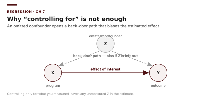
Regression controls only for variables you actually include. Anything that (a) affects the outcome and (b) differs systematically between treated and untreated units, but is left out of the model, contaminates the treatment coefficient. This is omitted-variable bias (OVB). Formally, if the true model includes an omitted variable \(W\) with coefficient \(\gamma\), and you leave it out, the expected value of your treatment estimate is
\[E[\hat{\tau}] = \tau + \gamma \, \delta\]where \(\delta\) is the slope from regressing the omitted \(W\) on the treatment \(D\) (and the included controls). The bias term \(\gamma\,\delta\) vanishes only if the omitted variable does not affect the outcome (\(\gamma = 0\)) or is unrelated to treatment given the controls (\(\delta = 0\)). The NSW job-training experiment (Case C) is the definitive demonstration. When LaLonde (1986) compared the program’s trainees to a survey comparison group — even adjusting for age, education, race, and prior earnings with regression — the estimate came out around −$8,498, implying the program cut earnings, against the experimental truth of +$1,794 (Dehejia & Wahba 1999). The omitted factors that sorted people into NSW (long-term welfare history, weak labor-market attachment, motivation) lowered earnings independently of the program and were concentrated in the trainee group, so the bias term swamped the real effect. Adding the controls you can measure narrowed the gap but did not fix the sign.
Briefing: The sign of omitted-variable bias is the sign of \(\gamma \times \delta\). Ask of any leftover variable: does it raise the outcome, and is it more common in the treated group? If both point the same way, your estimate is biased upward. In NSW the omitted variables pointed down, which is why a real, beneficial program looked harmful.
This is the deep reason regression adjustment is not equivalent to a randomized experiment. Randomization makes the treated and untreated groups statistically identical on everything — measured and unmeasured — so there are no systematically omitted variables. Regression can only balance the variables you can name and measure. Latent motivation, prior labor-market attachment, local economic shocks, and unrecorded eligibility rules all remain potential confounders. This is exactly why the Case B turnout model’s small set of controls — and its low \(R^2\) — cannot rescue a vote-center comparison from selection: the counties that adopt vote centers may differ from those that do not in ways income and education never capture. Shadish, Cook, and Campbell (2002) call this the central trade-off of observational work: you can adjust for what you observe, but you must argue, not assume, that nothing important is left out.
Common Pitfalls
- Treating \(R^2\) as a measure of causal success. A model can have a high \(R^2\) and a hopelessly biased treatment coefficient (Case A’s allocation model fits at \(R^2 \approx 0.94\) yet identifies nothing causal), and a low \(R^2\) like Case B’s 0.08 does not make its real associations wrong. Judge the design, not the fit.
- Controlling for a post-treatment variable. If a control is itself affected by the program (a “bad control”), adjusting for it can absorb part of the very effect you are trying to measure. Use only covariates measured before treatment.
- Reading the intercept as meaningful when \(X=0\) is impossible. The 0.425 intercept in the Case B model is the predicted turnout “at zero income and zero college share” — a mathematical anchor, not a real county.
- Putting non-contiguous X columns into the ToolPak. Excel requires the X variables to sit in adjacent columns; rearrange your sheet first or the regression will silently use the wrong data.
- Claiming causation from adjustment alone. “Controlling for” is not “holding constant in an experiment.” State explicitly which confounders you could not address.
Practice and Application
- Simple regression by hand and by ToolPak. In the Case B county panel’s 2020 cross-section, regress
turnoutonincome_1kusing both=SLOPE()/=INTERCEPT()and the Data Analysis ToolPak. Confirm the coefficients match, and interpret the slope in one sentence in the units of the data. - Adding a control. Add
pct_bato the model from Exercise 1 to reproduce the worked-example fit (\(\widehat{\text{turnout}} = 0.425 + 0.0017\,\text{income\_1k} + 0.0022\,\text{pct\_ba}\), \(R^2 \approx 0.08\)). Report how the income slope changes and explain, in terms of “controlling for,” why it moved. - Treatment dummy. Create a dummy equal to 1 for counties above the median in
pct_baand 0 otherwise (a stand-in “treatment”). Regress turnout on the dummy alone, then add income and population as controls. Report the adjusted coefficient and its P-value, and explain why this is not a credible vote-center estimate. - OVB reasoning (NSW). For the NSW job-training case (Case C), where the observational estimate was −$8,498 against the experimental +$1,794, name two plausible omitted variables. For each, state the likely sign of \(\gamma\) and of \(\delta\), and therefore the direction of the bias, and explain why the bias came out negative.
- Writing it up. In 150 words, write the methods note you would attach to a memo reporting the Case B turnout model, stating the estimated associations, the \(R^2 \approx 0.08\), and the limits of the design honestly.
Transition to Chapter 8
Regression with controls is the best you can do when your only leverage is the variables you happened to measure. But there is a more powerful idea: if you can find a comparison group that, by the structure of how a policy rolled out, plausibly stands in for what the treated group would have done in the absence of the program, you can defend a causal claim far more credibly. Chapter 8 turns to quasi-experimental designs — pre/post comparisons, nonequivalent comparison groups, and the difference-in-differences strategy — that exploit the timing and geography of real Texas policy changes to get closer to the experimental ideal without a randomized trial.