Chapter 8: Quasi-Experimental Designs and Difference-in-Differences
Epigraphs
“The most credible and influential research designs use random assignment.” — Joshua Angrist and Jörn-Steffen Pischke, Mostly Harmless Econometrics (2009)
“A comparison group is the heart of any impact evaluation.” — Paul Gertler and colleagues, Impact Evaluation in Practice (2016)
Opening Case: Did New Jersey’s Minimum Wage Cost Jobs? (Card & Krueger 1994)
On April 1, 1992, New Jersey raised its minimum wage from $4.25 to $5.05 an hour. Standard economic theory had a clear prediction: raise the price of labor and employers will hire less of it, so fast-food jobs — staffed largely by minimum-wage workers — should fall. David Card and Alan Krueger set out to test this with a research design that has since become the canonical example of difference-in-differences. They surveyed 410 fast-food restaurants in New Jersey and in neighboring eastern Pennsylvania, both before the increase (February–March 1992) and after it (November–December 1992).
The puzzle the design solves is this. If Card and Krueger had only looked at New Jersey before and after, any change in employment could be due to the minimum wage or to the broader 1992 economy. If they had only compared New Jersey to Pennsylvania after the increase, any gap could reflect pre-existing differences between the two states’ labor markets. Pennsylvania, where the minimum wage did not change, supplies the missing piece: it shows how New Jersey fast-food employment would plausibly have moved absent the policy. By measuring the change over time in New Jersey and subtracting off the change over the same window in Pennsylvania, they difference away both the economy-wide trend and the fixed differences between the two states.
Their finding stunned the profession: New Jersey employment did not fall after the minimum-wage increase — if anything, it rose slightly relative to Pennsylvania (Card & Krueger 1994, American Economic Review). Whatever one concludes about minimum-wage policy, the design is the point for us. This is the logic of difference-in-differences, the most widely used quasi-experimental strategy in applied public policy, and the worked example below rebuilds Card and Krueger’s two-by-two table step by step.
Guiding Questions
- When randomization is impossible, what makes a comparison group credible?
- How does difference-in-differences remove both time trends and fixed group differences at once?
- What exactly is the parallel-trends assumption, and how would a violation fool us?
Why This Chapter Matters
Public programs are almost never assigned by lottery. Legislatures phase policies in by region, agencies target services to needy populations, and cities opt into local-option taxes. In each case, the people or places that get the program differ from those that do not. Quasi-experimental designs are a family of strategies for squeezing a credible causal estimate out of these messy roll-outs by choosing comparison groups and time windows thoughtfully. Done well, they approximate an experiment. Done badly, they repackage selection bias as a finding. This chapter teaches the most useful of these designs and, just as important, the assumption you must defend to use it.
Weak Designs and Their Threats
The Single-Group Pre/Post Design
The simplest quasi-experiment measures one group before and after the program: \(\hat{\tau} = \bar{Y}_{\text{post}} - \bar{Y}_{\text{pre}}\). Its fatal weakness is that anything else that changed over the same window — the economy, a season, a co-occurring policy — is mistaken for the program’s effect. Shadish, Cook, and Campbell (2002) catalog these as threats to internal validity: history (other events), maturation (natural trends), testing, and regression to the mean. A pre/post design cannot rule any of them out.
The Nonequivalent Comparison-Group Design
Adding an untreated comparison group helps but does not save us. Comparing treated and comparison groups in the post-period only (\(\bar{Y}^{T}_{\text{post}} - \bar{Y}^{C}_{\text{post}}\)) is contaminated by selection bias: the groups may have differed before the program ever started. The two weak designs fail for opposite reasons — pre/post ignores the comparison group, post-only ignores the baseline.
Briefing: Pre/post controls for fixed differences between groups but not for time trends. Post-only controls for time but not for fixed group differences. Difference-in-differences controls for both.
The Difference-in-Differences Logic
Difference-in-differences (DiD) combines the two comparisons. Define a treated group (\(T\)) and a comparison group (\(C\)), each observed in a pre-period and a post-period. The estimator is the difference of two differences:
\[\hat{\tau}_{DiD} = \left( \bar{Y}^{T}_{\text{post}} - \bar{Y}^{T}_{\text{pre}} \right) - \left( \bar{Y}^{C}_{\text{post}} - \bar{Y}^{C}_{\text{pre}} \right)\]The first parenthesis is the change in the treated group; the second is the change in the comparison group over the same window. Subtracting the second from the first removes any change common to both groups — the regional economy, statewide policy, inflation — leaving only the change unique to the treated group. The canonical application is Card and Krueger’s (1994) study of a New Jersey minimum-wage increase, using neighboring Pennsylvania as the comparison.
The 2×2 DiD Table
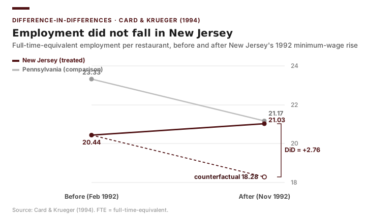
For a single treated group, a single comparison group, and two periods, DiD is just arithmetic on four cell means. Here are Card and Krueger’s results, using average full-time-equivalent (FTE) employment per restaurant. New Jersey is the treated group (its minimum wage rose); Pennsylvania is the comparison (it did not change):
| Pre (Feb–Mar 1992) | Post (Nov–Dec 1992) | Difference (Post − Pre) | |
|---|---|---|---|
| New Jersey (treated) | 20.44 | 21.03 | +0.59 |
| Pennsylvania (comparison) | 23.33 | 21.17 | −2.16 |
| Difference (NJ − PA) | −2.89 | −0.14 | +2.76 |
The bottom-right cell, +2.76, is the DiD estimate: New Jersey gained about 2.76 FTE jobs per restaurant relative to Pennsylvania. Read it two equivalent ways: New Jersey employment rose by 0.59 while Pennsylvania’s fell by 2.16, so the difference attributable to the policy window is \(0.59 - (-2.16) = 2.76\); or the NJ–PA gap moved from −2.89 to −0.14, a change of +2.76. The crucial substantive point is the sign: the minimum-wage increase was associated with employment that did not fall — it rose relative to the comparison state — directly contradicting the textbook prediction (Card & Krueger 1994). The −2.89 pre-period gap is exactly the fixed difference (Pennsylvania restaurants were simply larger on average) that a post-only comparison would have wrongly attributed to the policy.
Briefing: In the 2×2 table, the four means tell the whole story. The pre-period row difference is the baseline gap you must not blame on the program; DiD is the change in that gap.
DiD as a Regression with an Interaction Term
The table is intuitive but limited to one treated and one comparison group with no controls. The regression form generalizes it. Define \(\text{Treat}_i = 1\) for units in the treated group, \(\text{Post}_t = 1\) for the post-period, and their product \(\text{Treat}_i \times \text{Post}_t\). Then
\[Y_{it} = \beta_0 + \beta_1 \text{Treat}_i + \beta_2 \text{Post}_t + \beta_3 \left( \text{Treat}_i \times \text{Post}_t \right) + \varepsilon_{it}\]Each coefficient maps onto a piece of the table. \(\beta_0\) is the comparison group’s pre-period mean (Pennsylvania’s 23.33); \(\beta_1\) is the baseline treated-comparison gap (−2.89); \(\beta_2\) is the common time trend experienced by both groups; and the interaction coefficient \(\beta_3\) is the DiD estimate — the extra change in the treated group beyond the common trend. You can confirm that \(\beta_3\) equals the +2.76 from the 2×2 table exactly. The regression form earns its keep by letting you add control variables, use many units and many years, and read off a standard error for \(\beta_3\) directly.
Briefing: In a DiD regression, the coefficient on the interaction term \(\text{Treat}\times\text{Post}\) is your effect estimate. The two main effects are bookkeeping; the interaction is the finding.
Worked Example: The Card & Krueger Minimum-Wage DiD in Excel
We reproduce Card and Krueger’s (1994) analysis with the four cell means. The cleanest way to see the structure is to lay out the data in “long” form — one row per restaurant per period — but with only the four published means in hand, we can build the 2×2 directly and confirm the regression mapping.
Set up four columns: fte (full-time-equivalent employment, the outcome \(Y\)), treat (1 for a New Jersey restaurant, 0 for Pennsylvania), post (1 for the November–December wave, 0 for February–March), and an interaction treat_post. Create the interaction with a formula: if treat is in column B and post in column C, then in column D enter =B2*C2 and fill down. This product equals 1 only for New Jersey restaurants in the post-period — exactly the cell the policy “switches on.”
Build the 2×2 table with AVERAGEIFS. For the treated post-period mean, use =AVERAGEIFS(fte_range, treat_range, 1, post_range, 1); change the criteria to fill in all four cells. You should recover the table above: 20.44, 21.03, 23.33, 21.17. Then compute the DiD by hand:
Then run the regression. Open Data → Data Analysis → Regression. Set Input Y Range to fte. The Input X Range must be the three contiguous columns treat, post, treat_post (rearrange columns so they are adjacent). Check Labels and Confidence Level 95%. With the full microdata the coefficient table maps onto the cell means as follows:
| Term | Coefficient | Maps to |
|---|---|---|
| Intercept (\(\beta_0\)) | 23.33 | Pennsylvania pre-period mean |
| treat (\(\beta_1\)) | −2.89 | Baseline NJ − PA gap |
| post (\(\beta_2\)) | −2.16 | Common time trend (Pennsylvania’s change) |
| treat_post (\(\beta_3\)) | +2.76 | The DiD estimate |
The treat_post coefficient, +2.76, matches the 2×2 table’s bottom-right cell exactly. The headline finding is its sign: even as New Jersey’s minimum wage rose, fast-food employment did not fall relative to Pennsylvania — it rose. Card and Krueger reported this difference with a standard error so that readers could judge how distinguishable it was from zero; the regression form delivers that standard error on \(\beta_3\) automatically, which is the practical reason to prefer it over the bare 2×2.
Returning to the Case: The Card & Krueger design is the template you will carry into every quasi-experimental evaluation: find a comparison unit that plausibly tracks what the treated unit would have done, measure the change in both over the same window, and let the difference-in-differences isolate the policy. The minimum-wage result also carries a methodological warning — a clean DiD can overturn a “obvious” prediction, so the design, not the prior, should decide the question.
Applying DiD to Our Texas Data (Cases A and B)
Card and Krueger had two states and two survey waves. Our Texas panels give us the same structure at larger scale, and the recipe is identical once each unit’s adoption year is coded.
Case A — economic-development sales tax (cities): a worked DiD. In the Texas City Finance Panel, the treatment is a city’s adoption of a Type A or Type B economic-development sales tax, dated by the year its economic-development corporation first reported (edc_first_report_year). The treated group is the 13 cities that first adopted between the 2016 and 2020 elections (adoption years 2017–2020) with taxable-sales data in both years; the comparison group is the 475 cities that never adopted one. The outcome is taxable sales per capita — a measure of real retail activity, not the sales-tax allocation itself, since allocation mechanically rises with the EDC tax and would build the “effect” into the outcome by construction. Take 2016 as the pre-year and 2020 as the post-year:
| 2016 (pre) | 2020 (post) | Change | |
|---|---|---|---|
| Adopters (treated, n = 13) | $11,315 | $13,348 | +$2,033 |
| Never-adopters (comparison, n = 475) | $18,779 | $20,473 | +$1,695 |
| Difference (treated − comparison) | −$7,464 | −$7,126 | +$338 |
Adopting cities’ taxable sales per capita rose by about $2,033 over the four years; comparison cities’ rose by about $1,695. The difference-in-differences is +$338 per capita — the extra change in adopters beyond the statewide retail growth that lifted all cities. To get that estimate and an honest standard error in Excel, compute each city’s change in taxable sales per capita (2020 − 2016), then run a two-sample t-test comparing the mean change of the 13 adopters to the mean change of the 475 comparison cities (Data ▸ Data Analysis ▸ t-Test: Two-Sample Assuming Unequal Variances). The difference in mean changes is the difference-in-differences, +$338, now with a standard error of about $1,600, giving \(t \approx 0.2\), \(p \approx 0.83\), and a 95% confidence interval of roughly \([-\$2{,}900,\ +\$3{,}600]\). (The pooled treat + post + treat_post regression returns the same +$338 point estimate, but its default standard error is unreliable here — it treats each city’s two observations as independent when they are strongly correlated. Working on the change scores handles that correctly, and is the honest Excel route to a DiD standard error.)
Read this honestly: the estimate is positive but tiny relative to its uncertainty. The interval spans large gains and large losses, so we cannot distinguish the effect from zero — a precise “we don’t know,” not evidence that the tax had no effect. Three cautions travel with the number. First, only 13 cities adopted in this window, so the design is underpowered; the wide interval is the direct consequence. Second, adopters were much smaller retail economies at baseline (the −$7,464 pre-period gap) — exactly the fixed difference DiD is built to difference out, and here it does. Third, Texas cities adopted in many different years, so this clean 2×2 collapses a staggered rollout into two periods (the modern-DiD cautions above apply), and parallel trends (Practice item 3) is untested. The contrast with Card and Krueger is the lesson: there, a clean DiD overturned a confident prediction with a tight estimate; here, on our own Texas data, the same tool returns a noisy null. In both, the discipline is identical — report the coefficient and its standard error, and let the uncertainty temper the claim.
Case B — countywide vote centers (counties). Using the Texas County Panel, the treated group is counties that adopted countywide vote centers between two presidential elections; the comparison group is counties that had not yet adopted. The outcome is turnout. With treat = 1 for adopting counties, post = 1 for the later election, and their interaction, \(\beta_3\) estimates the change in turnout in adopting counties beyond the statewide change between the two elections. (Recall from Chapter 5 that 2020 turnout was 0.554 in metro counties versus 0.580 in non-metro counties — a reminder that the comparison group must be chosen so that such fixed differences are differenced out, not mistaken for the policy.)
In both cases the central requirement is the same one Card and Krueger relied on Pennsylvania to satisfy: the parallel-trends assumption, examined next. And both cases raise a wrinkle the NJ/PA study did not — Texas units adopt in different years (staggered adoption), which the simple 2×2 does not handle and which the next section flags as a limit.
The Parallel-Trends Assumption and Its Limits
DiD does not assume the two groups are identical. It assumes something weaker but crucial: that in the absence of the program, the treated and comparison groups would have followed parallel trends — their outcomes would have moved up or down together by the same amount. The baseline gap can be any size; what must hold is that the gap would have stayed constant without the intervention.
This assumption is untestable directly, because we never observe the treated group’s counterfactual path. But we can build confidence in it. The standard check is to examine pre-treatment trends: if the two groups moved in parallel in the years before the policy, parallel trends in the post-period is more plausible. Card and Krueger could point to broadly similar fast-food labor markets across the NJ/PA border; with the Texas panels you have many pre-periods to plot. For Case A, chart per-capita revenue for adopting and comparison cities across the years before adoption (e.g., 2013–2018) and look for parallel lines; for Case B, chart turnout for adopting and comparison counties across the presidential elections before adoption. Divergence before treatment is a red flag.
Briefing: Parallel trends is an assumption about a path you cannot see. Defend it with pre-trend evidence and institutional knowledge; never assert it just because you ran the regression.
The assumption fails when something other than the program differentially affected one group at the same time. If a new highway interchange opened in the adopting cities (Case A) in the same year, or a contested local race spiked turnout in the comparison counties (Case B), the trends would have diverged regardless of the policy, and DiD would attribute that divergence to it. Even Card and Krueger faced versions of this critique — was something else happening differently on the two sides of the state line in 1992? Other limits: DiD with a single treated and comparison unit has no real statistical uncertainty; staggered adoption (Texas cities and counties adopting in different years) requires more careful methods than the simple 2×2; and DiD estimates the effect for the treated group, which may not generalize to others.
A Note on Modern Difference-in-Differences
The 2×2 table above — one treated group, one comparison group, one before period, one after — is the honest building block of DiD, and everything you do in this course rests on it. But the Texas cases already hinted at a complication: our cities and counties do not all adopt in the same year. They roll out in different years (economists call this staggered adoption), and different adopters may experience different-sized effects that grow or fade over time. When you throw all of that into a single regression with unit and time indicators — the workhorse two-way fixed-effects (TWFE) specification that generalizes the interaction model above — something surprising and unwelcome can happen. This is not an Excel technique; it is a caution about how to read and commission studies, and about a real trap in the standard software approach.
The problem, worked out by Goodman-Bacon (2021), is that TWFE with staggered timing quietly builds its estimate out of many little 2×2 comparisons and then averages them. Some of those comparisons are the clean kind we want — a newly treated group against a not-yet-treated group. But others are “forbidden comparisons”: they use already-treated units as the comparison group for later adopters. When a unit that is already receiving the program (and whose effect may still be changing) stands in as a “control,” the arithmetic can go badly wrong. de Chaisemartin and D’Haultfœuille (2020) showed that TWFE can place negative weights on some of these building-block effects, so that the headline number is a strange weighted average that can even come out the opposite sign from every underlying effect — every group could be helped, and the pooled estimate could read as harm. That is exactly the kind of sign-flip Chapter 3 warned about, now hiding inside a respectable-looking regression.
The response from the field is a family of modern DiD estimators designed to avoid forbidden comparisons — building the effect only from clean comparisons of treated units against not-yet-treated ones, allowing effects to differ across groups and over time, and reporting an event-study picture of how effects evolve (Callaway and Sant’Anna, 2021; Sun and Abraham, 2021). Roth, Sant’Anna, Bilinski, and Poe (2023) survey this fast-moving literature. You will not run these in Excel — they live in Stata or R — but as an evaluator you should know they exist, ask whether a staggered-rollout study used one, and be wary of an old-style TWFE result that ignores the issue.
The same modern turn sharpens how we treat parallel trends. Earlier we checked pre-treatment trends and breathed easier when the lines looked parallel. Roth (2022) shows why that comfort is only partial: a pre-trends test can easily pass — fail to detect a problem — simply because it lacks the statistical power to catch the kind of gradual divergence that would still bias the estimate. So the current standard is to treat parallel trends as an assumption to probe, not a box a pre-test checks off: ask how large a hidden violation would have to be to overturn your finding (a sensitivity analysis), and report that alongside the estimate, rather than declaring victory because the pre-trend test came back clean.
Briefing: The clean 2×2 is safe. But pooling many staggered adopters in a single TWFE regression can make “forbidden comparisons” against already-treated units, put negative weights on some effects, and even flip the sign. Modern estimators (run in Stata or R, not Excel) avoid this, and parallel trends should be probed with sensitivity analysis, not certified by a pre-trends test.
Common Pitfalls
- Forgetting the comparison group. A before-and-after table with no comparison is a pre/post design wearing a DiD costume; it controls for nothing about the trend.
- Choosing a comparison group with different pre-trends. If the groups were already diverging before treatment, the design is broken no matter how clean the regression looks. Always plot pre-trends.
- Reading the main effects as the answer. \(\beta_1\) and \(\beta_2\) are not the program effect; only the interaction \(\beta_3\) is.
- Non-contiguous X columns in the ToolPak.
treat,post, andtreat_postmust sit in adjacent columns or Excel will read the wrong data. - Ignoring uncertainty. A DiD point estimate without its standard error does not support a confident causal claim; Card and Krueger reported theirs precisely so readers could judge it.
Practice and Application
- Build the 2×2 by hand. Using the four Card & Krueger cell means (NJ: 20.44 → 21.03; PA: 23.33 → 21.17), construct the 2×2 table with
AVERAGEIFSor by direct entry and confirm the DiD estimate of +2.76. Interpret its sign in one sentence. - Confirm via regression. Set up
treat,post, andtreat_postfor the Card & Krueger data and verify that the interaction coefficient \(\beta_3\) equals your hand-computed +2.76 and that \(\beta_0\), \(\beta_1\), \(\beta_2\) recover the cell means. - Case A pre-trends check. Using the city finance panel, choose a set of economic-development-tax adopters and comparison cities, and plot per-capita revenue for both groups across the pre-adoption years (e.g., 2013–2018). In two sentences, state whether the parallel-trends assumption looks defensible.
- A threat to validity. Name one plausible event other than the program that could have differentially affected the adopting units (Case A or Case B) around their adoption year, and explain how it would bias \(\hat{\tau}_{DiD}\).
- Case B application. Using the county panel, define a “treated” set of counties (those adopting countywide vote centers between two elections you can identify) and a pre/post pair of presidential elections, and estimate a DiD effect on turnout. State your comparison group and why it is credible, given that 2020 turnout already differed by metro status (0.554 vs. 0.580).
Transition to Chapter 9
Difference-in-differences leans on a comparison group to stand in for the counterfactual. But sometimes the cleanest leverage comes not from another group but from a sharp moment in time, or from a sharp threshold in a rule. Chapter 9 develops two such designs. Interrupted time series asks whether an outcome’s level and slope changed at the exact moment an intervention took effect, using the program’s own history as the comparison. Regression discontinuity exploits an arbitrary cutoff — an eligibility score, a population threshold, a vote share — to compare units that landed just above and just below the line. Both can be implemented in Excel, and both, like DiD, live or die by an assumption you must state out loud.