Chapter 5: Describing and Comparing Data
Epigraphs
“The greatest value of a picture is when it forces us to notice what we never expected to see.” — John W. Tukey, Exploratory Data Analysis (1977)
“Above all else show the data.” — Edward R. Tufte, The Visual Display of Quantitative Information (1983)
Opening Case: The Texas Economic-Development Sales Tax (Case A)
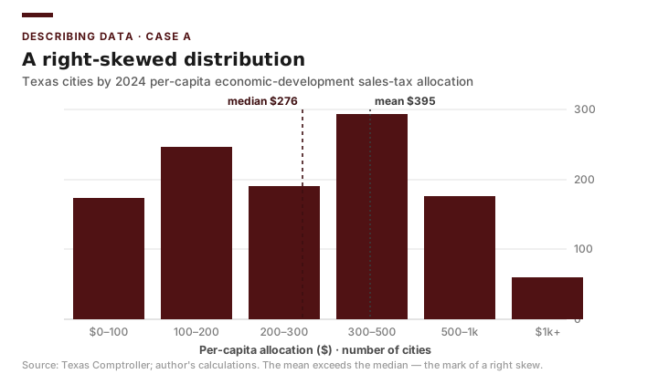
Hundreds of Texas cities levy a local “Type A” or “Type B” economic-development sales tax — a fraction of a cent on every taxable sale, dedicated to attracting and growing local business. A legislative committee wants a simple thing: a one-page description of how much money this tax actually raises per resident across the state, and whether it is distributed evenly or concentrated in a few places. A first-year analyst on your team opens the Comptroller’s 2024 allocation file, computes the average per-capita allocation across the roughly 1,141 reporting cities — about $395 — and reports that single number as “the typical Texas city.”
It is not. When the analyst’s supervisor builds a histogram, the distribution is sharply right-skewed: most cities sit far below $395, a long tail of a few high-allocation cities pulls the average up, and the median is only about $276. The “typical” $395 city barely exists. A committee that budgeted around the mean would systematically overstate what an ordinary Texas city collects. The number was not wrong; it was the wrong summary for a skewed distribution.
This chapter is about describing data honestly before anyone draws a conclusion from it. Before any program effect can be estimated, the evaluator describes the data: what the typical value is, how spread out the values are, whether outliers are distorting the picture, and — crucially for evaluation — whether the groups being compared were equivalent at baseline. This is not preliminary throat-clearing. It is where most of the honest insight in an evaluation lives, and where most of the embarrassing mistakes get caught.
Guiding Questions
- What does a good first description of an evaluation dataset include, and why is it the first step rather than an afterthought?
- How do central tendency, spread, and outliers each tell us something different about a program’s units — and why does a skewed money variable demand the median, not the mean?
- How do we check whether a treatment group and a comparison group were equivalent before the program began — and present that check so a decision-maker trusts it?
Why This Chapter Matters
Decision-makers do not read your regression output; they read your table and your chart. The ability to summarize a messy panel into a few honest numbers and one clear figure is, in practice, the most-used skill in this course. It is also a safeguard: exploratory data analysis (EDA) is how you catch the impossible values, the skewed distributions, and the baseline imbalances that would otherwise quietly corrupt every later analysis (Tukey 1977). Skip it, and you risk being the analyst in the opening case — reporting a $395 mean for a state whose typical city collects $276.
Exploratory Data Analysis as the First Step
EDA is the practice of looking — systematically and with suspicion — at your data before testing any hypothesis. The goal is to understand the shape of each variable and the relationships among them, and to surface anything that will break a later analysis. For an evaluation, three questions organize the first pass: What is typical? How much do units vary? And does anything look wrong or surprising?
Briefing: EDA is not optional warm-up. It is the stage where you catch the data problems that would otherwise become false findings. Budget real time for it.
Central Tendency
Three summaries of “typical” recur throughout evaluation, and choosing the wrong one misleads.
- The mean is the arithmetic average, \(\bar{x} = \frac{1}{n}\sum_{i=1}^{n} x_i\). It uses every value but is pulled toward extremes.
- The median is the middle value when data are ordered. It ignores the size of extremes and so resists outliers.
- The mode is the most frequent value, useful mainly for nominal variables.
For right-skewed money variables — per-capita sales-tax allocations, taxable sales, median household income — the mean exceeds the median because a few large cities or wealthy counties pull the average up. In the Case A 2024 file the mean per-capita allocation is about $395 but the median is only about $276; reporting only the mean would describe a city that does not exist. For skewed variables, report the median, or report both and let the gap reveal the skew.
Briefing: When the mean and median diverge sharply, the distribution is skewed. Report the median for skewed money variables; report the mean when the distribution is roughly symmetric.
Spread
A center without a spread is half a description. Two groups can share an identical mean turnout while one is tightly clustered and the other ranges from near-zero to near-universal — and those two worlds call for very different programs.
The range (max minus min) is simple but driven entirely by the two most extreme cases. The interquartile range (IQR), the distance from the 25th to the 75th percentile, describes the middle half and resists outliers. The standard deviation measures typical distance from the mean. The sample standard deviation is
\[s = \sqrt{\frac{1}{n-1}\sum_{i=1}^{n}\left(x_i - \bar{x}\right)^2}\]and its square, the variance \(s^2\), is the quantity that underlies every group-comparison test in the second half of this chapter. The \(n-1\) in the denominator — Bessel’s correction — corrects for the fact that a sample’s own points sit closer to their average than to the true population mean, so dividing by \(n\) would understate the real spread; using \(n-1\) removes that bias. It is why Excel’s STDEV.S (sample) differs from STDEV.P (population); for evaluation data, which is almost always a sample or a stand-in for one, use STDEV.S.
Distributions and Outliers
A summary statistic hides the shape of a distribution; a histogram reveals it. Bimodality — two humps — often signals that you are looking at two distinct populations mashed together, exactly the metro/non-metro split that recurs in the county panel. EDA exists to catch this before you average across it.
Outliers deserve judgment, not reflex. A turnout of 140 percent is an error and should be corrected or removed. But a genuinely tiny county with volatile turnout is real data, and deleting it because it is inconvenient is a form of fabrication. A common screening rule flags a value as an outlier if it lies more than \(1.5 \times \text{IQR}\) beyond the quartiles:
\[x < Q_1 - 1.5\,(\text{IQR}) \quad \text{or} \quad x > Q_3 + 1.5\,(\text{IQR})\]Flagging is the start of an investigation, never an automatic deletion.
Briefing: Outliers are flags, not verdicts. Investigate whether each is an error or a real extreme case before deciding what to do, and disclose the decision.
Baseline Comparisons and Equivalence
Here is where description becomes evaluation. When you compare a treatment group to a comparison group, the entire credibility of a later difference depends on whether the two groups were similar before the program. A baseline equivalence table lays the pre-program characteristics of both groups side by side so a reader can judge for themselves.
The logic: if vote-center and non-vote-center counties had nearly identical pre-program income, education, population, and rurality, then a post-program turnout difference is plausibly the program. If they differed sharply at baseline, then a post-program difference might be nothing more than that pre-existing gap persisting. Baseline equivalence does not by itself license a causal claim, but its absence is often enough to sink one (Rossi, Lipsey & Henry 2019). The cleanest version of this logic is randomization: in NSW (Case C) and MTO (Case D), a lottery assigned the program, so the groups were equivalent at baseline by construction — which is exactly why their simple post-program differences can be read as effects.
Briefing: Always show baseline equivalence before showing program effects. A reader who sees imbalanced groups will — rightly — discount everything that follows.
When groups are not randomized, the equivalence check often reveals trouble. Compare metro and non-metro counties in the Case B 2020 panel. The two groups have nearly identical turnout — metro counties average 0.554 (n = 86) and non-metro counties average 0.580 (n = 168) — but they differ on the very characteristics that drive turnout. A regression of 2020 turnout on county wealth and education makes the point: across all 254 counties,
\[\text{turnout} \approx 0.425 + 0.0017 \times (\text{median HH income in \$1{,}000s}) + 0.0022 \times (\text{percent bachelor's})\]with an \(R^2\) of only about 0.08. Income and education each nudge turnout upward, but together they explain just 8 percent of the variation across counties — a useful reminder that turnout is driven by much more than the two demographics any single program can target, and that comparing raw metro and non-metro means without accounting for those demographics confounds the urban-rural divide with everything else.
Worked Example: Describing the 2024 Per-Capita Sales-Tax Distribution in Excel
Return to Case A. You have the 2024 file open with one row per city and a column alloc_per_capita (the economic-development sales-tax allocation per resident) in, say, D2:D1142 for the roughly 1,141 reporting cities. The committee wants an honest one-page description.
1. Center. Compute =AVERAGE(D2:D1142) and =MEDIAN(D2:D1142). The mean returns about $395 and the median about $276. The mean sitting well above the median is the signature of a right-skewed distribution.
2. Spread. Compute =STDEV.S(D2:D1142) for the sample standard deviation — about $596 — and =MIN/=MAX for the range. A standard deviation ($596) larger than the mean ($395) is itself a red flag for strong skew and a long upper tail; for a roughly symmetric variable the SD is usually a fraction of the mean.
3. Histogram. Build a histogram with Data → Data Analysis → Histogram (or FREQUENCY with bins of, say, $100 width). The shape is unmistakable: a tall bar of low-allocation cities near zero, then a long thin tail stretching far to the right — a handful of cities collecting many times the median.
4. A description table. Report center, spread, and shape together so the skew is undeniable.
| Statistic | Excel function | Value (2024, per capita) |
|---|---|---|
| Cities (n) | COUNT |
~1,141 |
| Mean | AVERAGE |
$395 |
| Median | MEDIAN |
$276 |
| Standard deviation | STDEV.S |
$596 |
| Mean − median | subtraction | +$119 (right skew) |
The mean exceeds the median by $119, and the standard deviation exceeds the mean — both diagnostic of a strongly right-skewed money variable with a long tail of high-allocation outlier cities. The honest one-line summary for the committee is: “The typical Texas city collects about $276 per resident from its economic-development sales tax; the average is pulled up to $395 by a small number of high-collecting cities.”
Returning to the Case: The opening-case analyst was not wrong that the mean is $395 — that figure is real. The mistake was reporting it alone, as if it described a typical city, when the median of $276 and the $596 standard deviation reveal a distribution where most cities fall well below the average. Had the analyst built the histogram first, the right skew would have been visible immediately, and the committee would have received the median (with the mean shown alongside) rather than a single number that overstates what an ordinary city collects. Describe the shape before you summarize the center.
Presenting Data to Decision-Makers
A table for an analyst and a table for a committee chair are different documents. For decision-makers: round to meaningful precision (a per-capita allocation to the nearest dollar, not the cent), label every column with units, state the \(n\), and give the table a sentence-long title that states the takeaway. For charts, prefer a clean column or line chart over a 3-D pie; let the data dominate the ink. In Excel, build these with Insert → PivotChart off your PivotTable so the figure updates when the data do, and use Number Format to control rounding rather than retyping values.
Briefing: Round to the precision a decision-maker can act on, label everything, and title the table with its conclusion. Excess decimal places signal false precision and erode trust.
From Describing to Comparing
Description tells you that two groups look different — or, as with the metro (0.554) and non-metro (0.580) turnout means above, barely different at all. It does not tell you whether that gap is larger than what sampling noise alone would produce, or whether it is large enough to matter for policy. Comparing a group that received a program to a group that did not is the most basic evaluation design there is, and the tools that follow — the t-test and one-way ANOVA — are its workhorses. Almost every evaluation you read will, somewhere, compare two means and ask whether the gap is real. But a test only answers half the question. A large sample can make a meaningless difference “significant,” and a small sample can hide a real one, so we pair every test with an effect size and a plain statement of whether the difference matters. That is what separates an evaluation from a p-value hunt.
The Logic of Hypothesis Testing
Every test in this second half of the chapter shares one logic. We state a null hypothesis (\(H_0\)) of no difference, assume it is true, and ask how surprising our observed data would be under that assumption. The p-value is the probability of seeing a difference at least as large as ours if the null were true. A small p-value means our data are hard to reconcile with “no difference,” so we reject the null. By convention many fields use \(\alpha = 0.05\) as the threshold, but the threshold is a convention, not a law of nature.
Briefing: A p-value is the probability of the data given no effect — not the probability that there is no effect. It never tells you the size or importance of a difference, only how compatible the data are with chance.
The One-Sample t-Test
The one-sample t-test compares a single group’s mean to a fixed benchmark — a statutory target, a statewide average, a prior-year figure treated as known. The statistic is
\[t = \frac{\bar{x} - \mu_0}{s / \sqrt{n}}\]where \(\bar{x}\) is the sample mean, \(\mu_0\) the benchmark, \(s\) the sample standard deviation, and \(n\) the sample size. The denominator \(s/\sqrt{n}\) is the standard error of the mean — in plain terms, how much the sample mean itself would bounce around from one random sample to the next. Larger samples shrink the standard error, so the same gap becomes more “significant” as \(n\) grows — a fact worth holding onto when we reach effect size.
For example, in Case B you might test whether average county turnout in 2020 — about 0.57 across all 254 counties — differs from a statewide benchmark of 0.60. Excel has no single one-sample function, so you assemble \(t\) in one cell from AVERAGE, STDEV.S, and COUNT. With the turnout values in B2:B255 and the benchmark 0.60:
t (in cell E1):  =(AVERAGE(B2:B255) - 0.60) / (STDEV.S(B2:B255) / SQRT(COUNT(B2:B255)))
p-value:         =T.DIST.2T(ABS(E1), COUNT(B2:B255) - 1)
Read the first formula straight off the definition \(t = (\bar{x} - \mu_0)/(s/\sqrt{n})\): the numerator is AVERAGE minus the benchmark; the denominator is STDEV.S divided by SQRT(COUNT(...)). T.DIST.2T then converts the t value in E1 (with \(n-1\) degrees of freedom) into a two-tailed p-value.
The Independent-Samples t-Test
This is the central evaluation test: two separate groups, treatment and comparison, with no natural pairing between their members. It answers a basic evaluation question — did metro counties have different turnout than non-metro counties? The statistic compares the two group means relative to the variability within the groups:
\[t = \frac{\bar{x}_1 - \bar{x}_2}{\sqrt{\dfrac{s_1^2}{n_1} + \dfrac{s_2^2}{n_2}}}\]A decision you must make: do the two groups have equal variances? If you are unsure — and you usually are — use the Welch (unequal-variance) version, which is more robust and is the safer default (Agresti 2018).
Briefing: When in doubt about equal variances, use the unequal-variance (Welch) t-test. It costs little when variances are equal and protects you when they are not.
Recall from the baseline-equivalence discussion above that this test is only as credible as the equivalence behind it. Metro and non-metro counties differ on income, education, and population all at once, so even a significant turnout difference would tell you the groups differ — not why. The cleanest contrast comes from randomized programs: in NSW (Case C) the treatment group earned $6,349 versus $4,555 for randomized controls, an independent-samples difference of +$1,794 that can be read causally precisely because the lottery made the groups equivalent at baseline (LaLonde 1986; Dehejia & Wahba 1999).
The Paired t-Test
When each unit is measured twice — before and after — the two measurements are not independent, and treating them as if they were throws away the most useful information you have. The paired t-test works on the within-unit differences \(d_i = x_{i,\text{post}} - x_{i,\text{pre}}\), testing whether their mean differs from zero:
\[t = \frac{\bar{d}}{s_d / \sqrt{n}}\]In Case B this is the natural follow-up — within the counties that adopted vote centers, did turnout rise from the election before adoption to the election after? Pairing controls for everything stable about each county (its size, its political culture, its baseline civic habits), because each county serves as its own comparison. That is its strength and its limit: a paired pre/post comparison with no untreated comparison group cannot rule out that something else changed statewide between the two elections.
Briefing: Pair your data whenever the same units are measured twice. Using an independent-samples test on paired data is a common and costly error — it discards the pairing and usually inflates the standard error.
Comparing Two Proportions (Binary Outcomes)
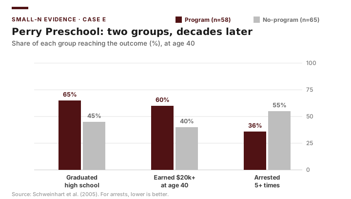
Not every outcome is a dollar amount or a rate. A great many evaluation outcomes are yes/no: did the client find a job, did the student graduate, was the person re-arrested? The summary of a yes/no outcome for a group is not a mean but a proportion — the share who met it, written \(\hat{p}\). Perry Preschool (Case E) is built almost entirely from such outcomes, which makes it the natural case here. Of the 58 children in the program group, 38 graduated from a regular high school — a proportion of \(\hat{p}_1 = 38/58 \approx 0.655\); of the 65 in the no-program group, 29 graduated, or \(\hat{p}_2 = 29/65 \approx 0.446\).
The most useful single number is the risk difference, the plain gap between the two proportions:
\[\text{risk difference} = \hat{p}_1 - \hat{p}_2 = 0.655 - 0.446 = 0.209.\]Preschool was associated with a 21-percentage-point higher graduation rate. To ask whether a gap that large could be sampling noise, use the two-proportion z-test. Pool the two groups to estimate a common rate under the null, \(\bar{p} = (38+29)/(58+65) = 67/123 \approx 0.545\), and form
\[z = \frac{\hat{p}_1 - \hat{p}_2}{\sqrt{\bar{p}(1-\bar{p})\left(\dfrac{1}{n_1} + \dfrac{1}{n_2}\right)}} = \frac{0.209}{\sqrt{0.545 \times 0.455 \times \left(\tfrac{1}{58}+\tfrac{1}{65}\right)}} \approx \frac{0.209}{0.090} \approx 2.32.\]A \(z\) of 2.32 gives a two-tailed \(p \approx 0.02\): even with only 123 children, the graduation gap is large enough to clear the conventional 0.05 bar. This is the small-sample lesson in numbers — a tiny study is not a powerless one when the effect is big.
Excel recipe. There is no ToolPak dialog for two proportions, so build it from the counts. In cells, enter x1=38, n1=58, x2=29, n2=65. Then p1 =B1/B2, p2 =B3/B4, risk difference =p1-p2; pooled pbar =(B1+B3)/(B2+B4); standard error =SQRT(pbar*(1-pbar)*(1/B2+1/B4)); z =(p1-p2)/SE; and the two-tailed p-value =2*(1-NORM.S.DIST(ABS(z),TRUE)). A convenient shortcut: because the outcome is coded 0/1, running the independent-samples t-test of the previous section on the raw 0/1 column returns almost the same result — proportions are just means of a 0/1 variable.
Briefing: For yes/no outcomes, summarize each group with a proportion, report the risk difference in plain percentage points, and test it with a two-proportion z-test. A large gap can be significant even in a very small sample.
One-Way ANOVA for Three or More Groups
Suppose turnout might differ across small, mid-size, and large counties — a three-group question. You might be tempted to run three separate t-tests (small vs. mid, mid vs. large, small vs. large), but each test carries its own chance of a false positive, and running several inflates the overall error rate. One-way ANOVA tests, in a single procedure, the null hypothesis that all group means are equal:
\[H_0: \mu_1 = \mu_2 = \mu_3\]ANOVA works by comparing variation between groups to variation within groups, summarized in the F-statistic:
\[F = \frac{\text{MS}_{\text{between}}}{\text{MS}_{\text{within}}}\]A large \(F\) means the groups differ more from each other than members differ within their own group — evidence against the null. A significant ANOVA tells you that some groups differ, but not which; you follow up with post-hoc comparisons to locate the differences, adjusting for the multiple looks.
Briefing: Do not run many pairwise t-tests across several groups. Use ANOVA to ask the overall question first, then follow up — running k(k−1)/2 separate tests inflates your false-positive rate.
Statistical vs. Practical Significance, and Effect Size
This is the hinge on which honest reporting turns. A p-value confounds the size of a difference with the size of the sample. The MTO housing experiment (Case D) makes the magnitude side vivid: children who moved young earned about $3,477 more as adults than the control group’s mean of $11,270 — a roughly 31 percent gain that is large enough to matter for policy on its own terms (Chetty, Hendren & Katz 2016). Contrast that with the metro/non-metro turnout gap, where, as we will see, a 0.026 difference across 254 counties does not even reach significance. The p-value alone cannot tell a decision-maker whether to act; effect size and policy judgment must accompany it.
Effect size answers the “how big” question on a scale that does not depend on \(n\). For comparing two means, Cohen’s d expresses the difference in standard-deviation units:
\[d = \frac{\bar{x}_1 - \bar{x}_2}{s_{\text{pooled}}}\]where \(s_{\text{pooled}}\) is the standard deviation pooled across both groups:
\[s_{\text{pooled}} = \sqrt{\dfrac{(n_1 - 1)\,s_1^2 + (n_2 - 1)\,s_2^2}{n_1 + n_2 - 2}}\]In Excel, with group 1’s values in the range G and group 2’s in the range H:
s_pooled (cell E1):  =SQRT(((COUNT(G)-1)*STDEV.S(G)^2 + (COUNT(H)-1)*STDEV.S(H)^2) / (COUNT(G)+COUNT(H)-2))
Cohen's d:           =(AVERAGE(G) - AVERAGE(H)) / E1
The pooled SD is just a sample-size-weighted blend of the two groups’ standard deviations; Cohen’s d then divides the raw mean gap by it, expressing the difference in standard-deviation units.
Conventional, rough benchmarks are \(d \approx 0.2\) (small), \(0.5\) (medium), and \(0.8\) (large) — but these are guidelines, and what counts as “large enough to matter” is ultimately a policy judgment about cost, context, and stakes, not a statistical one.
Briefing: Always report an effect size alongside a p-value. “Significant” answers whether a difference is bigger than chance; effect size and policy judgment answer whether it is big enough to act on. Decision-makers need both.
Worked Example: Comparing Metro vs. Non-Metro 2020 Turnout in Excel
Using the Case B county panel, we test whether 2020 turnout differs between metro and non-metro counties — the two-group comparison foreshadowed by the metro (0.554) and non-metro (0.580) means we described above.
1. Arrange the data. Put the 86 metro counties’ turnout in one column and the 168 non-metro counties’ turnout in another (filter on metro_status and copy into two ranges).
2. Run the test two ways. For a quick p-value, use =T.TEST(metro_range, nonmetro_range, 2, 3) — the 2 requests a two-tailed test and the 3 requests the unequal-variance (Welch) version. For a full report, open Data → Data Analysis → t-Test: Two-Sample Assuming Unequal Variances, which returns both group means, both variances, the t-statistic, degrees of freedom, and the p-value in one table.
3. Read the result. The ToolPak returns the means (0.554 and 0.580), a Welch t-statistic of about −1.67, and a two-tailed p-value of about 0.10. Because 0.10 is above the conventional 0.05 threshold, you fail to reject the null: the metro/non-metro turnout difference is not statistically significant.
| Quantity | Excel source | Value (2020) |
|---|---|---|
| Mean turnout, metro (n = 86) | AVERAGE |
0.554 |
| Mean turnout, non-metro (n = 168) | AVERAGE |
0.580 |
| Difference (metro − non-metro) | subtraction | −0.026 |
| Welch t-statistic | ToolPak / T.TEST |
−1.67 |
| p-value (two-tailed) | T.TEST(...,2,3) |
≈ 0.10 |
| Decision at α = 0.05 | compare to 0.05 | Fail to reject |
Three teaching points follow. First, the difference is small — about 2.6 percentage points. Second, it is not statistically significant at the conventional 0.05 level (p ≈ 0.10), so we cannot rule out that it is sampling noise. Third, and most surprising, the sign is negative: non-metro (rural) counties turned out slightly higher than metro counties, the opposite of the common assumption that rural turnout lags. The honest conclusion is that metro and non-metro Texas counties turned out at statistically indistinguishable rates in 2020.
Bringing it together: The metro-versus-non-metro comparison is an independent-samples (Welch) t-test, and it returns a small, non-significant, slightly-negative gap — a reminder that “we expected rural turnout to be lower” is a hypothesis to test, not a finding to assume. The natural next steps mirror the second half of this chapter: a paired t-test of turnout before versus after vote-center adoption within adopting counties, and a one-way ANOVA across small, mid-size, and large counties to see whether county size structures turnout. In every case the evaluation reports not just “significant or not,” but how large the difference is and whether it justifies the policy — and here the difference is neither significant nor large.
Common Pitfalls
- Reporting the mean of a skewed variable alone. The opening-case error: $395 reported without the $276 median. Money variables are right-skewed; the median, or both, belong in the table.
- Skipping EDA and modeling first. A coefficient before a histogram hides the shape the histogram would have revealed.
- Confusing population and sample standard deviation. Use
STDEV.Sfor evaluation data, notSTDEV.P. - Deleting outliers for convenience. Flag and investigate; deletion without justification is data manipulation.
- Comparing groups without a baseline equivalence table. A post-program difference between non-equivalent groups is uninterpretable.
- False precision in presentation. Six decimal places on a revenue figure tells a decision-maker you do not understand your own data.
- Reading the p-value as importance. Significance is about chance, not magnitude. A tiny, useless difference can be “significant” in a large sample.
- Using an independent-samples test on paired data. Pre/post on the same units is paired; treating it as independent discards the pairing.
- Assuming equal variances by default. Prefer the Welch test unless you have a reason not to.
- Running many t-tests across several groups. Use ANOVA first; pairwise tests inflate the false-positive rate.
- Reporting a test without an effect size. A p-value with no Cohen’s d leaves the decision-maker unable to judge whether to act.
Practice and Application
-
Center and spread. For the Case A 2024 file, compute the mean (
AVERAGE≈ $395), median (MEDIAN≈ $276), standard deviation (STDEV.S≈ $596), and IQR of per-capita allocation. Explain in two sentences what the gap between mean and median, and the SD exceeding the mean, tell you about the distribution’s shape. -
Histogram. Build a histogram of the Case A 2024 per-capita allocation using the ToolPak’s Histogram tool or
FREQUENCYwith $100 bins. Describe the shape, locate the median ($276) relative to the tall low-end bars, and explain why the long right tail pulls the mean above the median. -
Outlier screen. Apply the \(1.5 \times \text{IQR}\) rule to the Case A per-capita allocation using
QUARTILE.INC. List the flagged high-allocation cities and, for two of them, argue whether each is a data error or a genuine extreme (e.g., a small city with a large retail base). -
County turnout descriptives. Using the Case B 2020 panel, compute mean and standard deviation of turnout separately for metro and non-metro counties. Confirm you recover roughly 0.554 (metro, n = 86) and 0.580 (non-metro, n = 168), and write one paragraph on what the closeness of the two means suggests before any formal test.
-
Decision-maker table. Take any table you built above and rewrite it for a legislative committee: rounded, labeled, titled with its conclusion, and accompanied by one clean PivotChart. Explain each presentation choice in a sentence.
-
One-sample test. Using the Case B 2020 panel, test whether mean turnout among non-metro counties (≈ 0.580, n = 168) differs from a benchmark of 0.60. Compute \(t\) from
AVERAGE,STDEV.S, andCOUNT, then get the p-value withT.DIST.2T. Interpret in one sentence. -
Independent-samples test. Reproduce the worked example: run a Welch t-test of 2020 turnout in metro versus non-metro counties with both
T.TEST(...,2,3)and the ToolPak. Confirm you recover means of 0.554 and 0.580, t ≈ −1.67, and p ≈ 0.10, and that the two approaches agree. -
Effect size. For the comparison in Exercise 7, compute Cohen’s d from the two means and the pooled SD. Classify it against the small/medium/large benchmarks and write two sentences on whether a difference this small — and non-significant — is practically meaningful.
-
Paired test. Using the Case B panel, run a paired t-test of county turnout in two consecutive presidential elections (e.g., 2016 and 2020) using the ToolPak’s paired option. Explain why pairing is appropriate here and what it controls for.
-
One-way ANOVA. Classify the 254 counties into three groups by population tercile and run Data Analysis → ANOVA: Single Factor on 2020 turnout. Report the F-statistic and p-value, state what a significant result does and does not tell you, and describe what follow-up you would run.
-
Two proportions (Case E). From the Perry outcomes file, take one binary outcome — say, earned $20,000+ at age 40 (program 35 of 58; comparison 26 of 65). Compute both proportions, the risk difference in percentage points, and the two-proportion z-test using
NORM.S.DIST. Then re-run it as an independent-samples t-test on the raw 0/1 values and confirm the two p-values are close. In two sentences, explain why a 20-point gap can be significant here even though the sample is tiny.
Transition to Chapter 6
You can now describe a distribution honestly and test whether two or more groups differ. But a difference in outcomes — or the absence of one — is only interpretable if you know what the program actually did to produce it. A vote-center evaluation that finds no turnout gap has learned nothing until it can say whether vote centers were, in fact, opened and publicized; an NSW earnings comparison means little if the trainees never received the intended work experience. Chapter 6 turns from outcomes to delivery: process and implementation evaluation, which uses the program’s logic model to verify that activities and outputs happened as planned, measures fidelity, dosage, reach, and coverage, and draws the crucial line between a program that failed because its theory was wrong and one that failed because its delivery broke down.