Chapter 9: Interrupted Time Series and Regression Discontinuity
Epigraphs
“The regression discontinuity design has the attractive feature that the treatment assignment is known.” — Guido Imbens and Thomas Lemieux, Journal of Econometrics (2008)
“When the data have a structure, exploit the structure.” — adapted teaching maxim
Opening Case: A Drinking-Age Threshold and a Vote-Center Interruption
Consider two real evaluation problems that share nothing on the surface but call for the same family of tools. The first comes from one of the most-cited natural experiments in public health. In the United States, almost nothing about a person changes overnight when they turn 21 — except that it becomes legal to buy alcohol. Christopher Carpenter and Carleton Dobkin (2009) realized that this sharp age threshold is, in effect, an experiment: people who are 20 years and 11 months old are essentially identical to people who are 21 years and 1 month old, save for legal access to alcohol. Comparing mortality rates just below and just above the 21st birthday, they found a discrete jump in deaths — especially from motor-vehicle crashes, suicides, and alcohol-related causes — at exactly age 21. The cutoff did the work that randomization does in an experiment.
The second problem is our own. A Texas county adopts countywide vote centers in a particular election year. Its turnout had been following some trajectory across prior presidential elections; the question is whether adoption bent that trajectory — produced a jump, a change in slope, or both — at the moment the policy took effect. There is no obvious comparison county the analysts fully trust, so they lean on the county’s own turnout history as the counterfactual: what would turnout have done had the prior trend simply continued?
These two situations call for two distinct designs. The drinking-age threshold is the textbook setting for regression discontinuity (RDD), which compares units on either side of an arbitrary cutoff. The vote-center adoption is a natural fit for interrupted time series (ITS), which models whether the level and slope of an outcome changed at a known moment of intervention. Both rest on assumptions as specific as their geometry, and both can be built in Excel.
Guiding Questions
- How can a single series, interrupted at a known date, support a causal claim without any comparison group?
- What does a cutoff on a running variable buy you, and why does it resemble a local experiment?
- What are the identifying assumptions of each design, and what can each genuinely show?
Why This Chapter Matters
Many of the most consequential public interventions arrive at a known moment (a law’s effective date, a campaign launch) or are assigned by a sharp rule (an eligibility score, a population threshold that triggers a mandate). When you can pin down that moment or that threshold, you gain causal leverage that ordinary regression cannot match — because the timing or the rule is plausibly unrelated to everything else driving the outcome. Interrupted time series and regression discontinuity are the two designs that exploit this structure. They are powerful precisely where difference-in-differences struggles: when there is no good comparison group, or when assignment follows a bright administrative line.
Interrupted Time Series
Modeling a Level and Slope Change
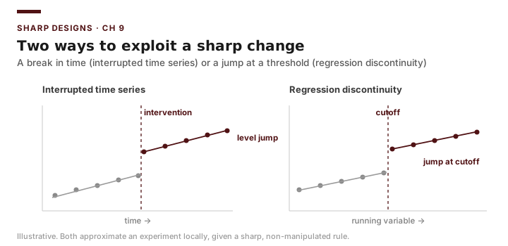
Interrupted time series (ITS) uses the pre-intervention trajectory of an outcome as the counterfactual for the post-intervention period. Let \(T_t\) be a time counter (\(1, 2, 3, \ldots\)) running across all periods, let \(\text{Post}_t = 1\) after the intervention and 0 before, and let \(T^{*}_t\) count the periods since the intervention (0 before it, then \(1, 2, 3, \ldots\) after). The model is
\[Y_t = \beta_0 + \beta_1 T_t + \beta_2 \text{Post}_t + \beta_3 T^{*}_t + \varepsilon_t\]where \(T^{*}_t\) counts periods since the intervention, restarting at 1 in the first post-period (\(0,0,\ldots,0,1,2,3,\ldots\)). It is not the raw product \(T_t \times \text{Post}_t\): because \(T_t\) keeps counting from the start of the series, that product would jump to the intervention’s global time value (e.g., \(5,6,7\) rather than \(1,2,3\)) and would contaminate the level-change term \(\beta_2\). Each coefficient has a distinct interpretation:
- \(\beta_0\): the outcome’s level at the start of the series (intercept).
- \(\beta_1\): the pre-intervention slope — the trend that was already underway.
- \(\beta_2\): the immediate level change at the moment of intervention (a jump or drop).
- \(\beta_3\): the change in slope after the intervention — does the trend steepen, flatten, or reverse?
The genius of ITS is that it tests two things at once: did the outcome shift suddenly (\(\beta_2\)), and did its trajectory change going forward (\(\beta_3\))? A program might cause a one-time drop with no change in trend, a trend change with no immediate jump, or both.
Briefing: ITS separates a level change from a slope change. Always report both \(\beta_2\) and \(\beta_3\) — a campaign that produces a temporary dip but no lasting trend change is a very different story from one that bends the long-run path.
Identifying Assumptions and Threats
ITS assumes that, absent the intervention, the pre-intervention trend would have continued unchanged. The central threat is a co-occurring event (history): anything else that happened at the same time as the intervention is indistinguishable from it. A classic real illustration is the federal 55-mph National Maximum Speed Limit imposed in 1974: highway fatalities dropped sharply that year, but the 1973–74 oil embargo cut driving at the same moment, so an ITS on fatalities alone cannot cleanly separate the speed limit from the fuel shock. For our case, if a high-profile contested statewide race coincided with a county’s vote-center adoption, ITS could not separate the policy from the election’s own mobilizing effect. Other threats include seasonality (many monthly series have strong seasonal swings that can masquerade as a slope change unless modeled), autocorrelation (errors in adjacent periods are correlated, which understates standard errors), and too few post-intervention periods to estimate a slope reliably. ITS also cannot rule out a gradual confounding trend that merely happens to coincide with the intervention date.
Briefing: ITS has no separate comparison group — the pre-period trend is the comparison. Its credibility rests entirely on the claim that nothing else changed at the same moment.
Worked Example: A Vote-Center Interruption in the County Panel
We frame a single county’s vote-center adoption (Case B) as an interruption in its turnout series, using the Texas County Panel. Pick a county that adopted countywide vote centers in a known election year, and pull its turnout across the panel’s presidential elections (2000–2024). Lay the turnout values in column A (turnout, the outcome \(Y\)), with the election year in an adjacent column for reference. In column B, enter time as a simple counter 1, 2, 3, … for the successive elections. In column C, enter post: 0 for elections before adoption and 1 from the adoption year onward (use =IF(year>=adopt_year,1,0)). In column D, enter time_post (\(T^{*}_t\)) as a counter that restarts at 1 at adoption: =IF(C2=1, N(D1)+1, 0) — that is, if the row is a post-adoption election, take one more than the cell above; otherwise 0. This yields 0 before adoption and then 1, 2, 3, … counting elections since adoption. (Do not use =B2*C2: multiplying the running time counter by post would give 5, 6, 7, … instead of 1, 2, 3, … and would bias the level-change coefficient.)
Run Data → Data Analysis → Regression with Input Y Range = turnout and Input X Range = the three contiguous columns time, post, time_post. Excel returns a coefficient table with the four ITS terms. Read each one against its meaning rather than memorizing a number:
| Term | What it estimates | How to read it |
|---|---|---|
| Intercept (\(\beta_0\)) | Turnout level at the start of the series | The baseline anchor at time = 1 |
| time (\(\beta_1\)) | Pre-adoption trend per election | Was turnout already rising or falling? |
| post (\(\beta_2\)) | Immediate level change at adoption | A one-time jump or drop at the adoption year |
| time_post (\(\beta_3\)) | Change in slope after adoption | Did the trend steepen, flatten, or reverse? |
The reading is a story in two parts: the sign and size of \(\beta_2\) tell you whether turnout jumped the first election after vote centers arrived, and \(\beta_3\) tells you whether the longer-run trajectory changed. A policy might cause a one-time bump with no lasting trend change, a gradual trend change with no immediate jump, or both. To visualize, plot turnout against time as a scatter, then add the fitted line; the line should show a kink at the adoption election. Because a single county has very few elections (at most seven in this panel), treat any post-adoption slope as imprecise — this is exactly the “too few post-periods” caution below.
Returning to the Case (Part 1): Report the county’s estimated level change (\(\beta_2\)) and slope change (\(\beta_3\)) at vote-center adoption, but flag two limits before anyone acts on it: with only a handful of elections the post-adoption slope is poorly pinned down, and any statewide swing in that same election (a presidential blowout, a registration drive) is baked into the estimate because ITS has no separate comparison group.
Regression Discontinuity
Assignment by a Cutoff
Regression discontinuity (RDD) applies when treatment is assigned by whether a continuous running variable \(X\) crosses a known cutoff \(c\). Units with \(X \geq c\) get the program; units with \(X < c\) do not. The key insight is that units just above and just below \(c\) are nearly identical — a person who just turned 21 is, on every other dimension, essentially the same as one a month short of 21 — yet one can legally buy alcohol and the other cannot. Near the cutoff, treatment is as good as randomly assigned (Imbens and Lemieux, 2008). Carpenter and Dobkin (2009) exploited exactly this with the minimum legal drinking age: plotting mortality against age in months, they documented a clear upward jump in deaths right at the 21st birthday, attributable to newly legal alcohol access. A second canonical example is Angrist and Lavy’s (1999) study of class size in Israeli schools, which used Maimonides’ rule — a centuries-old maximum of 40 students per class that forces a second class to open once enrollment crosses a multiple of 40. Crossing a multiple of 40 does not deterministically set class size (administrators keep some discretion), so the induced jumps at 41, 81, and 121 students are used as an instrument for class size rather than as a hard cutoff — a fuzzy regression discontinuity (defined below), the close cousin of the sharp design. With that caveat, Angrist and Lavy estimated the effect of smaller classes on test scores, finding that smaller classes raised achievement. The estimated effect in any RDD is the jump in the outcome exactly at the cutoff:
\[\hat{\tau}_{RDD} = \lim_{x \downarrow c} E[Y \mid X = x] - \lim_{x \uparrow c} E[Y \mid X = x]\]In practice we fit a regression that allows a discontinuity at \(c\). Center the running variable as \(\tilde{X} = X - c\) so the cutoff sits at zero, define \(D = 1\) if \(X \geq c\), and fit a local linear model within a window (bandwidth) around the cutoff:
\[Y_i = \alpha_0 + \tau D_i + \gamma \tilde{X}_i + \delta \left( D_i \times \tilde{X}_i \right) + \varepsilon_i\]Here \(\tau\) is the RDD effect — the vertical gap between the two fitted lines at \(\tilde{X} = 0\). The \(\gamma\) term lets the outcome trend with the running variable, and the interaction \(\delta\) lets the slope differ on either side of the cutoff.
Briefing: RDD estimates a local effect — the impact for units right at the cutoff. It says nothing about districts far above 60 percent or far below it. The price of its credibility is its narrow reach.
Identifying Assumptions and Threats
RDD’s core assumption is continuity: absent the program, the relationship between the outcome and the running variable would be smooth (continuous) at the cutoff, so any jump must be caused by the program. The drinking-age design is unusually clean here because no one can manipulate their own age to clear the threshold — a key reason the Carpenter–Dobkin result is so credible. Continuity breaks down when units can manipulate the running variable to land on the favorable side — for example, if a city could massage a reported figure to clear a threshold that triggers a benefit. The standard diagnostic is to check for bunching: plot a histogram of the running variable and look for a suspicious pile-up just above the cutoff (McCrary’s test formalizes this). A second threat is choosing a bandwidth that is too wide (pulling in dissimilar units and biasing the estimate) or too narrow (too few observations, huge standard errors). A third is any other rule that changes at the same cutoff, which would be confounded with the program.
Briefing: If units can choose which side of the cutoff to land on, RDD is dead. Always plot the density of the running variable and look for bunching at the threshold before trusting the estimate.
Worked Example: A Population-Mandate Cutoff in Excel
Texas occasionally ties requirements to population thresholds. Suppose a fiscal-reporting mandate applies only to cities above 25,000 residents, and we use the Texas City Finance Panel (Case A) to estimate its effect on per-capita sales-tax revenue. The running variable is population, the cutoff is \(c = 25{,}000\), and we restrict to cities within a bandwidth (say 20,000–30,000). This is a sharp RD: the mandate applies to every city at or above 25,000 by law, so crossing the cutoff determines treatment with certainty. When a cutoff instead only raises the probability of treatment — some units above the line are exempt, some below comply — the design is a fuzzy RD, and the effect is recovered by dividing the jump in the outcome by the jump in the treatment rate at the cutoff (the instrument logic behind Maimonides’ rule above). Fuzzy RD needs tools beyond this Excel treatment; recognizing which kind you have is the essential first step.
Build the columns: revenue (\(Y\)); pop_centered = =population-25000; D = =IF(population>=25000,1,0); and the interaction D_x = =D * pop_centered. Filter the sheet to the bandwidth window first. Then run Data → Data Analysis → Regression with Input Y Range = revenue and Input X Range = the three contiguous columns D, pop_centered, D_x. Read the four coefficients against their meaning:
| Term | What it estimates | How to read it |
|---|---|---|
| Intercept (\(\alpha_0\)) | Outcome at the cutoff, just below it | Predicted revenue at population = 25,000 from below |
| D (\(\tau\)) | The discontinuity at the cutoff | The RDD effect — the jump in revenue at 25,000 |
| pop_centered (\(\gamma\)) | Slope in the running variable | How revenue trends with population within the window |
| D_x (\(\delta\)) | Difference in slope above vs. below | Lets the two sides of the cutoff have different slopes |
The D coefficient (\(\tau\)) is the estimated jump in per-capita revenue at the 25,000 threshold — the RDD effect, the vertical gap between the two fitted lines at the cutoff. Before trusting whatever value Excel returns, build a histogram of population near 25,000 (Excel: select the column, Insert → Statistic Chart → Histogram, set bin width) and confirm there is no bunching just above the line — just as the Carpenter–Dobkin design is trustworthy precisely because no one manipulates their age past 21. Then re-estimate with a narrower bandwidth (e.g., 22,000–28,000) to check that \(\tau\) is stable; a result that swings wildly with the bandwidth is fragile.
Returning to the Case (Part 2): The drinking-age and class-size studies show the design at its most credible — a cutoff no one can game (age), or an old administrative rule that shifts treatment cleanly enough to serve as an instrument (Maimonides’ 40-student maximum, a fuzzy cutoff). For any Texas threshold mandate, the same recipe applies: center the running variable at the cutoff, define the treatment dummy, fit the local linear model, and — critically — check for bunching at the threshold before reporting the discontinuity as the program’s effect.
The Modern RD Standard: A Reader’s Checklist
The Excel recipe above teaches the logic of RDD — center the running variable, allow a jump, allow different slopes on each side. When you read a serious RD study, or commission one, professional practice has settled on a short list of things a credible design should do. You will not implement these in a spreadsheet; the tools live in Stata and R. But you should be able to look at a published RD figure and table and check the boxes.
- Local linear, not a high-order global polynomial. Early RD work sometimes fit a wiggly fourth- or fifth-degree curve across the whole range of the running variable and read the jump off where those curves met the cutoff. That practice is now discouraged, because a flexible global curve can manufacture or hide a jump depending on points far from the threshold. The standard is a simple straight line fit locally, using only observations near the cutoff (Calonico, Cattaneo, and Titiunik, 2014; Cattaneo, Idrobo, and Titiunik, 2020, 2024).
- A data-driven optimal bandwidth. Rather than eyeballing the window, modern methods pick the bandwidth by a formula that trades off bias (a wide window pulls in dissimilar units) against variance (a narrow window has too few observations). The bandwidth-sensitivity check in the worked example is the hand version of this idea.
- Robust, bias-corrected confidence intervals. Estimating right at a boundary introduces a subtle bias; the current standard reports confidence intervals that correct for it (Calonico, Cattaneo, and Titiunik, 2014). Expect the study to report a range, not just a point.
- A density (manipulation) check on the running variable. This is the formal version of the bunching histogram: a test for whether units piled up on the favorable side of the cutoff, which would mean they gamed their position and break the design (McCrary, 2008; Cattaneo, Jansson, and Ma, 2020).
Briefing: When judging an RD study, look for four things: a local straight-line fit (not a high-order global polynomial), a data-driven bandwidth, robust bias-corrected confidence intervals, and a density test for manipulation at the cutoff. Their absence is a warning sign.
Synthetic Control: Building a Comparison Unit When You Have Only One
Difference-in-differences and its modern cousins assume you have a pool of comparison units. But some of the biggest policy questions involve a single treated unit — one state passes a law, one city launches a program — and no other unit is a convincing stand-in on its own. Synthetic control, introduced conceptually here for awareness rather than for Excel implementation, offers an ingenious answer: instead of picking one comparison unit, build one.
The idea is to construct a “synthetic” comparison as a weighted average of the untreated units, choosing the weights so that the synthetic unit closely tracks the treated unit’s outcome before the policy took effect. If a synthetic California — some blend of other states — matches real California’s pre-policy trajectory well, then its post-policy path is a credible estimate of what California would have done without the policy, and the gap between real and synthetic California is the estimated effect. The canonical application is California’s Proposition 99, a 1988 tobacco-control law: Abadie (2021) reviews how a synthetic California, assembled from states that did not pass such laws, tracked actual cigarette sales closely before 1988 and then diverged after, implying the law reduced smoking. It is DiD’s spirit — compare a treated path to a constructed counterfactual — adapted to the one-treated-unit case. A newer hybrid, synthetic difference-in-differences, combines the weighting idea of synthetic control with the differencing logic of DiD (Arkhangelsky, Athey, Hirshberg, Imbens, and Wager, 2021).
Briefing: When only one unit gets the policy, synthetic control builds a comparison from a weighted blend of untreated units matched to the treated unit’s pre-policy history — the California tobacco law is the textbook case. Know it exists; it is run in Stata or R, not Excel.
What Each Design Can and Cannot Show
ITS can show whether an outcome’s level and trend changed at a known moment, using the series’ own history as the counterfactual — but it cannot, on its own, separate the intervention from anything else that happened at the same time (the 55-mph limit and the oil embargo are the cautionary pair). RDD can show a credible local causal effect for units right at a cutoff, rivaling an experiment in that narrow band — Carpenter and Dobkin’s mortality jump at age 21 is the textbook case — but it cannot tell you the effect for units far from the threshold, and it collapses if units manipulate their position. Both are sharp tools for specific structures, not all-purpose estimators.
Common Pitfalls
- ITS with too few post-periods. Estimating a post-intervention slope from three or four observations gives a number with no real precision — a live risk for the Case B county series, which has at most seven elections.
- Ignoring seasonality and autocorrelation in ITS. Monthly public-safety or fiscal series swing seasonally; an unmodeled cycle can masquerade as a slope change.
- Confounding the intervention with a co-occurring event. In ITS, anything else that changed on the same date is baked into the estimate — the 1974 speed limit could not be cleanly separated from the simultaneous oil embargo.
- Skipping the bunching check in RDD. If you never plot the density of the running variable, you cannot claim continuity.
- Extrapolating an RDD estimate far from the cutoff. The effect is local; do not report it as the program’s average effect for everyone.
- Non-contiguous X columns in the ToolPak. As always, the X variables must sit in adjacent columns.
Practice and Application
- ITS setup (Case B). Using the county panel, pick a county that adopted countywide vote centers in a known year, construct the
time,post, andtime_postcolumns across its presidential elections, and run the ITS regression. Interpret \(\beta_2\) (level change) and \(\beta_3\) (slope change) in plain language, and note why the small number of elections limits precision. - ITS visualization. Plot the county’s turnout series with a fitted line and mark the adoption election. In two sentences, describe whether the picture shows a level change, a slope change, both, or neither.
- RDD setup. Using the city finance panel and a population cutoff of 25,000, build
pop_centered,D, andD_x, restrict to a bandwidth, and estimate \(\tau\). Report the discontinuity. - Bunching check. Make a histogram of
populationnear 25,000. State whether you see evidence of manipulation and what it would imply for the design — contrasting it with why age (Carpenter & Dobkin 2009) cannot be manipulated. - Bandwidth sensitivity. Re-run the RDD with a wider and a narrower bandwidth. Report how \(\tau\) changes and what that tells you about the estimate’s robustness.
Transition to Chapter 10
Chapters 7 through 9 have built a ladder of evaluation designs — covariate-adjusted regression, difference-in-differences, interrupted time series, and regression discontinuity — each trading on a different assumption to approximate the experimental ideal. Chapter 10 steps back to weigh them against one another: given a particular program, a particular dataset, and a particular policy question, which design is most credible, and how do you communicate both the estimate and its limits to decision-makers who did not take this course? The methods are only as good as the honesty with which you report what they can and cannot prove.